|
|
|
Showing 2691 - 2700 of ~3582 |
| Image |
Comment |
| 10/30/2006 01:27:53 PM | |  Photographer found comment helpful. Photographer found comment helpful. |
| 10/29/2006 10:59:35 PM | Good effing morning, now get me more coffee!by snafflesComment: *Critique Club*
First thing I have to say is that this fits the challenge quite nicely! The title conveys such a "grumpy morning"-ness, and the expression on your face and red under your eyes really show that as well. Congrats on a bold approach to this challenge! Many women would not have wanted to show a self-portrait that presents them in a "dull and dismal" light... I just now went to your profile and saw your profile pic... hard to believe you look like this in the morning ;-D
I like the composition, although many people probably would have prefered a different (less distracting / more solid-colored background). I like the lighting, colors, and contrast. As another commenter said, the way that the robe and mug match is nice, and I also like the way your robe and necklace are arranged.
The huge problem that I see is that you did not take advantage of the maximum allowed file size or pixel size. Voters truly love an image that is the full 640px. Personally, I don't normally vote down for it, but I sometimes do for image quality. Using the maximumm 150kb would have made your image look cleaner and crisper. You lost points with that, and also probably because your image lacks a "wow" factor. That is exactly what it should lack, though, as you're trying to portray the groggy dullness of a morning, and you did that quite well. Just that voters like to see things more bright/colorful/etc as a rule (although I don't like your shot one bit less because of it, and might even like it more!)
| | Photographer found comment helpful. |
| 10/29/2006 10:43:18 PM | | | Photographer found comment helpful. |
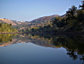
| 10/29/2006 10:37:39 PM | Morning Reflectionsby KrikkitComment: *Critique Club*
Congrats on a good score for your second challenge!
I don't do RAW and I don't know much if anything about converting, but I will try to comment on the other steps you mentioned in your comments.
I like the composition. Although I agree that a bit of a tigher crop on the right probably wouldn't have hurt, I love the overall shapes that the landscape and the reflection make. Your application of USM was good as I can see plenty of details but no signs of too much sharpening.
Hue and saturation look pretty good, although the shot overall looks washed out. I think that has less to do with hue and saturation, though, and more to do with levels or curves.
Pretty much always the first step I take when post processing is to use "auto levels" (in Photoshop). I may not always use the result, but it gives me a great idea of how the darks and lights in my shot should be balanced. I was working on a picture today, however, where auto levels gave my nice orange and yellow colors a greenish tint. So that is where I manually adjust the levels. Basically I want the lightest and darkest points of the histogram (the triangle sliders) to match up with the lightest and darkest points of the graph (so if the graph were to stop on the right, say a centimeter before the end, I might put the right slider a centimeter before the end as well). (This is a bad explanation but I hope it gets across at least a basic idea.) I don't use curves as much but some people prefer that to levels adjustments - I just don't know as much about it.
Why I'm saying all this is because the main problem I see with your shot is that the darks look too dark and muddy and the lights look too light, or washed out. Try playing around with the levels and see if you can get it to look a bit better. (I know this was a morning challenge where a lot of light was probably the point in a shot like this, but maybe this can give you ideas on where to go in the future.)
I hope this helps - PM me if you have any questions! :-) I am glad to see you participating in challenges - I love the seagull shot - and your portfolio shots are interesting as well :-) | | Photographer found comment helpful. |
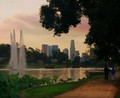
| 10/29/2006 01:34:01 PM | Good Morniiiiiing Los Angeles!by runericComment: *Critique Club*
Oooh, this is a lovely shot! I like what you did with the color/saturation/lighting adjustments - seems very effective. I do agree with other commenters that the cropping could be different, but as it stands now the crop you chose isn't bad at all.
Personally, I don't feel that the shadows are too muddy - I think they are a nice contrast to the lighter parts of the photo and give the city buildings and the sky a nice emphasis. And the city and sky are what, in my opinion, make this photo truly lovely.
I also like the people there as it gives a nice, personal feel, but having them not in the shot would give it a different feel that might be better (or might not). |
| 10/26/2006 06:22:14 PM | The Habitby timfythetooComment: This idea I hope does well as a serious subject amongst what I expect to be a bunch of silly shots.
You did that very well, congrats! | | Photographer found comment helpful. |
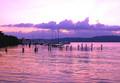
| 10/26/2006 06:19:26 PM | Those pastel morningsby dmaddenComment: *Critique Club*
While this is a nice shot overall, I think you could have achieved your goal of emphasizing the gulls and boats a bit better by cropping out some of the bottom. The patterns in the water are nice but they really do not add a whole lot to the main point of the photo. Personally, I would have cropped so that the horizon line was in the exact center of the shot. (However, I think this idea may not have done so well with the voters!!)
I like the contrast here. The color is nice, but it does feel a little too fake or processed to me. I would have liked to see some of the oranges brought out a little more, if possible.
The other thing I want to mention is: Your horizon is obviously straight, but the way the clouds are just gives a bit of a tilting feel to the photo. But this is a very minor point, and doesn't affect my initial impression of the shot.
I have probably sounded very critical but the main thing is that your image is very nice to look at and I am just nitpicking some things to hopefully be helpful. Congrats on a nice, peaceful, and beautiful shot. | | Photographer found comment helpful. |
| 10/26/2006 05:15:28 PM | | | Photographer found comment helpful. |
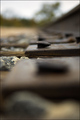
| 10/26/2006 02:55:18 PM | Abandoned Tunnelby fencekickerComment: Composition feels a little off to me - would have liked to see either less black space or the entire curve. But I really like this idea, as well as the colors of the shot. | | Photographer found comment helpful. |
| 10/26/2006 02:53:56 PM | Foundationsby m2iwComment: DOF is too extreme for my tastes but I like the composition. | | Photographer found comment helpful. |
|
Showing 2691 - 2700 of ~3582 |
Home -
Challenges -
Community -
League -
Photos -
Cameras -
Lenses -
Learn -
Help -
Terms of Use -
Privacy -
Top ^
DPChallenge, and website content and design, Copyright © 2001-2025 Challenging Technologies, LLC.
All digital photo copyrights belong to the photographers and may not be used without permission.
Current Server Time: 08/17/2025 04:17:13 AM EDT.
|