| Image |
Comment |
| 02/21/2007 01:50:04 AM |
|
 Photographer found comment helpful. Photographer found comment helpful. |
| 02/21/2007 01:49:56 AM |
|
| Photographer found comment helpful. |
| 02/21/2007 01:49:52 AM |
|
| Photographer found comment helpful. |
| 02/21/2007 01:49:28 AM |
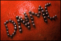
Crossing the lineby CraftyComment: I like the concept - and the title is very fitting - but this looks too staged for my liking. |
| Photographer found comment helpful. |
| 02/21/2007 01:48:53 AM |
. . . Nowby scarbrdComment: Crop's a bit too tight for my liking, but a powerful message is presented here. I wonder what it would have looked like with everything but red desaturated? Maybe not so good because of the yellow on the sign.. might have been really weird. |
| Photographer found comment helpful. |
| 02/21/2007 01:46:20 AM |
This word.. It Hurts..by bnileshComment: Ah yes.... that it does. Lighting is a tad harsh but composition is very nice. The red color gives this added emotional impact and was a great choice. Border is nice and complimentary without being distracting. |
| Photographer found comment helpful. |
| 02/21/2007 01:40:45 AM |
|
| 02/21/2007 01:39:42 AM |
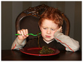
Life Happensby kimphComment: Glad his nose is okay! Check out the DPC tutorial on sizing for some good pointers. |
| 02/21/2007 01:37:56 AM |
|
| Photographer found comment helpful. |
| 02/21/2007 01:34:54 AM |
|
| Photographer found comment helpful. |
Home -
Challenges -
Community -
League -
Photos -
Cameras -
Lenses -
Learn -
Help -
Terms of Use -
Privacy -
Top ^
DPChallenge, and website content and design, Copyright © 2001-2025 Challenging Technologies, LLC.
All digital photo copyrights belong to the photographers and may not be used without permission.
Current Server Time: 08/25/2025 05:17:50 PM EDT.