| Image |
Comment |
| 05/07/2007 02:17:21 AM |
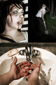
A Primarily Peaceful Springby GreetmirComment: -Critique Club-
I agree with some of the comments below. I think that the three images taken individually are pretty nice. Together, however, there is not a visual impact that causes the viewer to be impressed.
I don't prefer the "peace sign" presentation - it causes me to focus more on your processing when I look at it than on your images - but I do like what you did with it in terms of having a darker area where the images are on the edge of the circle.
I also think the image is a little unbalanced as far as having two of the images have green backgrounds and one without. Perhaps choosing different pictures or a different layout would have suited this challenge better. Overall not a terrible entry, and one I am happy to have seen. |
 Photographer found comment helpful. Photographer found comment helpful. |
| 05/07/2007 02:12:16 AM |
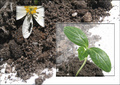
~*Life*~by KrystleComment: -Critique Club-
I scored this image pretty highly during voting. I think that the presentation of the three images worked very nicely. It was unique, and it drew attention to the flower and leaf while still making the dirt an important part.
I think the main problem that you have is that the image looks a little unbalanced - perhaps, as was mentioned, there was too much white. The eye is a little confused looking at the image. A smaller problem is that I can see a line of processing in the lower left corner of the leaf box.
I like your theme - having the leaf and the flower together with the dirt really does portray "life" and I think the addition of the ant was a lovely touch. I love your lighting - setting it out in the sun was nice - and I love the drops of water that you included.
All in all, great job. |
| Photographer found comment helpful. |
| 05/07/2007 02:07:42 AM |
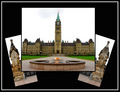
Eternal Flameby SimpaComment: -Critique Club-
The first thing when I saw it was that I noticed that it wasn't using all of the available image space. Personally I think showing off the subject in larger detail, and having less background/frame, would have been nice. However, you did a *fantastic* job of having it be symmetric and balanced. The arrangement of the three images wouldn't have been my choice BUT you did it very very nicely. I also think voters probably appreciated seeing a non-traditional arrangement of images.
A blue sky would have helped this immensely. Something like that could be accomplished in Advanced editing and I think would have just set the mood a little bit better. Your colors and your contrast are very nice. I also like the white outer border as it matches the images nicely.
I think your presentation of the building was very competent but it did not impress me. Perhaps having a closeup or two for the additional side images would have drawn me in a bit more and caused me to have more interest in the subject. I will say that this is your weakest point - the lack of "wow factor". And I think your strongest point was a nice, crisp presentation of the images. |
| 05/07/2007 02:02:11 AM |
|
| 05/07/2007 02:00:28 AM |
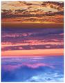
circle of zen by magnetic9999Comment: Very beautiful colors and composition. I really love this... it is very peaceful to look at. |
| 05/07/2007 12:35:25 AM |
|
| Photographer found comment helpful. |
| 05/07/2007 12:34:59 AM |
|
| Photographer found comment helpful. |
| 05/07/2007 12:30:36 AM |
|
| 05/07/2007 12:30:01 AM |
|
| Photographer found comment helpful. |
| 05/07/2007 12:24:04 AM |
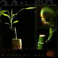
Neverwhereby jackal9Comment: I loved this and gave it a ten. I thought it was unique and artistic, and balanced very well to give a nice triptych composition. |
| Photographer found comment helpful. |
Home -
Challenges -
Community -
League -
Photos -
Cameras -
Lenses -
Learn -
Help -
Terms of Use -
Privacy -
Top ^
DPChallenge, and website content and design, Copyright © 2001-2025 Challenging Technologies, LLC.
All digital photo copyrights belong to the photographers and may not be used without permission.
Current Server Time: 08/21/2025 05:45:29 PM EDT.