| Image |
Comment |
| 04/13/2006 12:15:52 PM |
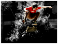
Learning how to Ollieby RikkiComment: Of the two pics of this kid, this is the better. The isolated saturation on him and the shadows in the background make him stand out really nice. You egt the feeling that he is WAY up in the air. This is in my top level of pics. |
 Photographer found comment helpful. Photographer found comment helpful. |
| 04/13/2006 12:14:18 PM |
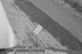
Vertigoby marvinComment: I will give you credit for a shot that makes me feel like the title. But outside of that I am not quite sure what I am looking at. Am I jumping? Just too blurry for me to figure out whats going on. |
| Photographer found comment helpful. |
| 04/13/2006 12:14:09 PM |
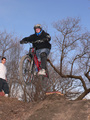
bike jumpby ronnytComment: A bit too blurry. Cropping out the kid on the left may have allowed for a better perspective on the biker - might make it seem like he is higher up than he is. |
| Photographer found comment helpful. |
| 04/13/2006 12:12:54 PM |
Save The Life Of My Childby GeneralEComment: "Cried the desperate mother..." - if I understand the song reference. Too little detail and the coloring just doesnt feel good at all (or at least doesnt make you feel like I assume the pic is going for). |
| Photographer found comment helpful. |
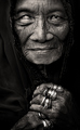
| 04/13/2006 09:04:33 AM |
Stories of Her Life by librodoComment: I almost didnt get to this one as I just remembered that I needed to finish out voting this category. Glad I did because this one knocked my socks off. In fact - I am going to bump it up again. Great shot. My only 10. |
| Photographer found comment helpful. |
| 04/12/2006 12:09:52 AM |
|
| Photographer found comment helpful. |
| 04/11/2006 08:51:29 PM |
Ready for bathtimeby CoozComment: Great shot. Great sharpness and detail and the selective sat works well. Great score especially considering the kid factor ( I wasnt as fortunate). And along with some of the other middling masses scores - those votes below 4 are just not appropriate. What are they voting on? |
| Photographer found comment helpful. |
| 04/11/2006 08:47:25 PM |
Not Chicken but Definitely Yellow.by eschelarComment: I really liked the use of the space to the right (my preference is to the left but what can you do - lol). I must admit I didnt get the reference in the title - but I don't believe that is any reason to drop the score on a pic. This is a picture competition after all. I would have to agree with some of the others that Tweetys face is a bit flat and unfortunately didnt have more detail to it - not that his face has alot of detail in the first place - just seemed a bit too simple. I dont agree with the votes under 3 and I did have you scored higher than your average. |
| Photographer found comment helpful. |
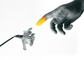
| 04/11/2006 08:41:20 PM |
Creationby JHComment: I liked this one as it was not the typical flower shot. Not much I could add to make it "better" as I couldnt have done as well myself. The sharpness inthe hand and flower was good and I didn't have an issue with the light background. I don't believe a dark background would have given the same if not better effect. Nice job. |
| Photographer found comment helpful. |
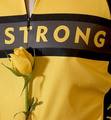
| 04/10/2006 07:38:02 AM |
LiveStrongby MelethiaComment: I didnt get the Texas relationship as well. Nice shot. I may have prefered a slightly more saturated yellow overall. Good composition and layout. Not much else I could suggest for improvement. But the most important thing is it's a wonderful shot of your jersey. (Wow - that sounded wierder than I had imagined). Good luck in Jump. |
| Photographer found comment helpful. |
Home -
Challenges -
Community -
League -
Photos -
Cameras -
Lenses -
Learn -
Help -
Terms of Use -
Privacy -
Top ^
DPChallenge, and website content and design, Copyright © 2001-2025 Challenging Technologies, LLC.
All digital photo copyrights belong to the photographers and may not be used without permission.
Current Server Time: 08/04/2025 02:53:09 PM EDT.