| Image |
Comment |
| 05/12/2007 02:16:12 PM |
Up ahead in the distance...by jenlund70Comment: Greetings from the Critique Club -
Editing is what can really take an ok image and boost it forward. I hope you find DPC a great place to learn more about editing. Everything I know about editing has come from the threads, images and people here at DPC.
I think the editing on this image is what hurt you. The scene is ok, nothing really wow about it, but the editing is pretty rough. Detail has been lost in general, there is a bit of noise in your sky and the colors have a bit of an odd feeling to them. It just has a dark and overall flat feeling to it.
I know this sounds a bit harsh and I can't really give you specific suggestions editing wise as to what to do different as I dont know what the original looks like. So I cant offer up options as to what you could change. But I can suggest highly finding someone here at DPC whose work you like and see if they would be willing to answer questions and/or give suggestions and tips to editing your images. There are alot of poeple that are more than willing to give some tips and help you along to learn some of the basic PS skills and tools that will give you images more in line of what you are looking for. This place is a treasure trove of info. Use it as best you can and yoru images will improve and your scores will go up. Most of all try to always have fun here. Dont let low scores or off comments get you down. This place is a blast. Dont let it be anything else.
Hang in there!
Tim |
 Photographer found comment helpful. Photographer found comment helpful. |
| 05/12/2007 02:04:54 PM |
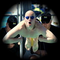
"Like a speeding bullet"by rdlorfComment: Greetings from the Critique Club -
First off - Great timing!!! You really caught a great pose and look. I wonder what your son thinks of it. It is a fun and entertaining image thats for sure.
A couple of issues that I had with it that may have prevented a higher score were the soft focus (but at the distance you were shooting from that could be expected), some of the skin tones look a bit odd and I am really not digging the vignette. I am guessing you were shooting for a perspective of looking down a gunbarrel or something. Its just a bit much for me. Also a bummer you had the two guys standing behind. If it had just been your son that would have been pretty cool. But whatcha gonna do. You deal with what you get.
Overall an entertaining pic, but lacking the technicals and the extra wow power to really score a whole lot better than it did. That said I cant imagine that you would give this pic up for anything. I look forward to seeing your future entries!
Tim
|
| Photographer found comment helpful. |
| 05/12/2007 01:57:41 PM |
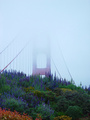
Golden Gate Gardenby yakatyouComment: Greetings from the Critique Club -
So how do I follow up with a comment after reading your dads. ;)
Really not a bad score here. You have an interesting image to begin with but I must say that I really want to see more of the bridge. I dont mind the fog covering up part - I just wish it wasnt covering so much. The lines and curves of the wire are interesting, just cut too short by fog. But whatcha gonna do? You can only shoot what you have in front of you and nature isnt always gonna give you the perfect options.
That said, you did pretty good here. Good eye for seeing an image available. Good job composing it in that you didnt have to crop much at all. Focusing on whats in your camera frame before hitting the shutter will yeild you better end product in the long run and a better eye for whats available to you. It really isnt a bad picture, it just lacks some of the wow power needed to get the higher votes. As you grow as a photographer that will come. You have a great mentor and teacher in your father. Milk all you can off him and all you can off this site and you will soon be leaving him in the dust. ;)
Keep up the good work and I look forward to seeing your future entries!
Tim |
| Photographer found comment helpful. |
| 05/12/2007 01:49:05 PM |
Eclipseby Dr.ConfuserComment: Greetings from the Critique Club -
Gotta love that Polar Coordinates filter huh? It has served me well in previous challenges thats for sure.
You have an interesting image here. One that is actually hard to critique. While being taken from a photograph you have brought it beyond that with PS. I am not saying this as a bad thing, but what you have created here is more of an artistic peice rather than strictly photographic. And thus hard to say what you could have done better or differently to make it score higher. This image is what it is. You created what I believe you were lookng for. I can say that colors are nice and the gradient is nice as well. It is an interesting image and didnt do really horrible for one that would be percieved as pure digital art.
Good luck in future challenges. I do enjoy seeing your images.
Tim |
| Photographer found comment helpful. |
| 05/12/2007 01:39:00 PM |
Here comes the rain againby SifinComment: Greetings from the Critique Club -
Welcome to the wonderful world that is DPC. Not a bad score for your first entry. My first four entries were well below 5.
Your image here has cool color. The clouds and light play also hold some interest. But i think what your image is lacking is a focal point of interest. The sky is cool and all but its not enough to carry the image - which it has to. I feel you have a bit too much black space on both top and bottom. Primarily the top though. It just isnt balanced well. I think this would be better as a thinner panaoramic image.
Not much else I can offer you here as critique. But I do hope you enjoy your time here at DPC. It can become quite addictive but there is also such a wealth of info to be taken from this place and its photographers. Have fun and keep on shooting!
Tim |
| 05/12/2007 01:34:26 PM |
Edinburghby SiggavComment: Greetings from the Critique Club -
Looks like you had a great location to shoot from. The clock tower is interesting as is the castle or whatever it is on the hill to the upper left.
I think the one thing that woudl have gotten you a stronge rimage and a better score is a longer shutter speed. 1/30 just seems to slow to give you what you probably could have had. 2 seconds may have gotten you much greater detail, better colors in your skyline and just more light from the city in general. You would have also gotten som elight streaks from the cars on the road which would also bring an added aspect of interest to your image. I would go back again and try some longer shutter speeds to see some different results. Could be well worth it.
And let me just add that just because a challenge has the expert edit ruleset it doesnt mean you have to use that ruleset. More often than not when people go out of their way to use all that expert editing allows they end up with a product that suffers in quality.
You have some great work in your portfolio. Really stunning images. Keep up that great work and I look forward to seeing your future entries!
Tim
|
| Photographer found comment helpful. |
| 05/12/2007 01:27:42 PM |
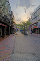
Early Morning in Songtanby BHusemanComment: Greetings from the Critique Club -
Looks like you have some interesting streets to be shooting on. You have some good lighting on this shot and the shops hold some interest, but overall I am not sure where to look. You havent presented the viewer with a main focus, my eye doesnt have a place to go. I look down the street but it doesnt feel like there is any purpose to the image.
The clouds are cool and the trees are nice. Mayeb a tighter crop to bring them more as the focus could have been good. A slight bump in saturation could have helped the colors available pop a bit more too.
Overall though this just has a tourist snapshot kind of feel to it. More documenting what the street looked like rather than a photograph that has stronger artistic purposes to it. Technically not a bad photo, good focus and sharpness and all. Just no wow factor, nothing really to hold my interest. Sorry I cant be of more help.
Good luck on future entries!
Tim |
| Photographer found comment helpful. |
| 05/12/2007 01:20:30 PM |
Spanish Stairsby howardjComment: Greetings from the Critique CLub -
You have a nicely composed image here with the placement of your model and the window. The colors on your model are very pleasing as well.
A couple of issues would be the sharpness of your model - a bit more in focus would be nice, and the blending of the staircase rail against the back wall. A bit mroe separation would have been nice IMO. And maybe a bit of a smile. She looks a bit tense, but thats not a major issue. Just something I was feeling.
This is in general a nice pic. Nothing really WOW about it but also nothing really bad about it either which came through in the voting curve. I am sure you know how DPCers want that wow factor to give out higher scores to. This falls short there. All that said, I would love to have an image like this on my camera. That would mean I got to hang at the Canary Islands. ;)
Keep on shooting and I look forward to seeing your future work.
Tim |
| Photographer found comment helpful. |
| 05/12/2007 01:08:40 PM |
Featherby mian3010Comment: Greetings from the Critique Club -
Well, your description of your entry helps explain the issues I have with this image. This is basically straight from camera and it has that feel. The colors are flat and the lighting is just ok. Soft in focus too. It just has no dynamic feel to it at all. It is just a snapshot basically.
Without going into everything I think you could have done, a minimal amount of post processing - levels, saturation, sharpening - could have really brought out some interest in this image. As it is though its just not much to look at. It doesn't hold my interest long enough to want to look at it for longer than what it took to hit a number. And unfortunately for this shot, thats what DPC requires for the higher vote. Play around with your editing, experiment a bit and see what you come up with. You could have scored higher here.
Tim |
| Photographer found comment helpful. |
| 05/12/2007 01:02:36 PM |
Looking From Aboveby GeocideComment: Greetings from the Critique CLub -
My first impression on this image was that I liked the lines. Good use of rule of thirds on the center part of the pattern as well.
Overall though there are some issues with this image that I had. The focus and sharpness of the image is a bit soft. But this is probably alot due to your initial image size from camera. I would think that having to upsize like you said you did would really affect the end quality. I think I also would have liked to have seen just a bit more on the left. I think its cropped just a bit too tight.
I think you scored right about where it should have for the FS. It doesn't have alot of WOW power and the technicals aren't the best. Looking at your portfolio I can see you do some excellent work with portraiture. I think you may have scored better with a portrait image over this entry here. Sorry I cant be more helpful. Good luck with your future entries!
Tim |
| Photographer found comment helpful. |
Home -
Challenges -
Community -
League -
Photos -
Cameras -
Lenses -
Learn -
Help -
Terms of Use -
Privacy -
Top ^
DPChallenge, and website content and design, Copyright © 2001-2025 Challenging Technologies, LLC.
All digital photo copyrights belong to the photographers and may not be used without permission.
Current Server Time: 08/24/2025 01:16:05 AM EDT.