| Image |
Comment |
| 04/24/2008 07:58:34 AM |
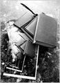
dante's staircaseby cutoutComment: I actually voted this high. Thought it was a well done image. But it looks like you were disqualified because you didnt provide an original - not because of the effect. And from reading the comments that were left you did achieve a good handful of kudos. If you had ribboned and not been dqed the backscratching would have come out in droves as well. Thats just the way DPC is. Top 3 get most of the views after voting is over, and thus they get most of the comments. 29 comments and 2 faves is nothing to sneeze at. |
 Photographer found comment helpful. Photographer found comment helpful. |
| 04/24/2008 07:15:29 AM |
framed by timfythetooComment: Originally posted by cutout:
sir
i wasnt talking about blue ribbons
the issue here is
is it boring
will it stand
go figure |
I guess ultimately that was not the purpose of this image. I didn't shoot it to be a long standing piece of artwork and to stand the test of time. It was a gimmick shot that was meant to hopefully appeal to the voting crowd here at DPC and get a good score.
I am sure you could go through many of my entries here at DPC and call them out as boring as well (I know I could make a long list) but I am not sure if that really is the issue. Comes off more as sour grapes here. But hey - you do what you need to do my friend. God bless! |
| 04/23/2008 01:59:52 PM |
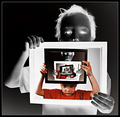
framedby timfythetooComment: Originally posted by KishKiai:
First thought "Wow, what a nice picture", second thought (right afterwards) "What the...? Colors in B&W picture? Basic editing?? How the...?"
No, really, please DO explain |
Explanation |
| 04/23/2008 01:58:57 PM |
framedby timfythetooComment: Originally posted by cutout:
getting a bit boring
this (droste effect)
no? |
Uhhmmm - blue ribbon - obviously not. |
| 04/23/2008 12:48:52 AM |
|
| Photographer found comment helpful. |
| 04/23/2008 12:21:06 AM |
|
| Photographer found comment helpful. |
| 04/23/2008 12:17:46 AM |
|
| Photographer found comment helpful. |
| 04/23/2008 12:16:59 AM |
Venezia by naomikComment: Congrats on the ribbon! Very cool effect. |
| Photographer found comment helpful. |
| 04/22/2008 10:15:26 PM |
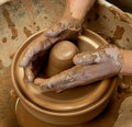
IMG_4217_edit.jpgby dsternerComment: I think I would like to take aspects of each of your images here and combine them. On this shot I like the color. More red and natural tones to it. But the other has better shadows, the hand position is more engaging and the hands being more wet with no dry clay spots is more appealing. Also the sponge on the lower left of your entry is a nice little addition for those who hang out long enough to find it there.
And now as I go back and forth between the two i seem to be swaying more to the tones on your entry. I wish you could have the greens of the bowl but have the hands be e bit less green/yellow. I do realize that you would need advanced editing for it.
I think you went with the better, more dynamic and more visually pleasing of the choices. Great idea Deb - and congrats again on your 6+ score. |
| Photographer found comment helpful. |
| 04/21/2008 01:30:40 PM |
mirrorby NaldComment: Very nice work Steve. Had this in my top row in voting. Well done. |
| Photographer found comment helpful. |
Home -
Challenges -
Community -
League -
Photos -
Cameras -
Lenses -
Learn -
Help -
Terms of Use -
Privacy -
Top ^
DPChallenge, and website content and design, Copyright © 2001-2025 Challenging Technologies, LLC.
All digital photo copyrights belong to the photographers and may not be used without permission.
Current Server Time: 08/18/2025 10:56:28 AM EDT.