| Image |
Comment |
| 03/08/2003 04:54:54 PM |
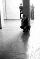
Odd Man Outby lykofosComment: Critique Club critique by Tim Jensen.
First of all, I like this concept quite a bit. However I am not especially happy with the composition. I do not feel that the way the pole is positioned between the people in the background as well as the close proximity of everyone lends itself well to the concept. What I would have tried is to position the pole and the young man along the left edge and closer to the camera and the background people more to the right edge, allowing for some distance between them. As it is now, most of the foreground space is not being effectively used and could be better used to visually convey the sense of separation that you intended. By reframing the scene you should be able to eliminate the distracting wall edge on the left side or show more of it and use it as a compositional element.
I have no particular issues with the lighting. I think you handled that pretty well. I would not have guessed that it was taken in a nearly black room. There is a nice powerful tonal range though I feel that the darkest areas, such as the young man's shirt could be even darker. The choice of black and white was a good one as it supports the isolation theme very well.
The location with it's openness and subtle textures was very appropriate for this image. I almost get the feeling that you could get lost and really feel alone in a building like this.
This photo certainly meets the theme quite well and is properly executed with clean sharp lines. Nice job.
Tim |
| 03/02/2003 05:00:48 PM |
brightening my dayby tomzinhoComment: Critique Club critiqe by Tim Jensen
First of all, this is a very good image and should have scored higher. It may not be among the most creative photos in the bunch but it is captured very well.
I would have liked to see a little more blurring on the petals on the left side to match that of the right side. It is a small thing but I feel it would have helped to move the eyes back to the center flower like it does on the right side. When an area is sharply focussed it is a tendency for the eyes to rest at that spot instead of moving on to another spot. Other than that, the DOF is very good with excellent sharpness at the center of the main flower.
The colors are very rich and bold and natural looking. They are appropriately saturated while still maintaining the subtle details that help make the photo. I find the bits of white on the lower right and left to be a little distracting, however. Those are the smallest of details that do not add anything to the photo and should be eliminated if possible. Having only shades of green visually supporting the bright yellow and red flowers would provide a simpler and more effective color palette.
The composition is very effective. By using the edges of the frame to crop every object except for the main flower is a very effective way of showcasing the flower. The other flowers and grass blades create a secondary frame and provides just the right amount of information to show the flower in it's environment.
The exposure is very good with a small exception being the overly dark area from the shadow of the flower on the lower left edge. I know it is difficult to avoid when we can't do any dodging or burning.
For the most part this is very solid photo with brilliant colors, nice composition and values, and well executed. Good job.
T |
 Photographer found comment helpful. Photographer found comment helpful. |
| 03/02/2003 04:14:59 PM |
Catching a breezeby #1 Bronco FanComment: Critique Club critique by Tim Jensen
I have to agree with some of the comments about using a faster shutter speed to slow the spinning motion and to show the blades more. I think it is a very intersting idea and the colors are very nice and bold. I'm just missing seeing more of the blades in motion. As it is the pinwheel tends to look a little small in the frame but maybe would not if the blades were not quite so blurred.
The composition is pretty good with the pinwheel set to the right of center. I may have preferred to see it positioned at a slight angle, leaning outward, to provide a more unbalanced feel that I think would match nicely with the spinning motion. It is a simple composition and I like that aspect. Someone mentioned showing many pinwheels in motion and I think that would have been an interesting idea as well, almost like a field of daisies.
I like the slight blur to the stick as it blends in nicely with the motion blur. It helps to increase the feeling that the pinwheel is somehow being transformed or disappearing into the background. It is appropriately sharp in the center of the pinwheel where it should be. This provides a solid starting point for the eyes to rest before viewing the rest of the image.
This photo clearly meats the challenge, it is an interesting and unique idea, and you executed it nicely. Good job.
T |
| Photographer found comment helpful. |
| 03/01/2003 03:31:20 PM |
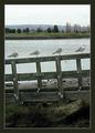
Gull-ableby GeneralEComment: Critique Club critique by Tim Jensen
As others have said this is a little soft on the focus. You may have had to crop some of the image to get it framed properly, plus, being in the boat probably did help too much.
I still like the image quite a bit. There is nice rhythm and order to the scene and the composition has a way of keeping my eyes moving around effectively. I also like the way it is divided into sections horiontally helping to convey the sense of depth.
This would probably be worth re-taking with a polarizer and either a steadier hand or a faster shutter speed. The polarizer will help deepen the blue in the sky and water and maybe provide a little more color to the rest of the scene.
It definitely meets the challenge and considering that it is slightly soft I think you did a nice job with presenting the photo. You chose a good image to begin with. The mat is tastefully done as well.
Good job Paul.
T |
| Photographer found comment helpful. |
| 02/19/2003 04:35:05 PM |
Abstract Yellow Bugby DCThiessenComment: I always enjoy shots like this. For this particular challenge I think it would have been better to show less of the tail light and more of the yellow lines of the bug. It's a nice composition and well executed. 7 |
| Photographer found comment helpful. |
| 02/19/2003 04:20:46 PM |
The End of Winterby ZiggyComment: This is very beautiful. Natural and simple. Excellent composition and colors. The border is very effective as well. 10 |
| Photographer found comment helpful. |
| 02/16/2003 04:37:17 PM |
Happyby mariomelComment: Critique Club critique by Tim Jensen
My first impression was that the skin tones were too red but after considering it I think that the coloring is appropriate because the child is inside a red tube where the whole overall color is red. Red is much more natural a color then, say, green would have been. The blue shirt is also effective in creating a nice contrast and emphasizing the boy's face and hands.
I think the cropping is also pretty effective. I might have cropped the top of the head a little to match the cropping on the arms. The extra space at the top is not necessary. The tighter cropping reveals more detail and increases the intimacy while excluding any distracting elements.
Somehow the lighting, in the way that it is a bit harsh, adds to the natural, playfulness of the photo as apposed to an evenly lit studio type shot that would appear too contrived and setup.
There really isn't much of significance that I would change with this photo. The composition, framing, bright colors and lighting, and big smile all add up to a very striking and emotional photo. It clearly meets the challenge and technically it looks solid. I think it is a very good photo.
Tim |
| Photographer found comment helpful. |
| 02/15/2003 04:38:43 PM |
rainbowby gilad33Comment: Critique Club critique from timj351
My pet peave in photos is when the horizon line is not perfectly horizontal when it looks like it was intended to be. Such is the case here. This gives off a very unbalanced feel to the scene which, for me, creates an uncomfortableness that remains as I view the image. If it is intended then tilt the image even more, if not then straighten it out. It is too easy to fix in an editing program that it should almost never be an issue.
Since there is a beautiful rainbow in this photo it is easy to gather that that is the main subject but instead of supporting the rainbow the surrounding subjects serve only to compete with it visually. This scene is unnecessarily cluttered and without a real focus. I feel it would have been much more effective to move somewhere else where you could show only a few of the surrounding elements while keeping the focus squarely on the rainbow. Using the yellow building against the blue sky with the rainbow may have provided some nice color contrast with the right composition. Maybe using the powerlines to mimic the shape of the rainbow would also work well. The key here is to greatly simplify the scene in some pleasing manner.
The colors are very good, bright and natural looking. It is also appropriately sharp and clean. I feel you met the challenge as well.
You had some very good elements to work with. You just need to determine what the primary subject is and eliminate everything that does not support or compliment that subject.
Tim Jensen
|
| 02/15/2003 04:04:13 PM |
Cliche' Sunflower Shot # 73by boyte1Comment: Critique Club critique from timj351
You certainly picked a gorgeous flower for this shoot. I don't mind the angle at all. What I don't really like is the background. I think this is because it doesn't appear very natural to me. It serves to only provide a smooth background but it doesn't seem to compliment or support the flower in a visual way. Sometimes what works very well is to use the same colors that are in the main subject as a background. In this case I can image a very light yellow or even green cloth or fabric. This isn't the type of photo that requires a complimentary color for contrast, but rather a similar color, to create a color theme that provides a soft, inviting feel to the scene.
Your use of focus is perfect here. There is sharp, edgy detail in the leaves where it is appropriate and softer detail in the petals where it accentuates the color and smooth lines.
Your use of lighting is good, particularily in the way the shadows are nice and soft matching the flower nicely.
The composition works well enough and I don't have any problems with the downward angle of the flower. I might have tried to emphasise the beautiful shapes of the petal and leaves some more by trying some different compositions and framing it even closer but that's just me and not right or wrong. As it is, it is a nice composition that doesn't detract from the beauty of this flower.
The colors are very natural looking and it is presented very cleanly. I feel you did a nice job with this photo.
Tim Jensen
|
| 02/09/2003 10:37:39 PM |
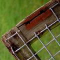
Absent Squares by paynekjComment: Critique Club critique
I'm a little late getting to this, sorry.
I just love images like this. They are fun to look at. You can let your eyes wander around from detail to detail. I wouldn't change too much about this photo except for maybe showing a little more of the links on the fence, but I would have to experiment with it to know for sure. The colors and textures are just wonderful and not overly sharpened or saturated, I'm glad to say. The composition is very nice with a good use of angles. You handled the depth of field very well by keeping the background blurry so that it contrasts very nicely with the fence. even the subtlety of reds in the grass matches nicely with the red color in the fence. This is a very clean image, it meets the challenge nicely, and I think it is appropriately cropped. Good job.
T |
| Photographer found comment helpful. |
Home -
Challenges -
Community -
League -
Photos -
Cameras -
Lenses -
Learn -
Help -
Terms of Use -
Privacy -
Top ^
DPChallenge, and website content and design, Copyright © 2001-2025 Challenging Technologies, LLC.
All digital photo copyrights belong to the photographers and may not be used without permission.
Current Server Time: 08/03/2025 06:54:32 AM EDT.