| Image |
Comment |
| 03/23/2003 05:18:07 PM |
Into The Mystic by sherComment: An average of 6.7 from the non camera users? A full point lower then the others. Unbelievable. End of tiny rant.
This photo is awesome. This deserves to be displayed large. I think you should definitely try to promote this image because everybody will love this and you could make some good money off of it.
The choice of colors is perfect as well as the composition and detail.
I guess you can tell how much I love this photo. Great job!
T |
 Photographer found comment helpful. Photographer found comment helpful. |
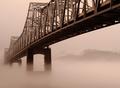
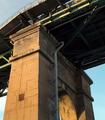
| 03/23/2003 05:07:54 PM |
No Turning On Bridgeby autoolComment: Critique Club critique by Tim Jensen.
The first thing that caught my attention was the strong visual impact of this photo due to its dynamic composition. Compositionally it is very effective in communicating the sense of beauty, size, and strength of this structure. I would have preferred to not see the trees just to the right of the closest column. Instead, by moving to the right you could have blocked those trees with the column and displayed a solid blue shape that would better reflect the blue area on the left side of the bridge. I understand why the image is tilted slightly so that the apparent horizon line is level but by doing that the columns are tilted and the bridges looses some of its structural balance. it's a bit of a trade off and I am simply wondering what it would look and feel like with the columns more vertical.
Your intent was to shoot this scene at mid day and while that works just fine I am wondering what this would look like taken at dusk or nighttime with a much darker background. A timed exposure could give a real interesting deep blue color that could compliment the color of the concrete very well. It could simplify much of the background and empahasize the composition even more. Of course I would have to see that to know for sure. Just an idea.
The colors and values are very natural looking and the contrast is appropriately bold. It is very sharp but I think I would have preferred a much shallower depth of field where the focus was on the foreground 1/3 of the bridge and to go slightly soft as it receded. I feel that this would support the already strong sense of depth and 3dimensionality (is that a word?).
I love how you took a pretty common structure and created a very artistic image out of it. Good job.
Tim |
| Photographer found comment helpful. |
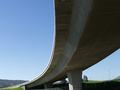
| 03/23/2003 04:31:12 PM |
Five Archby Dim7Comment: Critique Club critique by Tim Jensen.
This is a very interesting bridge and I love the way the snow is piled up on the sides of the columns. I am not completely in favor of the composition, however. It's not bad but I think you could have chosen a better angle that eliminated the branches and was more dramatic. I'm not sure exactly what that angle should be but maybe one that highlighted one of the piles of snow and an arch by showing it closer to the camera. Basically looking down the side of the bridges some more. Since I can't see the entire scene I can't know if there were some elements that you didn't want to show in the scene. The repetition of the arches and piles of snow are very interesting and I would like to see them pronounced even more in some way. The same goes for the nice texture of the bridge. I just want to get closer to all of that.
The colors and values are very good and natural looking. I really like the smoothness and brightness of the snow and the way that it helps lead you into the photo. Within the second arch from the right there are trees that are interfering from clearing showing the arche's shape on the backside. The arches are an important visual element and care should be taken so that they are not blocked or interfered with.
The photo is appropriately sharp and executed very well. Overall this is a pleasing photo of a very intersting bridge and surrounding elements. Good job
Tim |
| 03/23/2003 04:00:12 PM |
Body Part Number 1by OneSweetSinComment: Critique Club critique by Tim Jensen
To be honest this appears to be a photo that was entered at the last moment when you didn't have a better idea. I don't mean to be harsh but I just don't find this to be a very compelling photo. I feel it is borderline in meeting the challenge as well because you created the 1 shape yourself so it wasnt naturally occurring. But it's probably close enough. If you had to use your own hand then I think you should have tried to create a semi-abstract, compositionally strong image. Strong, contrasty light and maybe the use of black and white would have created a more visually appealing photo. There is interesting texture in the wall and more could have been done with that with some strong sidelighting. I hope this helps. It's all good practice and that is the main point of this site so I hope you can use this advice in a positive way.
Tim |
| 03/21/2003 06:06:49 PM |
|
| Photographer found comment helpful. |
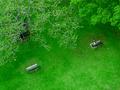
| 03/21/2003 05:51:20 PM |
Miles of Momentsby GotchaComment: The blue in the shadow seems inappropriate for this. In fact I think this would be better in black and white. It is a very nice composition and choice of subject. |
| Photographer found comment helpful. |
| 03/21/2003 05:43:26 PM |
|
| Photographer found comment helpful. |
| 03/21/2003 05:42:28 PM |
Conversationby HavokComment: This is excellent. I really hope others will take the time to really appreciate the beauty and impact of this photo. It reminds me of a Norman Rockwell painting. perfect choice of cropping and the use of monotone.
T |
| Photographer found comment helpful. |
| 03/19/2003 03:07:16 PM |
Bridgeby punchereloComment: Critique Club critique from Tim Jensen
I believe you were trying to capture a semi abstract point of view that showed the detail and character of the bridge. While I can appreciate that point of view, in this case I don't find this photo to be particularily compelling. I'm not sure why exactly but I feel that it is because it just seems ordinary. Not at all bad but it lacks the visual interest. Part of the reason is that it seems to be taken at a distance that only makes me more curious as to what the rest of bridge looks like but I feel frustration that I can't. I do usually enjoy studying a subject very closely when there is a lot of rich texture to enjoy but I'm just not finding a lot of enjoyable textures here. Maybe if you would have done something more interesting with the composition, like taking the photo from a more a extreme angle or waited until the lighting was more dramatic that would have helped give it some punch.
It is executed pretty well with sharp details and natural colors. I do like the complimentary and secondary colors used here, they are pleasing to look at. The values are interesting with the darkness underneath the bridge complimenting the brightness of the columns.
You have plenty of interesting elements to work with here. I just feel that the composition is the weakest area that needs improvement.
Tim |
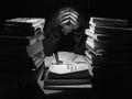
| 03/08/2003 06:57:47 PM |
Late Nightby mariomelComment: Critique Club critique by Tim Jensen
I think we have all been there. This is an absolutely fantastic shot. I'm not sure what, of significance, I would change in this photo. In my mind, I think I had even more books. : )
The lighting using the single point source is perfect. You have used it to highlight only what is neccessary which is exactly what you want in an effective shot. The choice of black and white was very appropriate as was choosing a dark sweatshirt to help make the face and hands stand out more.
The composition is used to maximum effect. The arrangement of the books serve to frame the person and focus our attention on her. One idea that came to mind was to include many little bookmarks or tabs sticking out of several of the books to enforce the idea that they are actually being used and studied from as apposed to being merely props in a scene. The arrangement also gives me the impression that some sense of order is being attempted but at any moment the may be scattered in a fit of frustration.
The real beauty is in how you showed only enough visual information to create a very impactful image. This clearly meets the challenge and you executed it to perfection. Great job.
Tim |
| Photographer found comment helpful. |
Home -
Challenges -
Community -
League -
Photos -
Cameras -
Lenses -
Learn -
Help -
Terms of Use -
Privacy -
Top ^
DPChallenge, and website content and design, Copyright © 2001-2025 Challenging Technologies, LLC.
All digital photo copyrights belong to the photographers and may not be used without permission.
Current Server Time: 08/01/2025 09:07:16 AM EDT.