| Image |
Comment |
| 04/13/2003 08:50:45 PM |
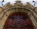
Front Doorby Pep VentosaComment: Critique Club critique by Tim Jensen
Wow! was my first impression when I first saw this image. So it is pretty obvious that I like this photo.
First of all, it is very symmetrical so you have easily met the challenge. I really like the two torches or sconces that raise up at the top as well as the flow of the arch into a point at top center. You chose a very good perspective to show the symmetry here. I'm having a hard time deciding if I would like to see more of the door or if it just right the way it is. It is hard to know without seeing other views. I just purchased a wide angle conversion lens and I am really loving the wider angle shots. Of course it is very dependent on the subject.
Clearly the other element in this photo is the beautiful textures and features of this old building. While it is good as it is I think it could have been improved by more contrast with more direct lighting. This would make an excellent subject for studying the effects of various lighting situations.
The color and values appear very natural except I don't like the bluish sky reflecting in the door. A little hard to avoid, I know. Maybe you could have desaturated some of the blue and cyan channels since blue is not a prominant color in this image.
Technically everything looks pretty good and your depth of field is appropriate for showing all of the details clearly.
Very nice work.
Tim
|
 Photographer found comment helpful. Photographer found comment helpful. |
| 04/04/2003 03:08:03 PM |
lines of sorrowby kenboComment: Critique Club critique by Tim Jensen
I think I understand what you were doing with the softfocus here but I feel that it is too soft. I think it would be much more effective if it was just slightly soft instead of the blurriness I see here. The best method I have seen for accompishing this effect is where the edges are actually pretty sharp or in focus but the brightest areas have a soft blurriness to them as in classic wedding and portrait photos. This is most effectively accomplished by using a softening filter on the camera. The other method is with layers in Photoshop which isn't legal for this challenge.
As for the theme. The title says sorrow but I think it could represent many different emotions and that is what I like about it. It allows me to apply my own story to the photo. It helps make it engaging.
I usually like a tightly cropped photo because they focus our attention real well but in this photo I thnk I would have backed off just a little to allow more of the womans arm near her elbow as well as allowing a touch more space to the right of her head. Otherwise the composition is very good and the woman's posture is convincing.
The values especially the use of a black background is very effective in communicating the mood. This may have been a good choice for black and white but I would have to see it to know for sure.
For the most part this is a good photo and it is executed and presented well but it is difficult to get past the too soft effect that was used. If you have a sharp original it may be worth exmerimenting some more on some different effects like alternate ways of softening, less croping, as well as black and white. Good job.
Tim
T Message edited by author 2003-04-04 17:03:13. |
| 04/04/2003 02:56:19 PM |
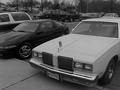
Old and Newby AllenComment: Critique Club Critique by Tim Jensen
The idea behind this photo is a pretty good one. I love cars and I think since there are so many variations the idea of contrasting an old car with a new one to represent time is pretty good. However, the main problem I have with this photo is that the theme is not very clear by looking at the photo itself. I'm also very unclear as to what the can has to do with the photo unless that is really part of your theme. I just can't completely figure it all out. You would need to figure out a more effective way to convey your idea. A tighter cropping to eliminate unwanted background elements and a more interesting composition and perspective could help improve on this.
I would also have preferred color in this photo unless the above suggestions were used and there was more contrast. As it is there just doesn't seem to be a strong reason to use B&W. Color would help it pop out more and command more attention.
The execution is fairly good with some slight softness to the edges. It's pretty clean but needs more contrast as a B&W.
Overall I have to say this is a pretty ordinary photo but with plenty of potential. It needs much more creativity especially in regards to the composition and perspective. this way you can better grab the viewer's attention.
T |
| 04/02/2003 04:56:29 PM |
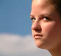
Contemptby crabappl3Comment: Critique Club critique by Tim Jensen
This is an interesting photo and I like it quite a bit. My one slight problem I have with it, though, is the fact that I don't see a lot of contempt in the girl's expression. Maybe it would if I knew her expressions. To me it simply looks like she is looking off intently at something. As a photo, in general, this is actually one of the elements that I enjoy about this photo. The other elements that I think are well done are the tight cropping, the simple blurred background, and the natural complimentary colors. These elements create an engaging photo by eliminating everything that isn't necessary. I enjoy portraits the most where the subject is looking away at something. This puts the emphasis squarely on the person and doesn't imply that there is someone with a camera nearby.
The overall lighting is very effective and I like the shadows cast by the girl's eyelashes. However, I find the shadow from her nose a little distracting and maybe some very subtle fill flash would have helped in that area.
Technically everything appears perfect with nice colors and appropriate sharpness. I see no evidence of jpeg artifacts and there is a pleasant smoothness to the girls skin and features. I am normally not in favor of a square format but I find it effective in this case.
Very nice job.
Tim |
| Photographer found comment helpful. |
| 04/02/2003 02:46:41 PM |
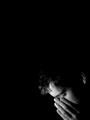
Silenceby lennierComment: Critique Club critique by Tim Jensen
Even though I feel that this is a decent photo I am a little uncomfortable with this photo for a couple of main reasons. The first reason is the pasty color of the skin that tends to convey less emotion rather than more. It is an interesting effect but I don't feel that it works well in this photo. The second reason is the cropping. It appears unecessarily tight. If the cropping were relaxed to show more of the crowd this man would still be the focal point but with the addition of the crowd around him it would help tell the story of the event and further add to the emotion.
I find a strong sense of emotion to be lacking here. Instead I find a very complacent scene. This is due to the fact that I can only see the man's eyes and only a slight expression on the woman behind him. It is a surprise to me to see a photo taken in a crowd where I see so few expressions. I understand your title of 'Silence' but I find that the man's eyes and stance just aren't conveying much emotion.
Technically it is well done with good values and sharp clean edges.
I believe I understand what you were trying to do in the way of isolating this young man and trying to convey his attituted toward the current events but I just feel that this particular style wasn't the best method of doing it.
T |
| 04/01/2003 04:41:16 PM |
Almost Holy by KonadorComment: Ben, you are really starting to develop a nice style with the use of black and white along with dramatic lighting and interesting compositions. I knew it was yours and a winner even from the thumbnail. Congratulations.
T |
| Photographer found comment helpful. |
| 03/23/2003 05:32:06 PM |
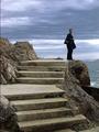
Waiting...by Bojan BonifacicComment: Oops. A misinterpretation of the rules. This is still a very interesting photo with nice composition, texture, and detail. I always prefer when the subject is not looking at the camera. It tends to emphasize the fact that there is a camera and another person involved. I much prefer the subject looking away at something. This creatres curiousity and wonder about what the subject is looking at or thinking about. Good job.
T |
| 03/23/2003 05:26:16 PM |
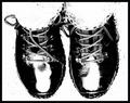
To Shoesby robbiehComment: One of my tens for the week. It's simple, it's dramatic, it's detailed, and it's just plain fun to look at. Very good job! |
| 03/23/2003 05:24:04 PM |
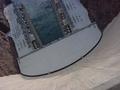
"Looking Down Hoover"by tfarrell23Comment: This is one of those images that could have really benefitted from a wide angle lens. As it is it is still very good with strong composition and great detail. Angling the image was a good idea.
T |
| Photographer found comment helpful. |
| 03/23/2003 05:20:57 PM |
Lottie by dsidwellComment: Absolutely beautiful. My top pick. The composition, colors, and perspective are perfect. The great texture and details throughout realy help tie it all together.
T |
| Photographer found comment helpful. |
Home -
Challenges -
Community -
League -
Photos -
Cameras -
Lenses -
Learn -
Help -
Terms of Use -
Privacy -
Top ^
DPChallenge, and website content and design, Copyright © 2001-2025 Challenging Technologies, LLC.
All digital photo copyrights belong to the photographers and may not be used without permission.
Current Server Time: 08/03/2025 02:43:43 AM EDT.