| Image |
Comment |
| 09/06/2006 01:11:26 AM |
From Father to Sonby rushartistryComment: With this photo, the viewer is pulled toward the frog. It just seems like the frog is not quite sharp and in focus enough. |
 Photographer found comment helpful. Photographer found comment helpful. |
| 09/06/2006 01:10:07 AM |
sundayby shenanigansComment: Image is overexposed? The tile wall is blown out too much. Possibly because of the strong light source, which also produces those harsh shadows. |
| Photographer found comment helpful. |
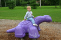
| 09/06/2006 01:08:35 AM |
My Rideby well7430Comment: A tighter crop would have worked better, IMO, to emphasize the child more. Maybe a shorter DOF to reduce the distracting background. |
| 09/06/2006 01:07:15 AM |
|
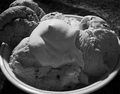
| 09/06/2006 01:06:20 AM |
Cookies 'n Creamby SquishyBComment: Not enough contrast. While I like the front shadows, they are a bit to dull. Adjusting the Levels more would probably help to bring out those features. |
| Photographer found comment helpful. |
| 09/06/2006 01:05:01 AM |
Ice Cream Sandwichby Man_Called_HorseComment: Background is too distracting. Overall photo is just too busy. The shadows are a bit harse. using softer light sources (multiple) and a tight cropping on the face, ice cream sandwich, and the box would have been much better, IMHO. |
| 09/06/2006 01:02:56 AM |
Phone talking is my life!by theseeaComment: Good idea, but the image seems to light (missing overall contrast). Also, the subject is cropped too close, which centers him. A little off-center would change the whole dynamic of this image. |
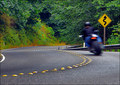
| 09/06/2006 01:01:28 AM |
wahooooooo..... !by robaComment: Well done. I like the feel of motion in the blur. I like the off-center placement of the subject, with plenty of room in the frame to "drive into". |
| Photographer found comment helpful. |
| 09/06/2006 12:59:39 AM |
|
| 09/06/2006 12:58:56 AM |
|
| Photographer found comment helpful. |
Home -
Challenges -
Community -
League -
Photos -
Cameras -
Lenses -
Learn -
Help -
Terms of Use -
Privacy -
Top ^
DPChallenge, and website content and design, Copyright © 2001-2025 Challenging Technologies, LLC.
All digital photo copyrights belong to the photographers and may not be used without permission.
Current Server Time: 09/03/2025 06:04:31 PM EDT.