| Image |
Comment |
| 04/26/2006 11:19:46 PM |
|
 Photographer found comment helpful. Photographer found comment helpful. |
| 04/26/2006 11:15:40 PM |
|
| 04/26/2006 11:13:58 PM |
|
| 04/26/2006 11:11:48 PM |
|
| Photographer found comment helpful. |
| 04/26/2006 11:11:17 PM |
|
| Photographer found comment helpful. |
| 04/26/2006 10:58:52 PM |
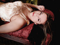
The Lookby bryantbusComment: Hello from the Critique Club
Let me start out by saying I gave this photo a seven. It is a very alluring pose that is seductive but not overly so. The model's expression is perfect, she draws your eyes in and holds them and that gives this shot a lot of impact.
The main thing that bothers me about this shot is the camera position. At this angle, it appears that her feet would be elevated above her head. This gives it a subtle feeling of tension that seems out of place. I tinkered around in Photoshop and rotated the image 25 degrees CCW. This put her in a position where her feet would be in a slightly lower than her head and gave it a much more relaxed feel.
I might also crop out the bottom of the bed. What appears to be a metal frame detracts from the feeling of softness in the rest of the composition.
Your comment made me think you might not be satisfied with the work you did on her eyes. I think you did really well with this. Her eyes really stand out, but you didn't take it too far.
Well done!
-Bill |
| Photographer found comment helpful. |
| 04/25/2006 01:48:59 PM |
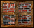
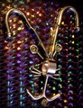
Crazy Chrome Ideaby dube140463Comment: Hello from the Critique Club!
My first impression is that the background really steals the attention from the subject. Since the background is the only real source of color, and it is very high contrast, it prevents your eye from resting comfortably on the subject. This may have worked better with a solid color background, maybe black. This would force your eye back on to the subject.
The lighting also seems a bit soft. It appears to me that there may be two light sources. One above the subject (the bedside lamp?), and the second across the room from the subject (maybe a window?). Neither light source is very dramatic. A single bright light that would create some interesting reflections on the metal would add some punch to this photo. This would also sharpen the picture more.
One other thing to consider is using the full file size available to you. This picture is only 82k. You are allowed up to 150k. That extra resolution can do nothing but help. It allows for more detail in your picture, and in this case may increase the sharpness some!
-Bill |
| 04/24/2006 11:53:23 PM |
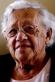
Vera - 2006by kari1Comment: Hello from the Critique Club!
There are just a few things I see here that could use a little tweaking. The lighting is what I think kept this photo from scoring higher. The light on the her right side is too harsh. I am assuming this is natural light coming in from a window. It may have helped to partially close a shade, or position something in between her an the light to lessen it some. Another option would be to lightly use the burn tool in post processing since this was an advanced editing challenge. I like that you have two light sources and that they are not equal in strength. The lighting on her left side is much softer and has a more comforting feel. Adding some fill flash would help brighten up her eyes, which seem to be a little dark. One final nit-pick would be the cropping. The edge of the frame cuts out some of her hair. This makes it feel cramped. Allowing the background to completely surround her head would help with this.
You had a few comments where people said you over sharpened. I really think you did a nice job with this. People's eyes may have been drawn to her lips and chin, where the wrinkles are more pronounced, but looking at her cheeks tells me that this really is natural. Another thing fill flash may have done is make the wrinkles a little less pronounced.
Her pose is wonderful. She seems quite relaxed and comfortable. It makes me feel like she has just finished telling a story of one of her life experiences, and is now looking at me to make sure her point sinks in!
-Bill
|
| Photographer found comment helpful. |
| 04/20/2006 10:59:47 PM |
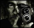
Yashica Manby annahComment: This is one of my favorites in this challenge. I hope it does well for you! |
| Photographer found comment helpful. |
| 04/20/2006 10:58:53 PM |
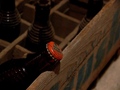
'40s Crushby yantskiComment: I really like this shot. The colors, lighting and DOF all work well together. |
Home -
Challenges -
Community -
League -
Photos -
Cameras -
Lenses -
Learn -
Help -
Terms of Use -
Privacy -
Top ^
DPChallenge, and website content and design, Copyright © 2001-2025 Challenging Technologies, LLC.
All digital photo copyrights belong to the photographers and may not be used without permission.
Current Server Time: 08/14/2025 10:32:40 AM EDT.