| Image |
Comment |
| 02/09/2003 10:52:34 PM |
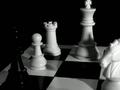
Emminent Defeatby snsComment: ~Critique Club Comment~
COMPOSITION- Composition is kind of harsh on this one. The king is a little tightly cropped on top and lighting is a little dark on the black king. It is hard to make out what it was. I think you should have lined up the camera with the back of the board to make kind of a horizon. It is tilted as is. I love the whole chess theme and the shadows from the white players are great.
BACKGROUND- Not much to the background. Having it black cuts down on distractions greatly.
CAMERA WORK- Your focus is great. I think a tad longer shutter speed would have lightened it up a little bit.
POST PROCESSING- Post processing is nice. The sharpness is perfect. There is some noise in the whites, but nothing too distracting.
MY OPINION- It's always great to win a game of chess. This is nice and I would have given it a 5. Just straighten up a few things and you have a great shot. |
| 02/09/2003 10:21:40 PM |
Door of Wonderby AntithesisComment: ~Critique Club Comment~
COMPOSITION- NIcely composed image. I like how you've done the portrait frame and had it long for this one. It fits perfect for this shot. Color and the way you have it lined up is good. I like the dark effect with the little windows lit up.
BACKGROUND- it works great for this photo. Nothing is distracting.
CAMERA WORK- you focus and shutter speed are perfect. The photo is exposed perfectly. I like the glint of the doorknob, it lets us know it's a door.
POST PROCESSING- color adjustments and saving are done great. no artifacts or noise here.
MY OPINION- This is a nicely framed well shot photograph. It looks like something an artist would have in his studio. It is shot perfectly, but this kind of art isn't my fortè. Do you live in Japan? I've loved some of your other shots. |
 Photographer found comment helpful. Photographer found comment helpful. |
| 02/04/2003 10:18:34 PM |
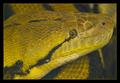
Cute Pet Cliches ?by GordonComment: awesome, is this guy venomous? This is a cool composition, kind of like the snake picture I did, but mine wasn't as good. 10 |
| 02/04/2003 01:41:42 AM |
The Early Birdby jitamsComment: that bird only has ONE leg!!! I love how much this is in focus and the stopped motion of this. |
| Photographer found comment helpful. |
| 02/04/2003 01:32:48 AM |
|
| Photographer found comment helpful. |
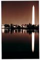
| 02/03/2003 02:20:41 PM |
Washington Monument at Nightby bgmorrisComment: this is a great night shot. I think it would look a little better if you cropped out the border. You can tell that the photo was rotated about 1 degree CCW, if you want a border crop it out and add one back that is all level. For the photo I give you a 7 |
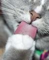
| 02/03/2003 02:17:04 PM |
tongue in cheekby cercyComment: I love your composition, I just wish the whole photo was super sharp. I love his cute little nose. |
| Photographer found comment helpful. |
| 02/03/2003 02:15:49 PM |
Laid Backby sahkoComment: I love this. What a cute kitten. I love the lighing on this. I hope you don't get tons of comments about the overexposed light. I think it is great, your composition and DOF are perfect. |
| Photographer found comment helpful. |
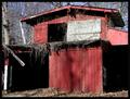
| 02/03/2003 02:12:04 PM |
Abandoned Shedby BAMartinComment: "Critique Club Comment"
COMPOSITION- Very nice subject for the challenge. The red color is great. The angle you shot this at is ok, however it feels to be leaning slightly to the left. Your lighting is good on this. You've filled the frame nicely and it works for this kind of shot.
BACKGROUND- There is not really a background here. The barn fills the frame nicely.
CAMERA WORK- As mentioned above, it is slighty tilting. I wonder how it would have looked at a different place. It might have given it more depth. Shutter and aperature are great, no super highlights or underexposed areas.
POST PROCESSING- you've done good at resizing the shot. Saturation and everything are perfect.
MY OPINION- I like photo's of old buildings. This is very nicely shot, but to me it kind of lacks some depth and just feels flat. |
| Photographer found comment helpful. |
| 02/03/2003 01:29:32 AM |
meowby quicksand84Comment: great shot. I like the space above his head because it gives a sense that he's looking at something. Good composition. |
Home -
Challenges -
Community -
League -
Photos -
Cameras -
Lenses -
Learn -
Help -
Terms of Use -
Privacy -
Top ^
DPChallenge, and website content and design, Copyright © 2001-2025 Challenging Technologies, LLC.
All digital photo copyrights belong to the photographers and may not be used without permission.
Current Server Time: 08/05/2025 04:40:41 AM EDT.