| Image |
Comment |
| 07/29/2004 05:44:12 PM |
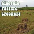
Discrete Pasture Croonersby alanfreedComment: I have no idea what a crooner is....which adds to the country-esque quality of this shot. Good use of repetition. Some saturation boosting, particularly in the reds, might give more "pop". |
 Photographer found comment helpful. Photographer found comment helpful. |
| 07/29/2004 05:42:39 PM |
Dead Poets Classicby JohannesFrankComment: Nice use of black and white. I'd prefer the font if it was smoother. It would make for a nice contrast against the grain and texture of the statues. Well done. |
| 07/29/2004 05:41:50 PM |
|
| Photographer found comment helpful. |
| 07/29/2004 05:40:46 PM |
|
| Photographer found comment helpful. |
| 07/29/2004 05:31:57 PM |
|
| Photographer found comment helpful. |
| 07/29/2004 05:31:25 PM |
Dead Poets' Childrenby Dr.ConfuserComment: As a graveyard shot, I think black and white would better suit this. The bright blue skies don't fit the theme. Compositionally, I think this could also be improved, maybe by getting closer in on the graves or using a wider aperture to throw the background out of focus. |
| Photographer found comment helpful. |
| 07/29/2004 05:29:24 PM |
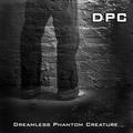
Dreamless Phantom Creatureby nbortonComment: Awesome trick - well executed. I'm gonna assume this was a long exposure that your subject jumped out of. The lighting, whether created in post or not, is great. One of the best this round. |
| Photographer found comment helpful. |
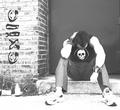
| 07/29/2004 05:28:03 PM |
Dark Punk Colonyby RoosterComment: I like this shot, but would suggest a little more grain, or editing the blacks (such as the shirt and the text on the wall) to be a little darker - they appear gray on the monitor I am using, I will recheck this. Other than that, I like the subject and composition. The highlights aren't bad, but maybe in a little more moderation (maybe less on the sidewalk, while leaving the elements on the person overexposed). Overall a nice job. |
| Photographer found comment helpful. |
| 07/29/2004 05:25:21 PM |
Deep Pink Cloudsby pitsamanComment: In this shot, I am drawn more to the sunset in the back of the shot. That said, there are several elements that attract attention and lend themselves to be slight distractions - the stoplight, imho is unnecessary, but I like the curver and perspective lines created by the street. I guess I'm not sure what I would change with this shot. The pink clouds are attractive, possibly a closer crop on that would work. |
| Photographer found comment helpful. |
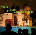
| 07/29/2004 05:22:55 PM |
Dan's Puppet Commancherosby camelotnorthComment: The text positioning adds strength to the composition, but the exposure is a little off for my tastes. As there appears to be a spotlight on the puppets, I would have spot metered on that, making the rest of the stage darker (this might not have been possible - this looks like a tough setting to get a good shot from). This would have at least fixed the highlight clipping observable on the chair and table. The title and idea, however, are clever and fit the challenge well. |
| Photographer found comment helpful. |
Home -
Challenges -
Community -
League -
Photos -
Cameras -
Lenses -
Learn -
Help -
Terms of Use -
Privacy -
Top ^
DPChallenge, and website content and design, Copyright © 2001-2025 Challenging Technologies, LLC.
All digital photo copyrights belong to the photographers and may not be used without permission.
Current Server Time: 07/27/2025 10:31:47 AM EDT.