| Image |
Comment |
| 03/19/2006 07:03:13 PM |
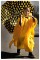
Splish, Splash, Spring by Jan Carrby L1Comment: I like the subject and the colors, but there appears to be some strange artifacts throughout the image, particularly on the boy's face. I see that the image is about 150 kb, so I'm not sure what the cause for this would be. |
 Photographer found comment helpful. Photographer found comment helpful. |
| 03/18/2006 01:06:53 AM |
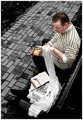
Left Behindby jpochardComment: I read a few of the books in that series, nice & creative shot. You've captured the scene well. |
| Photographer found comment helpful. |
| 03/18/2006 01:05:06 AM |
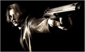
Sin City... 'Big Fat Kill' by QartComment: I haven't read the comics, but did see the movie and your photo captures the style of it pretty well. Some selective coloring might tie in even closer, but its not really necessary. I like the focus and composition as well. |
| Photographer found comment helpful. |
| 03/15/2006 08:51:59 PM |
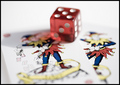
Fools Die - Mario Puzoby PixelstateComment: I like the subject and the shallow depth of field, but I think I'd prefer to see the point of focus moved about 1/2 inch back to put the dice and the jesters' faces more in focus. It's clear that the focal plane is placed where it is for a reason, I'm just not sure what that reason is... Other than that the exposure and composition are very nice. |
| Photographer found comment helpful. |
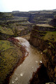
| 03/14/2006 05:57:34 PM |
"A River Runs Through It"by lkn4truthComment: This is a nice scene, my only suggestion would be to crop out the sky in this instance, due to the uncooperative weather. The white emptiness on the top distracts from the river and cliffs imho. |
| Photographer found comment helpful. |
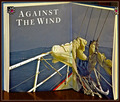
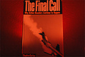
| 03/14/2006 05:54:39 PM |
Against The Windby BrianRComment: I like the image of the boat in rough seas, but I'd rather see the actual boat rather than a picture of one in the book. The composition is nice though. |
| Photographer found comment helpful. |
| 03/13/2006 07:41:17 PM |
|
| Photographer found comment helpful. |
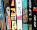
| 03/13/2006 07:40:14 PM |
Unordinary Livesby BlownAwayComment: I like the use of interesting/provocative novels, but I think they could be shot in a better fashion (imho). Stronger focus (or selective focus, shooting the books at an angle to add depth), a bit more contrast and maybe some dodging and burning to emphasize the part of the scene that you feel is most important might be some improvements. |
| Photographer found comment helpful. |
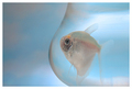
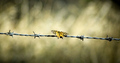
| 03/13/2006 07:37:00 PM |
Papillonby MichaelCComment: I like the soft tones here - it makes a nice contrast to the 'sharpness' implied by the barbed wire. Compositionally a little weak but not bad - I like the centering of the butterfly but am not wild about the position of the wire. |
| Photographer found comment helpful. |
| 03/13/2006 07:35:16 PM |
Educated Flyerby crazedfost78Comment: Maybe a little too obvious/literal...The red filtering shows some creativity, and the background textures are nice, but the book is a little out of focus, the composition is awkward (vertical book framed horizontally) and the subject itself could be a little more interesting (imho). |
| Photographer found comment helpful. |
Home -
Challenges -
Community -
League -
Photos -
Cameras -
Lenses -
Learn -
Help -
Terms of Use -
Privacy -
Top ^
DPChallenge, and website content and design, Copyright © 2001-2025 Challenging Technologies, LLC.
All digital photo copyrights belong to the photographers and may not be used without permission.
Current Server Time: 07/20/2025 11:56:51 PM EDT.