| Image |
Comment |
| 03/22/2006 08:27:10 PM |
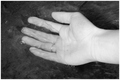
Brotherly Loveby Dirt_DiverComment: i like the almost heart shape this has formed. some suggestions that i'm sure you're going to get barraged with, but i'll say them anyway:
1) ah! gotta get rid of that date stamp. "March 17 2006" is intruding upon your composition!
2) for most purposes on this website bigger is better. the size on this was perhaps a bit too conservative.
3) ignoring the date stamp, the weakest element of the photo, I think, is the background. your subject is obviously the hands holding one another, so a background with minimized contrast/busyness would be best. in the case of this photo you have the grass (which isn't a horrible background) giving way to a very bright sky. the result is that the sky looks washed out and "glows" while the subject becomes dim and loses contrast. this is a good idea for a photo, but definitely a more solid, consistent background would be a good idea, because it'll bring out the subject better. |
 Photographer found comment helpful. Photographer found comment helpful. |
| 03/22/2006 08:21:46 PM |
A Hand In Waterby GandalvComment: nice range of tones. this might be more powerful if you had been able to capture ripples from the initial submergence of the hand, or had waited long enough for the bubbles (which are unfortunately distracting) to dissipate. the problem with them is that, in particular in regards to your middle finger, block your subject a bit, but also because their circular nature allows them to create bright, point highlights where the light reflects off of them properly. one last thing i would suggest is a slightly darker border, maybe a mid-tone gray. this is just my personal preference, obviously, and the border here doesn't hurt things that much, but since most of the image is so dark, something closer to that (certainly no brighter than the hand itself) would resonate better with the "soft" feel water elicits. -6- |
| 03/22/2006 08:17:28 PM |
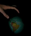
The Hand of Godby The Resplendent SnippycatComment: i like the concept but some things that might help improve this:
the lighting is too dark. i agree a dark background is probably ideal for the theme of this photo, but "God's" hand should be illuminate at least. also, i know you might be limited by available materials by a glob with writing on it and clear dilineations of state size, along with regional color-coding, makes it a bit less believable. i know there are globes available without political information that would seem more appropriate for a whole "hand of god descending on earth" feel. just some thoughts |
| Photographer found comment helpful. |
| 03/22/2006 08:14:47 PM |
Portraitby stare_at_the_sunComment: this is an interesting photo. I think the thumb distracts slightly from the composition, as does the one very bright pixel on (your) left eye. i think i might have liked to see this photo with slightly less sharp lighting, i.e. a bit more light filling (your) left side, and maybe a tighter crop that removes the arm from the bracelet down (though to get a clean crop you'd probably have to adjust your arm so it was parallel to your shoulders). clever concept, though. |
| Photographer found comment helpful. |
| 03/22/2006 07:52:23 PM |
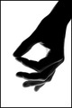
my skin fits like a gloveby SimonkasprzakComment: something about this image makes my skin crawl haha. i might have had a hard time telling what it was if this wasn't the hands challenge. i like the dark streak moving from just above the wrist towards what i'm assuming is the blade (pinky side) of the hand. one improvement maybe would be to have reduced highlights on the lower wrist/forearm area to brin gout that dark trail more. it's the most captivating part of the image. |
| Photographer found comment helpful. |
| 03/22/2006 07:49:40 PM |
|
| Photographer found comment helpful. |
| 03/22/2006 07:43:02 PM |
I'm This Manyby DannyMComment: good concept. criticism i would offer is that the photo would probably fit the challenge better and be more compelling (with the title in consideration) if focus was on the hand instead of the face. |
| Photographer found comment helpful. |
| 03/22/2006 04:12:11 PM |
|
| Photographer found comment helpful. |
| 03/22/2006 04:00:07 PM |
|
| Photographer found comment helpful. |
| 03/22/2006 03:57:38 PM |
|
Home -
Challenges -
Community -
League -
Photos -
Cameras -
Lenses -
Learn -
Help -
Terms of Use -
Privacy -
Top ^
DPChallenge, and website content and design, Copyright © 2001-2025 Challenging Technologies, LLC.
All digital photo copyrights belong to the photographers and may not be used without permission.
Current Server Time: 08/18/2025 06:16:41 AM EDT.