| Image |
Comment |
| 03/28/2006 09:51:32 PM |
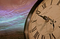
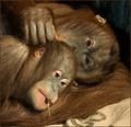
cantabileby LevTComment: there's something about this one in particular that makes it my favorite of the series. they're all great though, i would've had no idea what they were without the description. |
 Photographer found comment helpful. Photographer found comment helpful. |
| 03/26/2006 10:21:27 AM |
|
| Photographer found comment helpful. |
| 03/25/2006 09:53:55 AM |
|
| Photographer found comment helpful. |
| 03/25/2006 09:47:14 AM |
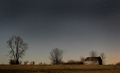
Under the Starsby philupComment: THIS is a two second exposure? wow. did you run this at a really high ISO? |
| Photographer found comment helpful. |
| 03/22/2006 10:46:43 PM |
|
| Photographer found comment helpful. |
| 03/22/2006 10:39:21 PM |
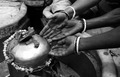
Passionby andreisComment: i think there needs to be more focus on the hand itself here. it's somewhat marginalized on the edge of the image. |
| Photographer found comment helpful. |
| 03/22/2006 10:38:08 PM |
Touch of Faithby abhraComment: this is a great image. not the sharpest focus, but i love the composition which extends from upper right corner directionally towards lower left. some sort of a border may have helped with framing, though. |
| Photographer found comment helpful. |
| 03/22/2006 09:32:43 PM |
Non-Idle Handsby awpollardComment: ahhh i had written a long set of comments here that didn't get submitted when i voted. i'll try to summarize, don't take brevity to be an insult, please, just don't feel like typing it all out again:
1) a shorter exposure would've been better, would've made the seconds hand look more "jittery" and reduced blur on the minute hand
2) the lighting should probably be reversed so you're highlighting the hands on the clock and reducing the flatness of the lighting there.
3) slight clockwise (no horrible pun intended) rotation of the image because it feels tilted right now.
4) i know you're probably getting hammered with "does not meet challenge" stuff right now and i admit that has affected my score slightly, but i made the above comments as generic technical suggestions to improve the image itself rather than its "appropriateness" for the challenge. |
| Photographer found comment helpful. |
| 03/22/2006 08:41:28 PM |
A Mother's Touchby docurrieComment: a beautiful moment. i only have a couple suggestions. the first is that the surface (is that a cloth of some type?) in the lower right detracts a bit from the rest of the image, and the emphasis seems to be less on the hands than the expressions (which is only a problem because of what the challenge is). |
| Photographer found comment helpful. |
| 03/22/2006 08:30:06 PM |
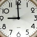
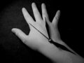
The Hand of Timeby kashiComment: i like the idea on this one a lot. there have been a lot of clock "hands" in this challenge so far. black background is definitely a good idea here, but the image would benefit from removal of lint/etc. to the best of your abilities (edit: not by spot editing, er, i mean brushing them off if possible). lots of bits of dust, hairs, and such are glowing on the left side of the image and it detracts somewhat. hair near the blade (pinky side) of th ehand is also lit up and a bit distracting. i'm not suggesting you pluck those hairs out or anything but maybe a different angle for the light would solve that problem. otherwise good job. -6- |
| Photographer found comment helpful. |
Home -
Challenges -
Community -
League -
Photos -
Cameras -
Lenses -
Learn -
Help -
Terms of Use -
Privacy -
Top ^
DPChallenge, and website content and design, Copyright © 2001-2025 Challenging Technologies, LLC.
All digital photo copyrights belong to the photographers and may not be used without permission.
Current Server Time: 08/18/2025 06:17:15 AM EDT.