| Image |
Comment |
| 06/11/2003 03:27:49 PM |
National Geographicby alexmfinComment: I think I might have gone with another magazine than National Geographic for this photo... I don't often seen just flowers on the front of NG. Just my opinion though. Pretty nicely done photo... a little bright at the bottom, and since the rest is in focus I think I would have liked to have seen it all in focus. This is a nice flower macro but because of the magazine you chose to use, i don't think it fits the theme. Thats just my opinion though. |
 Photographer found comment helpful. Photographer found comment helpful. |
| 06/11/2003 03:21:38 PM |
Travel & Leisure (Cincinnati)by lecalanComment: Very nicely done night photo. I could definitely see this as the cover of a magazine. I'm wondering if there's not enough room for type though? It's a pretty picture that definitely could have done without the border. Not sure many magazines use borders, just something to think about. I really like how the bridge leads you into the city. |
| Photographer found comment helpful. |
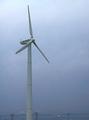
| 06/11/2003 02:37:38 PM |
EcoLivingby AntithesisComment: Have we seen this windmill before? Or just one similar to it? I like this, I could see it as a cover of a magazine. The colors are somewhat dull but I think it fits this photo well. Plenty of room for the type, I could see the Eco to the left of the windmill and the Living to the right... or something like that. Not extremely interesting, but it fits the subject and works well. Good luck. |
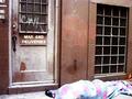
| 06/11/2003 02:35:33 PM |
U.S. NEWS AND WORLD REPORTby SweetKaliComment: Personally I do not consider magazines to be in a horizontal shape... thats just me though. I can't really see this as the front of a magazine... I'm not sure what the thing is on the bottom of the photo... I'm guessing it's a homeless person? Also the way you took the photo is kind of akward... not sure if it is the best way for the situation. Interesting statement though. |
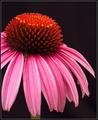
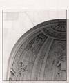
| 06/11/2003 02:33:16 PM |
Garden Designby DennisFComment: This is beautiful... very professional looking. I like the way you have it on a black background. Everything is perfectly in focus, Very well done. I could definitely see this on the front of the magazine you chose after going and looking at the website you posted. However, I think you should have thought more about putting the border as it doesn't look to me like the magazine has a border on it... it goes all the way to the edges except for maybe just at the top. Beautiful photo though! I'm noting the border, but I've decided not to take away from your score because of it. -10- I think you should think about submitting this to that magazine... :-) Good luck. |
| Photographer found comment helpful. |
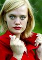
| 06/11/2003 02:28:09 PM |
Vogueby arnitComment: We've seen this girl before haven't we? Very nice portrait, well done. I think it fills the frame almost too much, and I'm not sure where you would put any type. This is kind of a problem for magazine. Also the hands lose a little bit of definition especially the far one... it's almost too bright. |
| 06/11/2003 02:26:31 PM |
Runners worldby kengurinnComment: Great stop action shot... unfortunately the subject doesn't quite look in focus... looks like your focus is on the background and not the guy... You could definitely put wording at the bottom of this, if this was in focus it would have been great. |
| Photographer found comment helpful. |
| 06/11/2003 02:10:02 PM |
Architectural Digestby TarbiniComment: I like this... looks very professional. Nicely done with the area at the top for text. I could definitely see this as the front of a magazine. Good luck. |
| Photographer found comment helpful. |
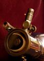
| 06/11/2003 02:08:37 PM |
Sky & Telescope ~ Eclipse of Sunby ladpupmoeComment: The bright white behind the BUSHNELL on the telescope is very annoying, it totally draws my eye from the main point to it... I think I would have used a lighter colored background... because the wine color is almost similar to the telescope, and it makes the telescope blend in. Watch your reflections. |
| Photographer found comment helpful. |
| 06/11/2003 02:05:27 PM |
Scientific American - Relativistic DNAby ArtifactsComment: This is pretty cool, almost doesn't look like a photograph. What are the red splotches here and there? the black on the bottom right is kind of annoying... I think cropping that out would have made it more of a vertical photo and fit it better to the theme. Not sure I care for the border, but I'm not usually big on borders. |
| Photographer found comment helpful. |
Home -
Challenges -
Community -
League -
Photos -
Cameras -
Lenses -
Learn -
Help -
Terms of Use -
Privacy -
Top ^
DPChallenge, and website content and design, Copyright © 2001-2025 Challenging Technologies, LLC.
All digital photo copyrights belong to the photographers and may not be used without permission.
Current Server Time: 08/25/2025 12:34:30 PM EDT.