| Image |
Comment |
| 06/15/2003 03:57:43 PM |
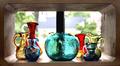
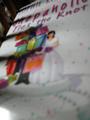
Collectiblesby STEINRComment: Personally I do not consider magazines to be in a horizontal shape... thats just me though. This is very pretty how you put it in front of the window kind of lightingup the glass. This might have been a cool picture for the glass challenge. I like the photo, as just that a photo, I don't think it would work as the cover of a magazine for various reasons, including the shape of the photograph, and I couldn't imagine how it would ever fit a vertical page. Although I like the photo I have to count down for my belief that it doesn't really fit the challenge. Sorry
|
 Photographer found comment helpful. Photographer found comment helpful. |
| 06/15/2003 03:54:34 PM |
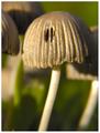
Mushroom Newsby LarsPaysenComment: Thats a crazy looking mushroom! Mushroom News? is there really a Mushroom News magazine? hehehehe... Nice DOF on this photo. I wonder though whether there would be enough room for type at the top... I think it wouldn't be too much of a problem though. I think this photo is well done and would definitely fit for the said magazine. Don't care for the border, not sure that most magazines have borders... thats just me though. |
| Photographer found comment helpful. |
| 06/15/2003 03:52:58 PM |
American Entomologist by connieComment: This is really nice... very professional looking. I like the white background, amazing you got the butterfly to stay for the photo? Is it a real, live butterfly? Very nice macro. The only thing I question would be if there is room to put in the type. Just a little something that might be important for the magazine cover... I'm sure there could be a way though. Nice job! Good luck! |
| Photographer found comment helpful. |
| 06/14/2003 05:57:13 AM |
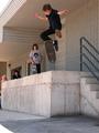
Trans World Skateboardingby photogirl66Comment: Great mid air catch! I would have liked to have seen the shutter speed just a little bit faster to keep the kids hand in focus. I like the way the people are all sitting there watching him... might have been cool to have the two at the end watching and the two with the skateboards both doing some sort of trick. It looks like there is tons of space at the bottom but not a lot at the top, I think I would have liked a little more room at the top for type. I also think zooming in on the kid, and getting him more in the picture and less cement might have been more dramatic. |
| Photographer found comment helpful. |
| 06/14/2003 05:54:17 AM |
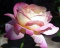
The English Garden - Tea Rose a "Chicago Peace"by smshatsComment: Personally I do not consider magazines to be in a horizontal shape... thats just me though. Some very uneven lighting here... some of the rose looks too bright and some of it looks too dark. Maybe that was what you were going for? The shadows and part of the background are somewhat distracting, but not too bad. I'm thinking type for the magazine might go directly over the top of some of the main part of the flower.Nice job with your focus though and getting most of the flower in focus, sometimes with macro thats hard to do. |
| Photographer found comment helpful. |
| 06/14/2003 05:51:41 AM |
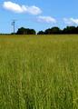
The Ecologistby UberFishComment: This is a fairly boring photo, but in some respects I guess I could see it as the front cover of a magazine titled what you have it as. it's a shame those powerlines are running through it, but that can't be helped in many parts of the world. The clouds are very nice, and I'm wondering if they would get lost in type? The photo looks slightly tilted.. but maybe thats just me. |
| Photographer found comment helpful. |
| 06/13/2003 06:53:08 PM |
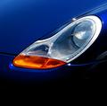
Car and Driver....by Dallas_TXComment: Personally I do not consider magazines to be in a horizontal shape... thats just me though. A Porsche right? Beautiful blue color, very eye catching. I like the little stars of light here and there, their cute and make you look. You lose some of your nice color in the upper corners. I could see this maybe as a cover, if you had it cropped differently, but I'm not sure how that would be. Good job leaving space for the type. |
| Photographer found comment helpful. |
| 06/13/2003 06:50:24 PM |
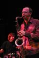
Down Beatby rhipsterComment: Nice... I like the warm colors this has, and your selective focus. Very nicely done... Looks like it would be a pretty good magazine cover. It's simple, straightforward, and eye catching. Good luck! |
| Photographer found comment helpful. |
| 06/13/2003 06:48:28 PM |
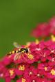
Virginia Wildlife Magazineby FranziskaLangComment: This is really nice. Just wish you had focused a bit more on the bug, instead of mainly on the flowers. Nice macro though... very pretty and colorful. This would be a wonderful magazine cover, with room at the top for the type! Just perfect. -9- |
| 06/13/2003 06:46:53 PM |
|
Home -
Challenges -
Community -
League -
Photos -
Cameras -
Lenses -
Learn -
Help -
Terms of Use -
Privacy -
Top ^
DPChallenge, and website content and design, Copyright © 2001-2025 Challenging Technologies, LLC.
All digital photo copyrights belong to the photographers and may not be used without permission.
Current Server Time: 08/24/2025 08:54:00 PM EDT.