DPChallenge: A Digital Photography Contest You are not logged in. (log in or register
 
Browse Settings
Currently viewing:
Registered UserRiderGal

Show comments:

Per page:

Order:

Comments:


Comments Made by RiderGal
Pages:   ... [51] [52] [53] [54] ... [115]
Showing 501 - 510 of ~1142
Image Comment
Gone Wild
08/11/2003 12:59:18 AM
Gone Wild
by autool

Comment:
Greetings from the Critique Club

Hi Autool... I didn't vote on in the garden photos, but this is extremely well done! beautiful photo that doesn't have flowers, or bugs in the photo GREAT JOB!

It definitely fits the challenge. I'm not sure I care for the title.... I didn't understand the title until I read your photographer's comments. It makes sense now, but might not have made sense to others while they were voting.

Your composition here is great, use of thirds is very well done. The lighting here leaves a few hot spots on some of the grapes, but it's not too distracting really. I love the large DOF so you can see whats going on behind the grapes and the contrast of the light grapes against everything dark really helps it to stand out!

Nice thought to add the water droplets, definitely makes them look fresh and inviting. :-) Did you taste them... were they good? they look like good grapes. This is such a pleasant peaceful picture it definitely makes me think of being in the garden.

Beautifully done photo, I think it should have had a higher score. Nicely done!

Good luck in the future challenges!

-Talya
Photographer found comment helpful.
Home Alone
08/11/2003 12:48:56 AM
Home Alone
by OneSweetSin

Comment:
Greetings from the Critique Club

Hi OneSweetSin, I'd guessed this was yours during voting... I thought I'd seen this little boy in your photos before :-)

First off, it definitely fits the challenge. Very cute. I loved home alone! It's amazing to me that McCaulley Culkin is already grown and married, we're similar ages! Anyway, good job choosing your subject for the photo.

The lighting here leaves a lot to be desired.. it is very flat and straightforward, and doesn't really do a lot for the photo. He looks like he has a bluish tint to him, I know that part of it is from the koolaid (?) but I'm sure he didn't get it on his forehead. Hehehe...

I like your composition... filling the frame was nicely done here and it helped with no distractions surrounding the kid.

This looks quite a bit like a snapshot, but it's not a big deal... I would try and work on getting better lighting for sure. Play around with lighting... doing this outdoors without a flash might have been a good thing.

Good luck in the future!

-Talya
Photographer found comment helpful.
The Dentist
08/11/2003 12:13:37 AM
The Dentist3rd Place
by grigrigirl

Comment:
Congrats... might also have been good for.. Little shop of Horrors "You'll be a dentist... be a dentist" hehee... congrats again!
Photographer found comment helpful.
Psycho
08/10/2003 11:55:50 PM
Psycho2nd Place
by Jacko

Comment:
I can definately see this one in first place... AWESOME SHOT! great lighting, very well done... WAY TO GO! -10-
Photographer found comment helpful.
What is That?
08/10/2003 12:50:18 PM
What is That?
by pepsipepsibaby

Comment:
Greetings from the Critique Club

Hi pepsipepsibaby and welcome... good score of a 5 for your first entry!

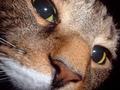
First impressions... I like the angle, wonderful detail in the shot, pretty good macro!

Your lighting here is rather bothersome, though only in the eyes... I'm guessing you used a straight flash... when taking a straight on shot, especially this close up, try to get rid of some of the harsh flash, this can be achieved in a few ways, taping a few layers of tissue may be enough to achieve what you are looking for, but try different things.

This is a good Fill the Frame, it meets the challenge well, and I like the fact there is no distracting background (it's black) to take away from what we are looking at. Nice job there.

I would have liked if you had the nose a tad bit more in focus, but it's not extremely distracting.

The subject you used was great, especially cause he was sniffing the camera. I like that this is a different shot, and it's not forced which is cute, the cat interacts with the photo which makes it much more personal then the average macro of cats.

Overall pretty nice job... work on that flash a little, and I think this could be great if you could get the cat to sniff the camera again ;-)

Under your shot details you can find out what you had the settings at on your original photo. For aperture I would guess around F3.5, ISO... maybe 400 and shutter was probably at 1/60 of a second or whatever your flash syncs at. fill those in instead of what you filled in.

Ok... good luck in the future!

-Talya
Camaraderie
08/10/2003 12:26:57 PM
Camaraderie
by wayne9232

Comment:
Greetings from the Critique Club

First impressions this is interesting... it definitely meets the challenge, and has some great colors.

What are those? It would be nice when you request a critique from the critique club to give us some idea of how you did the shot... or some basic info... it helps us in critiquing more efficiently just for further reference.

Anyway... I like your lighting here a lot. I think it works very well giving the items color, with not too much of a sillouhette look. I think it makes for a very effective shot.

Not much to say about composition here... it's pretty straight forward.

Focus wise, great job. I'm guessing you used macro for this? I can't really tell because I'm not sure what the items are.... but very good job on focus.

Nice job, not overly a wow shot IMHO... but a nice solid shot.

-Talya
Sleeping tight
08/06/2003 02:27:35 PM
Sleeping tight
by MjrTom

Comment:
hmmm... what are these animals? I hope they are sleeping and not dead! interesting use of right angles...
Sneaking Past the Palace Guard?
08/06/2003 02:26:19 PM
Sneaking Past the Palace Guard?
by balarila

Comment:
This looks like Burma/Myanmar? or maybe not... beautiful building though... Good catch also... hehehe.
Once There Was a Bird
08/06/2003 02:22:51 PM
Once There Was a Bird
by JPR

Comment:
Hehehe... thats funny.. interesting photo as well, but the title just makes it -8-
Lincoln Memorial
08/06/2003 02:18:20 PM
Lincoln Memorial
by daverx7

Comment:
Looks very tilted to me, which bothers me. Pretty photo though. I like the way you can really make out lincoln in the very center... thats pretty cool. a little rotation would have helped.
Pages:   ... [51] [52] [53] [54] ... [115]
Showing 501 - 510 of ~1142


Home - Challenges - Community - League - Photos - Cameras - Lenses - Learn - Help - Terms of Use - Privacy - Top ^
DPChallenge, and website content and design, Copyright © 2001-2025 Challenging Technologies, LLC.
All digital photo copyrights belong to the photographers and may not be used without permission.
Current Server Time: 08/23/2025 09:56:00 AM EDT.