| Image |
Comment |
| 01/18/2005 04:28:45 AM |
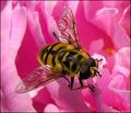
Let Me Tell You About The Flowers And Bees !by MonaComment: I love the colors here... and great focus! I have to ask... is this bee actually alive? Something about the crop strikes me as a little off... but I played around with it a bit and can't find one I like better, maybe if there is more to the photo (which I assume there is) you might want to go back and take a look at the crop again. Nicely done. |
 Photographer found comment helpful. Photographer found comment helpful. |
| 01/18/2005 04:23:05 AM |
Always a Kittyby Links 2 3 4Comment: Truthfully... I feel that this is a cute photo that one might want to keep for oneself, but as a photograph, I have to say I feel that it isn't great... I apologize for saying that. As a photo, and less of a snapshot... you might have made the kitty less centered? I do like the fact that you seem to have gotten down on the kitties level. |
| Photographer found comment helpful. |
| 01/18/2005 04:15:37 AM |
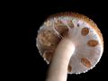
Breakin' the Veilby peeteComment: I like this a lot... good use of empty black space (and good job with your compression) I love the textures you see here... I LOVE MUSHROOMS :-). If I had to make a constructive criticism I would say that there might be a tad too much light on the bottom right... corner... although I like the amount that is hitting the stem. It would have been cute to see a tiny one of these mushrooms a little bit to the left. Nice solid photo! -9- |
| Photographer found comment helpful. |
| 01/18/2005 04:10:07 AM |
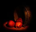
Light on Applesby elsapoComment: BEAUTIFUL!!! Looks like a painting! Great job with your lighting... absolutely stunning photo. Unfortunately the low allowance for KB and your compression caused some artifacting on the pure black which is a shame. I'm not sure... it's a little late, and can't think completely, but I believe you might be able to deal with this by saving for the web in photoshop, instead of just saving straight off at a low compression. Gorgeous photo though. I'm giving it a 9... would have been a 10 if it weren't for the artifacting. Good luck! |
| Photographer found comment helpful. |
| 01/18/2005 04:02:45 AM |
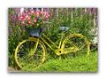
Yellow Bikeby nathaliedooComment: I like the colors here, and how you filled the frame. I am NOT a big fan of the elaborate framing you did of the photo, although the photos seems to pop off the page... I want to judge on the photo itself and not on the presentation (but that is just me). Just a couple of ideas that might be fun to play around with here... playing a little with saturation levels might be fun, making the bike really POP out of the leaves, or bringing out the magentas and reds in the flowers, maybe trying a desat of the green? This is a photo that you could probably play around with to get something a little more artsy and less of a well composed snapshot. |
| Photographer found comment helpful. |
| 01/18/2005 03:58:58 AM |
California Dreamin'by charmayneComment: You have a good angle for this photograph, and a beautiful day. Seeing as how the sky is so clear, I think I would have been happy cropping off about half of the blue you have at the top... and making this a wider photo, this would not only get rid of the fairly blank sky, but sould make the area you are seeing seem wider because of the width of the photo. Just an idea. Also I would have liked a little more substance to the waves which are just TOO white. |
| Photographer found comment helpful. |
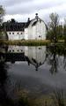
| 01/18/2005 03:52:13 AM |
The Barnby KaDiComment: I would have loved to have seen this in black and white... or perhaps even sepia. It's a beautful scene but to me... it looks OLD, and to pull that emotion you needed the extra suggestion hinted to by black&white/sepia. Nice use of wide DOF for everything in focus. |
| Photographer found comment helpful. |
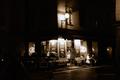
| 01/18/2005 03:44:44 AM |
The Cafeby studhiloComment: This evokes thoughts of old fashion black and white film photos of old cafes possibly in Paris. I love it! The street scene is really wonderful :-) I'm trying to think of a specific photographer who it reminds me of, but his name is escaping me. Anyway... very nicely done. Only suggestion I might make is to play with cropping a little more... especially maybe the left side... but I'm not sure. Good luck! |
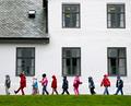
| 01/18/2005 03:33:42 AM |
In a straight lineby arnitComment: I like this photo a LOT... but personally I might have tried it as a panoramic type shot... personally I feel you loose some of my interest in the children when I'm looking at the top to see what else there is... I would have cropped it just a tad bit above the 1 level of windows... because it keeps your attention on the children, and also I find that the whole photo seems to look tilted even though it really isn't, when I'm looking at what you have. |
| Photographer found comment helpful. |
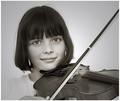
| 01/18/2005 03:28:51 AM |
Portrait of Amelieby whiteroomComment: Beautiful slightly sepia soft tones... I like how she sort of melts into the background, but I'm slightly distracted by the quite bright light on her left shoulder behind the violin... it takes away some from the softness of the photo. beautiful eyes which really pop... I also would like to have seen how a slightly darker hue on her lips might have made them pop just a bit, although I would worry that would take away from her innocence. Nicely done. |
| Photographer found comment helpful. |
Home -
Challenges -
Community -
League -
Photos -
Cameras -
Lenses -
Learn -
Help -
Terms of Use -
Privacy -
Top ^
DPChallenge, and website content and design, Copyright © 2001-2025 Challenging Technologies, LLC.
All digital photo copyrights belong to the photographers and may not be used without permission.
Current Server Time: 08/21/2025 08:42:37 AM EDT.