| Image |
Comment |
| 02/22/2005 11:43:02 PM |
Ready to get my groove on.by PedroComment: "Pedro offers you his protection" - that's funny, because I recall you actually doing that one time! Great photo as always... I love the high contrast. So by voting for you would all of my wildest dreams come true? |
 Photographer found comment helpful. Photographer found comment helpful. |
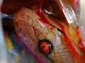
| 01/23/2005 04:29:34 AM |
A Tiny Giant...by NeoScalesComment: I'm not sure what I'm looking at here... but if it's what I think it is... a dead snake in a bag with blood... it's pretty disturbing... I'm sorry but I just had to say that. |
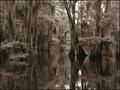
| 01/22/2005 11:55:23 PM |
A Louisiana Swampby Kathryn8Comment: This is really cool... I would never have thought to put it in sepia... but it's really neat that way. I like the detail here... and the framing... everything is really nice. -10- |
| Photographer found comment helpful. |
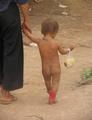
| 01/22/2005 11:52:26 PM |
Kid in Red Bootsby KaraComment: I know you are getting this a lot... but this isn't in focus... Otherwise it would have been really cute. I think it would have been nice to have a tighter crop as well. on the right and bottom. What's in the bag? Wish this was in focus :-/ |
| Photographer found comment helpful. |
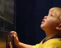
| 01/22/2005 11:42:59 PM |
Wondermentby shoylesComment: Good catch! nice candid. I like his bright colors against the fairly simple blueish background and how the button he is pushing ties it all in, as well as his blue eyes. I think that all works very well. The title you came up with is good, because it works in two ways... he's in wonderment.. and we are wondering what he is pushing and looking at! I think the extra space you left at the top works well. My only issue with it is whether it should be rotated just slightly so that the metal(?) against the wall is straight up vertical. |
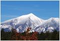
| 01/22/2005 11:37:26 PM |
Snow Mountainby sfarrell23Comment: I think I would have liked a little more definition to the snow... almost looks a tad bit blown out... but maybe that's just me. I do like the multiple layers green - white - blue. |
| Photographer found comment helpful. |
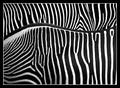
| 01/22/2005 11:36:36 PM |
Two Zebrasby dsa157Comment: This is wonderful! are those real? It's amazing how much more contrasty the upper one is than the lower one. Beautiful, modern design! Where did you do this? Great job!! One of my favorites so far! -10- |
| Photographer found comment helpful. |
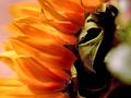
| 01/22/2005 11:34:49 PM |
Sunflowerby atsxusComment: Pretty... I like the shallow DOF giving it a sort of modern art look. The right side however does bother me... although I know it is part of the stem/leaves, the blob catches my eye too much and detracts from the main subject. I think you could have been just as effective cropping off about an inch on the right side. Good luck! |
| Photographer found comment helpful. |
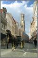
| 01/22/2005 07:06:52 PM |
Stepping Backby muur88Comment: Did you try this in sepia or black and white? Nice framing... I like the way you were down somewhat. |
| Photographer found comment helpful. |
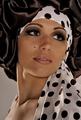
| 01/22/2005 07:04:01 PM |
Retroby AnastasiaComment: Gorgeous portrait... I like it a lot! pretty solid lighting... great mixture of neutral colors... evokes emotion. Nicely done. -10- |
| Photographer found comment helpful. |
Home -
Challenges -
Community -
League -
Photos -
Cameras -
Lenses -
Learn -
Help -
Terms of Use -
Privacy -
Top ^
DPChallenge, and website content and design, Copyright © 2001-2025 Challenging Technologies, LLC.
All digital photo copyrights belong to the photographers and may not be used without permission.
Current Server Time: 08/22/2025 05:02:28 PM EDT.