| Image |
Comment |
| 11/01/2005 12:44:20 AM |
That!by TheLittleIslandComment: *Critique Club*
First off - I did not vote for this challenge because I had some difficulties with the challenge title, and it was a tad confusing for me... however of the ones I've seen, yours definitely make me think WHAT? I'm wondering what this kid is pointing at and where... although I have to say the passive look on his face throws me off a tad. That being said, let me get to the specifics of the photo.
Compositionally... I'm happy that you did not put him dead center... however I feel that your image would have benefitted from having him more to the right and pointing across the photo (so that you could travel a bit with the imaginary line from his finger and then take you off the page) I think that this might have added some curiousity to the photo.
Nice DOF... I love the hand extending toward the viewer...
In terms of lighting... the ground and the background are well exposed however the boys face and hand leave a little to be desired... I think playing around with some fill flash might have been useful here... especially for that dark shadow under his hat... also it seems part of his hand and face are a tad blown out... I think I would suggest standing him back a bit... and light metering for the back... and working with flash at the front.
I like that you seem to have used a wide angle here... but even with a wide angle, you still have to check for straightness... this just looks too tilted at the horizon line.
Otherwise I think you've got a lot of nice elements in this photo, with just a little more playing around it could really be great!
-Talya |
 Photographer found comment helpful. Photographer found comment helpful. |
| 10/31/2005 08:14:42 PM |
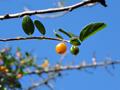
Orange Berryby SciurusComment: *Critique Club*
First off, in terms of the challenge it is very difficult to decide whether this fit or not... I did not vote in this challenge, because I felt it was much too wide open, and so I really can't say yes or no.
Good job blurring your background with the f2.8... this made for a fairly clean photo with the subject popping out at you. One of my main issues here though, is that I'm not sure there is anyone part of the subject that is completely in focus. maybe just a tad bit of the leaf that extends out, but that's it, and you have to be careful with that when using such a low fstop. Because your photo is titled orange berry... I would expect the orange berry to be the sharpest part of the photo.
I'm having difficulties getting to the main subject for quite a few reasons, that I think could have been fixed quite easily...
1) the focus issue - sometimes when you are dealing with low f-stops like 2.8 and very small subjects, auto focus just will not do... if you have the option of using manual focus... that may be helpful... if not... try very hard to keep in mind that you will have less in focus in the image.
2) The branch above your main one is quite distracting to me, it is the darkest thing in the photo, and it leads my eyes right off the page. This might have been taken care of with a simple crop.
3) also something that might have been taken care of with a crop is the fact that the branch is dead center... because of the horizontal nature of the image... it might have been cool to have this as more of a panoramic (short and wide) shot, there by also cleaning up some of the distracting elements in the image.
Color wise, it's pretty nice, although I'm wondering if it might have benefitted from being a tad darker? it looks maybe a bit washed out.
Keep playing around! Looks like a really nice tree to photograph.
-Talya |
| 10/31/2005 08:03:54 PM |
Automaticby SkreppurComment: *Critique Club*
Hi... I hope my critique is helpful!!
First of all, I like what you were trying to go for here, however I feel the the reflection just didn't come out as strongly as it needed to for the challenge.
Compositionally I find it a bit lacking, there is just too much unneeded extra space, which I really don't see a point to having (unlike say where you purposely have blank space in an image) I feel you could have filled the space more appropriately... maybe even including the candles in your image? I find myself drawn to the very center of the image, and then I lose interest in it, it's not compelling me to explore the photo as a whole.
I like the focus on the word "automatic" but I'm trying to decide whether it could have been just a tad sharper or not (sorry I'm in college, and I've been doing a LOT of work).
I really like the colors that are in the image.
Overall I think you might have benefitted by taking a different look at different angles here, seeing this toaster from different ways, and trying different crops and compositions. |
| Photographer found comment helpful. |
| 10/26/2005 02:34:16 AM |
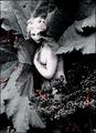
DYING FAIRYby RandiComment: I'm not really seeing this as fitting the challenge without your title.. and that rather bothers me... I feel that this image is lacking in something... perhaps something to add interest to it? |
| 10/26/2005 02:31:51 AM |
fragileby xtineComment: I rather like this image... I think it's different and interesting... The leaves work well to add to her look of hiding, and I like the color pallette you have left the image with. I think it's a well thought out and composed shot that is very attractive. -9- |
| Photographer found comment helpful. |
| 10/26/2005 02:29:31 AM |
Delicate Music of the Bellsby newtune3Comment: In my honest opinion this could have been a much better photo, I feel that there are quite a few things that could be improved. First of all I am having issues with the focus... I can't tell whether it's bad focus, possibly poor lens quality, or extreme cropping, but either way, it's just not sharp. Also I think that the way it is set up leaves a lot to be desired, I think you might have been able to get a better angle on this subject... I do however like the blue and brown stripes at the top... I just maybe wish the bells took up more of the frame? All of the wires at the left take my eyes away... |
| Photographer found comment helpful. |
| 10/26/2005 02:26:19 AM |
Bouquetby AntanasComment: I like this picture quite a bit.... what are you sniffing? It doesn't look like wine, but I may be wrong... Why did you choose to use the background color you did? I think the tint throws off the color of the drink. Good luck. -8- |
| Photographer found comment helpful. |
| 10/26/2005 02:23:56 AM |
Girls are delicate.by ttreitComment: This just doesn't say delicate to me at all... in fact... it says the total opposite of "girls are delicate" here they are getting dirty and competitive. As a sports photo, I would suggest a higher shutter speed if possible... also make sure that you check for your horizon line to be straight... they would most likely not be playing soccer on a tilted field, so I hope that the fence would not be tilted... Fairly good emotion on their faces, especially number 13's I'm not sure that this is quite clear either, but that may be because of lower shutter speed, or the focus may be in the wrong spot which happens easily when you are shooting at lower fstops to blur out the background... also check your exposures, the ball and the girl's white shirt seem to be a bit blown out. |
| Photographer found comment helpful. |
| 10/26/2005 01:32:20 AM |
Little One by wsteynComment: This is really a beautifully done photo!!! Great catch here... I love the nice soft focus on the flower, and how in focus the little bug is... I can't imagine this was easy to catch. I can't say enough about how much I love this image... I hope that you get a ribbon!! seriously. Good luck -10- |
| Photographer found comment helpful. |
| 10/24/2005 10:29:48 AM |
Taking The Backstreetby charmayneComment: For some reason this reminds me a great deal of Arnold Newman's famous 'Red Brick Wall' I like it a lot.. Very nicely done and good use of image grain... what a cool building and awesome graffitti! (nice that the graffitii isn't brightly colored... or maybe you did some desat? I love the streak of light running across it... I think this is a cool image. -10- |
| Photographer found comment helpful. |
Home -
Challenges -
Community -
League -
Photos -
Cameras -
Lenses -
Learn -
Help -
Terms of Use -
Privacy -
Top ^
DPChallenge, and website content and design, Copyright © 2001-2025 Challenging Technologies, LLC.
All digital photo copyrights belong to the photographers and may not be used without permission.
Current Server Time: 08/20/2025 03:55:26 PM EDT.