| Image |
Comment |
| 03/30/2006 07:03:42 PM |
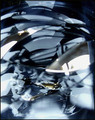
Wingsby PaulEComment: I would rather have seen this photo in full colour, I don't feel B/W (almost)lends itself well to the Abstract theme. |
 Photographer found comment helpful. Photographer found comment helpful. |
| 03/30/2006 07:02:11 PM |
|
| 03/30/2006 07:00:31 PM |
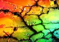
Psychedelicby brizmamaComment: Although I appreciate this entry I would have liked to see the Blue extend further down into the design (say at least 1/3 down) |
| Photographer found comment helpful. |
| 03/30/2006 06:56:50 PM |
|
| Photographer found comment helpful. |
| 03/30/2006 06:56:02 PM |
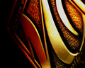
Cast in Bronzeby C_Steve_GComment: It works for me, but if it was possible I would have liked the left edge expanded to include a touck of the blue background (for compositional reasons) Well done none the less. |
| Photographer found comment helpful. |
| 03/30/2006 06:53:05 PM |
In Vitroby xtineComment: Although I love your design/composition I just don't feel the colours lend themselves well to the "Abstract" theme. My vote would have been higher with colour added for dramatic effect, although not knowing what the subject matter used is I can't suggest how it would be done. So you don't think my vote is too harsh, I am a hard marker with only 6 given to the very best so far :) |
| 03/30/2006 06:48:30 PM |
Fire and Iceby KarenNfldComment: Thank goodness we can't vote from thumbnails - Your shot got my attention but I was going to say the addition of say blue or magenta would enhance the look, however now I see it in a larger size I like it as it is. It's got my vote. |
| Photographer found comment helpful. |
| 03/30/2006 06:44:17 PM |
lampby cq107Comment: Although I don't know how it could be done, the inclusion of another colour would have added to this shot. Well done none the less; it got a vote from me. |
| Photographer found comment helpful. |
| 03/30/2006 06:42:52 PM |
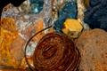
junkby margaretalindenComment: I like it, it works for me. My only suggestion composition wise would be to have the wire and bolt off centre not smack bang in the middle |
| 03/30/2006 06:41:39 PM |
Coastal Goldby PrismComment: This one got my attention, but I would like to see it rotated 90 deg. anti-clockwise for more effect. Also, although not allowed in this comp, it would be more dramatic with the scratched on the "brass" cloned out. |
| Photographer found comment helpful. |
Home -
Challenges -
Community -
League -
Photos -
Cameras -
Lenses -
Learn -
Help -
Terms of Use -
Privacy -
Top ^
DPChallenge, and website content and design, Copyright © 2001-2025 Challenging Technologies, LLC.
All digital photo copyrights belong to the photographers and may not be used without permission.
Current Server Time: 08/04/2025 02:35:33 AM EDT.