| Image |
Comment |
| 11/10/2011 08:25:33 PM |
Sunday Morningby PaulComment: Pleasant, good cropping and natural looking. Maybe trimming to exclude the bed post on the top left corner would help leading the eye to the subject. Trimming more on the right as well, but I am less sure. The detail in the air is a bit jagged (not that I would know how to improve that, details defintion in black hair always gives me nightmares :) Good portrait, quite personal. |
 Photographer found comment helpful. Photographer found comment helpful. |
| 11/10/2011 08:18:07 PM |
suspensionby MikeComment: Nice perspective and use of repeating patterns, I wonder if having captured the approaching figures closer would have made for a stronger image. Also, I wonder if either cropping down to the base of the lamp or exclude the lamp post completely by moving a bit forward would have improved the photo. This way it cuts the frame in half without quite reinforcing the motiv of lamp posts stretching in the distance.. |
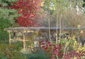
| 11/10/2011 08:10:25 PM |
trellisby tnunComment: Not too keen on a subject, or lack thereof, maybe because it all appears a bit flat. But I do find the two patches of red attractive in the way they mirror each other. I think a bit of under exposure would have helped retaining detail in highlights and strenghtening colors, while keeping everything sharper. Also, maybe choosing a later or earlier time of the day would have given you a more dramatic light to play with. But that's just my opinion, no offence taken I hope. |
| Photographer found comment helpful. |
| 11/10/2011 07:53:12 PM |
|
| Photographer found comment helpful. |
| 11/10/2011 07:51:15 PM |
|
| Photographer found comment helpful. |
| 11/10/2011 07:46:46 PM |
dewby liangdaweiComment: I like it. I know that getting more depth of field with this kind of macro is pretty complicated, but having the tip of the right stem in focus would work better. Also, an angle or a choice of exposure minimizing the portion of overexposed sky in the left reflection would add a lot, in my opinion. However, probably it's just me. |
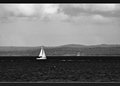
| 11/10/2011 07:42:23 PM |
Sailing Homeby BrianRComment: Not sure about this. While the three tones work well (very bright boats, very dark sea and midtone land/sky) the image lacks of definition and the framing is very static. I think cropping out most of the image left of the boat would give more the impression of directing home, particularly if the vassel was actually oriented more towards the shore. The blotchiness of the image is a bit of a let down. Challenge and basic editing aside, I think it would work better blurring the image and adding quite a lot of fake analog grain in photoshop or some other software. |
| Photographer found comment helpful. |
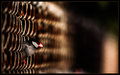
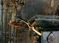
| 11/10/2011 07:34:36 PM |
Steam Powerby dtallaksonComment: Nice texture. Maybe having the background a bit out of focus would have helped creating separation. Thsi way it looks almost painted rather than three dimensional. |
| Photographer found comment helpful. |
| 11/10/2011 06:59:37 PM |
Unaware of any ratioby HighNoonerComment: I like the duotone here, it works well., as it does the very shallow DOF and the blown up highlights keeping the interest on eyes and moustaches. Good portrait. |
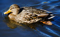
| 11/10/2011 06:56:29 PM |
Mallardby tvsometimeComment: I like the ripples a lot. Much less the hard shadows. It is a pity that the kind of angled light that makes for an interesting water surface also makes for a very extreme range. Maybe a bit of extra fill in flash could have helped lifting the shadows while keeping more detail in the highlights? |
| Photographer found comment helpful. |
Home -
Challenges -
Community -
League -
Photos -
Cameras -
Lenses -
Learn -
Help -
Terms of Use -
Privacy -
Top ^
DPChallenge, and website content and design, Copyright © 2001-2025 Challenging Technologies, LLC.
All digital photo copyrights belong to the photographers and may not be used without permission.
Current Server Time: 08/23/2025 06:54:50 AM EDT.