|
|
|
Showing 731 - 740 of ~1056 |
| Image |
Comment |
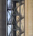
| 01/15/2006 07:04:07 PM | Stairs.jpgby TallblokeComment: I'm think silos. I love the shadows across the rounded structure. Gimme less of the one on the left since it's all in shadow. |  Photographer found comment helpful. Photographer found comment helpful. |
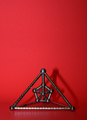
| 01/15/2006 04:27:18 PM | A Shape Within A Shapeby theSajComment: **** Greeting from the Critique Club ****
Challenge
- Relevant to the Challenge? Yes. I feel the color is competing with the shape for importance in the image, though.
- Is subject unique (vs. unoriginal or rehashed)? That's is certainly one unique shape.
Compostion
- Good or Bad? How can it be fixed? I like the use of negative space and the vertically off-center position, however I disagree with comments about puttin the image on the right third. I'd like to see it on the left third because of the shadow. The shadows leads the eye to the right. If you cut off that shadow you essentially draw the eye straight out of the image. Put the piece on the left third and let the shadow lead the eye into the negative space.
- Good use of Depth of Field? Yes
- Good focus? Yes
Lighting
- Good use of light? I think the lighting is overpowering the image. The background is washed out, and the reflections off the piece are strong. Difuse the light.
- Good use of shadows? Yes. I like the shadows, but where the background curves, so does the shadow which bugs me. I'm not sure how to reconcile the two without flattening the background and raising the camera angle (aim down at the floor).
Aesthetics/Artistic Appeal:
- What is my reaction or feelings? In spite of the background, the chromy bits give it a cold feel. The shape interesting, yet unemotional. Overall, the image doesn't grab my attention.
You nailed your score guess, and this is your 5 best. Keep it up. | | Photographer found comment helpful. |
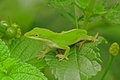
| 01/14/2006 11:37:13 AM | Anoleby JOHNBOY1970Comment: The colors seem to be oversaturated. And I would agree that the background needs a contrasting color from the lizard and leaves. | | Photographer found comment helpful. |
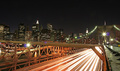
| 01/14/2006 11:24:30 AM | A nice place to watch the the busy cityby davidx76Comment: **** Greeting from the Critique Club ****
Challenge
- Relevant to the Challenge? Yes. It's one of the few skylines in this challenge that actually shows activity (life/living/liveliness) through the capture of the car lights.
- Is subject unique (vs. unoriginal or rehashed)? Yes
Compostion
- Good or Bad? How can it be fixed? I like the viewpoint down the length of the bridge, with lower Manhatten off to the left. I do agree with the comments about the horizontal brace being a major negative aspect to the image. Maybe a couple of feet higher would drop this down whileblocking less of the traffic and waterfront.
- Good use of Depth of Field? Yes. The skyline is in focus as are the rivets on the right.
Lighting
- Good use of light? Tough question. This is a hard photo to pull off. Long exposure with several very strong light sources in the frame. Using me fingers to block out the two brightest improves the image, but as shot there isn't anything that you could do. The lights on the suspension cables are captured beautifully. I like the shadows and reflections on the beam on the right as well. I don't mind the lens flare to be honest.
Aesthetics/Artistic Appeal:
- Colors and Contrast. Due to the lighting, there are a variety of colors in the image: the orange of the street light hidden near the middle, the red and white of the car lights, the green of the suspension cable lights.
- Sharpness. For a 10 sec exposure, it's quite sharp. I assume handheld using the beam as a base. My only complaint here is the lighing makes the bridge tower in the background soft.
- What is my reaction or feelings? Overall the image strikes me as being cold. I wish I could expain it better.
Congratulations on your highest placing and highest scoring image to date. | | Photographer found comment helpful. |
| 01/14/2006 01:22:02 AM | Tasty Shapesby ShermyComment: **** Greeting from the Critique Club ****
Okay first impression at voting and now: Very cheesy, pun intended.
Next when you request a critique, please be sure to give us a much information to work with as possible See //www.dpchallenge.com/forum.php?action=read&FORUM_THREAD_ID=272219.
Challenge
- Relevant to the Challenge? Yes
- Is subject unique (vs. unoriginal or rehashed)? Yes
Compostion
- Good or Bad? How can it be fixed? The use of ?construction paper? meats on the pizza seems to be an attempt at humor that I don't quite understand. I can empathize as I have a very dry sense of humor and think that I am funny when others disagree. I like tha off centered plate, although I might have turned the pizza crust down and right to make it easier to grab. ;)
- Good use of Depth of Field? Yes
- Good focus? Yes
Lighting
- Good use of light? Yes. The reflection give dimension to the plate, however maybe soften the lighting a little.
- Good use of shadows? Unfortunately ther are no shadows with this viewpoint.
Aesthetics/Artistic Appeal:
- Colors and Contrast. I would have to say that the plate and pepperoni's are not the same color is the first thing that I notice. It bothers me, but maybe I am a bit anal about these things. Change the plate. Go with purple or white or something different. To keep the eye from judging the differences.
- Sharpness. Nicely done.
- What is my reaction or feelings? I don't get it, to be honest. Which shape am I evaluating? The plate? The pizza? The pepperoni? I think it's the last, but I am not certain.
| | Photographer found comment helpful. |
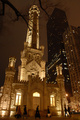
| 01/13/2006 03:24:26 PM | American Gothicby flip89Comment: **** Greeting from the Critique Club ****
Challenge
- Relevant to the Challenge? Yes
- Is subject unique (vs. unoriginal or rehashed)? Yes
Compostion
- Good or Bad? How can it be fixed? I like the off center composition of the... Waterworks, right? I like the branch framing in the top of the image, but the one thing that bugs me is the wire running diagonal in the top right. Probably not much you can do within the current editing constraints, but it affects the image.
- Good use of Depth of Field? Yes.
- Good focus? Yes, however a few commented on things being out-of-focus. There are several reasons for this. First, 1/15 shutter speed and moving people in low light. Second, there is also a softness to the Waterworks lighting that makes it occur soft/blurry, however I don't think that you can do much here.
Lighting
- Good use of light? Yes, although I'd reduce the exposure. The lights in the lower left and on the second floor are blownout.
- How can it be made better? Maybe try freexing the action with flash. At this distance it would not be enough to add details, but might remove the blur from the people. I don't know, you might like the people this way. Your call.
Aesthetics/Artistic Appeal:
- Colors and Contrast The two red lights in the lower right stand out. Since this is fairly monochromatic you might want to desaturate the reds to make them less noticable.
- What is my reaction or feelings? I love Chicago (I suspected this was the waterworks during voting). I love the feel this image has. The image does convey life in the city. A more fitting title may be, "Shoppers Passing The Waterworks."
|
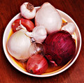
| 01/13/2006 02:06:59 AM | Bulbby talmyComment: Challenge
- Relevant to the Challenge? Yes.
- Is subject unique (vs. unoriginal or rehashed)? Yes.
Compostion
- Good or Bad? How can it be fixed? Let's deal with the humorous aspect, the light bulb, first. I'm thinking bad choice. From your previous submissions, you seem to have a sense of humor, however I don't think that many others appreciate it. (I have a very dry sense of humor, so I can talk from experience in other venues. ;) If you want to go for the humorous I'd go for a standard light bulb. I like the diagonal lines of the grain of the table, but make it run corner to corner. Add a few more onions and turn it into a small pyramid with the larger ones to the back and bottom.
- Good focus? Yes
Lighting
- Good use of light? Yes. Nice soft diffused lighting. Nothing blown out, but still enough to create some nice shadows.
Aesthetics/Artistic Appeal:
- Colors and Contrast. Here's the first thing that struck me at voting. The color of the table, the onions and the inside of the bowl all combine to give the image a orange tone to it. Change the bowl to a contrasting blue bowl. Hide the Bermuda Onion to the back. Let it be an accent, but it currently overwhelms.
- Sharpness. Nicely done.
- What is my reaction or feelings? My first reaction is "Eh, it's okay," but here's the thing: This is your best image out of nine submissions.
If you haven't already read it, I suggest //www.dpchallenge.com/forum.php?action=read&FORUM_THREAD_ID=156130 You want you photography to improve, take this line to heart: "Your challenge: Shoot an Endangered Species. Capture a photo of something for the benefit of later generations who may never see one." This is what will get you 'unstuck' from the middle range as you say.
I hope this helps. | | Photographer found comment helpful. |
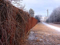
| 01/12/2006 07:16:08 PM | Life on the Edgeby PrismComment: Challenge
- Relevant to the Challenge? I didn't see it during the challenge, but your explanation makes sense. Unfortunately, I think that it needed explaining was your biggest hurdle in this challenge.
- Is subject unique (vs. unoriginal or rehashed)? Yes
Compostion
- Good or Bad? How can it be fixed? I can't decide if I want to see more of the tree on the right or less. More. I also think the shot would be more powerful if taken from a couple steps to the right. It would make the fence more dominant in the image. I like the climbers on the left.
- Good use of Depth of Field? Yes
- Good focus? Yes
Lighting
- Good use of light? Yes
Aesthetics/Artistic Appeal:
- Colors and Contrast The colors are muted, but to be expected from a cold winters day.
- Sharpness. Nicely done. No blurriness.
- What is my reaction or feelings? It reminds me of growing up in a suburban area of Indianapolis.
Edit: Er... Clod/Cold. I'm a clod the winter is cold... Message edited by author 2006-01-12 20:24:56. | | Photographer found comment helpful. |
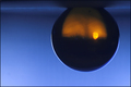
| 01/12/2006 07:04:14 PM | Refracted Sunsetby soupComment: Challenge
- Relevant to the Challenge? Yes
- Is subject unique (vs. unoriginal or rehashed)? Yes
Compostion
- Good or Bad? How can it be fixed? It's very pleasing to the eye.
- Good use of Depth of Field? Yes
- Good focus? Yes
Lighting
- Good use of light? Yes
- Good use of shadows? Yes
Aesthetics/Artistic Appeal:
- Colors and Contrast. Very vibrant colors
- Sharpness. The edge of the mrble has a very clean sharp edge to it. While the reflection and the board have a softness to them.
- What is my reaction or feelings? Jesus. For the life of my I can't remember voting this one. I have no idea why I only gave it a 6, but I should have given it a 8. There was a LOT of heavy competition in that challenge though.
| | Photographer found comment helpful. |
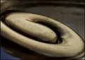
| 01/12/2006 05:54:38 PM | Koru in bronzeby kari1Comment: Challenge
- Relevant to the Challenge? Yes
- Is subject unique (vs. unoriginal or rehashed)? Yes
Compostion
- Good or Bad? How can it be fixed? I really didn't know what to think here. I feel like I am missing out on the bigger picture, however the image you captured. is good. Nice textures.
- Good use of Depth of Field? Yes. I like the softness to the front of the image.
- Good focus? Yes
Lighting
- Good use of light? Yes. I love the reflections and the shadows.
Aesthetics/Artistic Appeal:
- What is my reaction or feelings? It's a nice shape, but you had very heavy competition for this one. | | Photographer found comment helpful. |
|
Showing 731 - 740 of ~1056 |
Home -
Challenges -
Community -
League -
Photos -
Cameras -
Lenses -
Learn -
Help -
Terms of Use -
Privacy -
Top ^
DPChallenge, and website content and design, Copyright © 2001-2025 Challenging Technologies, LLC.
All digital photo copyrights belong to the photographers and may not be used without permission.
Current Server Time: 08/06/2025 03:29:07 AM EDT.
|