DPChallenge: A Digital Photography Contest You are not logged in. (log in or register
 
Browse Settings
Currently viewing:
Registered User_eug

Show comments:

Per page:

Order:

Comments:


Comments Made by _eug
Pages:   ... [63] [64] [65] [66] [67] [68] [69] ... [106]
Showing 651 - 660 of ~1056
Image Comment
Hand over the anchovies and nobody gets hurt.
01/25/2006 12:56:22 AM
Hand over the anchovies and nobody gets hurt.
by studio1graphics

Comment:
Great title Wonderful details. Nice shadows and the ripples on the water. May blown highlights on the head and beak.
Photographer found comment helpful.
Gulls at Dusk
01/25/2006 12:54:48 AM
Gulls at Dusk
by GIS_boy

Comment:
Wider DOF. It's making my eyes hurt. Maybe oversharpened?
G
01/25/2006 12:53:33 AM
G
by Art Roflmao

Comment:
I hope you were using a long lens on this one. What are those lines in the upper right?
Photographer found comment helpful.
Perched Eagle
01/25/2006 12:52:14 AM
Perched Eagle
by randolph259

Comment:
You have purple fringe. Nice eagle needs to be sharper, more in focus.
Thats it I am out of here
01/25/2006 12:51:23 AM
Thats it I am out of here
by brens29

Comment:
Something's off. Maybe oversharpened?
Photographer found comment helpful.
enhanced by the light
01/24/2006 11:54:15 PM
enhanced by the light
by violeta

Comment:
**** Greeting from the Critique Club ****

Challenge
- Relevant to the Challenge? Yes, however the foreground lighting overpowers the backlighting effect. The best area to find the backlighting is in the top middle where the shaded flower contrasts nicely with the lamp light. This is how the whole image should look.

Compostion
- Good or Bad? How can it be fixed? I like the composition the flower up front fills a good portion of the image.
- Good use of Depth of Field? Yes. The light is nicely out-of-focus.
- Good focus? The focus as commentor mention is a little soft. I think it works, but I'd apply a little bit of Unsharp Mask in your editor.

Lighting
- Good use of light? As mention before the foreground over powers the image. Less light up front for this challenge.
- Good use of shadows? Yes Yes Yes. Beautiful.

Aesthetics/Artistic Appeal:
- Colors and Contrast. The lack of color is great. You can see a little camera noise, but it works for this image.
- Sharpness. Needs to be a little sharper.
- What is my reaction or feelings? It's a very strong image, and it's too bad that others didn't appreciate it more, but you had very heavy competetion in this challenge.
magic ball
01/24/2006 03:33:58 PM
magic ball
by eggfox

Comment:
**** Greeting from the Critique Club ****

Challenge
- Relevant to the Challenge? Yes

Compostion
- Good or Bad? How can it be fixed? I like the off-centered composition, but I feel the angled horizon has a negative impact on the image.
- Good use of Depth of Field? Yes The out-of-focus lighting in the background is very nice although the Bokeh of it is distracting due to the nature of your aperture blades. It would be les distracting if the lights were more circular. I'm not sure if this could be fixed with using a wider aperature or if you'd need to use a different lens.
- Good focus? The focus is a bit soft on the ball, but it's not bad.

Lighting
- Good use of light? Yes, but a very little soft lighting for the top of the globe work work wonders.
- Good use of shadows? Yes. I love the foreground shadow and reflection on the table.

Aesthetics/Artistic Appeal:
- Colors and Contrast Nice colors, but add a little saturation to it.
- What is my reaction or feelings? Almost abstract, which I like. I don't think voters on DPC agree with me on that opinion.
Photographer found comment helpful.
Winterscene in sodium
01/24/2006 12:42:57 AM
Winterscene in sodium
by ebbe

Comment:
**** Greeting from the Critique Club ****

Challenge
- Relevant to the Challenge? Yes
- Is subject unique (vs. unoriginal or rehashed)? Yes

Compostion
- Good or Bad? How can it be fixed? Nice use of the Rule of Thirds for composition. The subject is interesting with the curves of the puddle and the straight lines of the twigs and stones.
- Good use of Depth of Field? Yes. I am amazed at the work you did with ISO 100, aperture f/11. It would require a 20 sec exposure. I don't know that I could pull that one off myself (although strictly speaking I can only do an f/8 with my camera...)
- Good focus? Yes

Lighting
- Good use of light? Yes. Interesting use of white balance along with the long exposure.
- Are there any over-blown highlights? Thereare a couple of edges that are blown out, but minorly. My eye keeps going to the lit edge of the top middle stone with the very sharp white edge.
- Good use of shadows? Yes
- Are there any overly dark shadows? Actually the biggest rock I'd like to see more details in the shadows.

Aesthetics/Artistic Appeal:
- Colors and Contrast. Contrast is excellent, and I don't know that I'd choose the WB to give the orange color cast, but it works for many of the commentors/voters.
- Sharpness. Maybe a little over sharp. Did you post-process at all. Maybe soften it a little.
- What is my reaction or feelings? A great image with lots of details. Very respectable score for your second submission. I can't wait to see more of your work.
color is in the cut
01/20/2006 02:49:49 AM
color is in the cut
by Darkprincess

Comment:
**** Greeting from the Critique Club ****

First, as many people noted the border is over done. I am not a fan of borders, but when properly done should be a small percentage of the image (and I prefer white, but that's me.)

Challenge
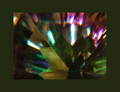
- Relevant to the Challenge? Yes, although the colors area bit dull.
- Is subject unique (vs. unoriginal or rehashed)? Yes

Compostion
- Good or Bad? How can it be fixed? Um, I can't really respond. Well, okay. It's an abstract. There is little composition when discussing abstract.
- Good focus? I would say yes and no. What lead me to say this is that the edges of the facets are sharp near the center of the image, but I'd like them to be sharp through the entire image. Many people mentioned the focus, but I think the are confusing the lighting reflected in the top 1/3 of the image as the subject.

Lighting
- Good use of light? No. I am guessing overhead flourescent tubes. What makes me guess this is the long blueish-white reflections in the top facets.

Aesthetics/Artistic Appeal:
- Colors and Contrast. As mentioned before, the colors are a bit dull. In post processing, bring the saturation up some and adjust the contrast and brightness to make the colors come out more.
- What is my reaction or feelings? It's absract, but I like it. It could be better, but I like abstract even though abstract doesn't score well here.
This way, please...
01/19/2006 02:32:10 PM
This way, please...
by nessnaj

Comment:
Over exposed the ?sky? Lose the border.
Photographer found comment helpful.
Pages:   ... [63] [64] [65] [66] [67] [68] [69] ... [106]
Showing 651 - 660 of ~1056


Home - Challenges - Community - League - Photos - Cameras - Lenses - Learn - Help - Terms of Use - Privacy - Top ^
DPChallenge, and website content and design, Copyright © 2001-2025 Challenging Technologies, LLC.
All digital photo copyrights belong to the photographers and may not be used without permission.
Current Server Time: 06/19/2025 06:15:52 PM EDT.