| Image |
Comment |
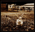
| 02/28/2006 02:42:06 AM |
Wonderlandby whiteroomComment: I really like this, the moody contrasts really work well and add to the photo not distract like some of the photos in this challenge. There is nothing distracting in the background and the few strands of grass on the left compliment the ears! |
 Photographer found comment helpful. Photographer found comment helpful. |
| 02/28/2006 02:39:53 AM |
|
| Photographer found comment helpful. |
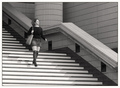
| 02/28/2006 02:39:41 AM |
Stripesby ArtanComment: Nice image, two things that look slightly strange to me. Firstly it is a shame her eyes are shut, secondly the top of her socks is exactly at the top of the first flight of stairs and makes her legs look like they have been chopped off. Nice simple image. |
| Photographer found comment helpful. |
| 02/28/2006 02:37:45 AM |
A Watchful Eyeby jmritzComment: Beautifully sharp image, that eye just seems to watch you! Nice choice of duotone colour as well. Perfect lighting to get that lovely white neck |
| Photographer found comment helpful. |
| 02/27/2006 01:04:34 PM |
|
| Photographer found comment helpful. |
| 02/27/2006 01:03:21 PM |
|
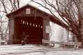
| 02/27/2006 01:02:15 PM |
McCafferty Bridgeby MarjoComment: Nice image, I think the fact that the shadow / darkness in the tunnel isn't completely black. The image looks a little faded but it doesn't take away from the image too much. I also like the lines from the trees and the tunnel. |
| Photographer found comment helpful. |
| 02/27/2006 01:00:49 PM |
Priceless Expressionsby deanaComment: I think pet pictures have to be really really special to get the good marks. This one appears a little washed out, grainy and the focus isn't really nailed. However, it did make me smile so I upped a point |
| Photographer found comment helpful. |
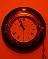
| 02/27/2006 12:59:24 PM |
Clockwork Orangeby j3zzComment: I like the strong duotone colours, probably the richest in the challege. The subject isn't really interesting (to me), and a little grainy on the clockface. |
| Photographer found comment helpful. |
| 02/27/2006 12:58:15 PM |
Plant Shadowby greignerComment: It all seems too washed out, not sure if this was the effect you were going for but it doesn't do it for me. I think this was work much better if there was more tone in the leaves of the plant. |
Home -
Challenges -
Community -
League -
Photos -
Cameras -
Lenses -
Learn -
Help -
Terms of Use -
Privacy -
Top ^
DPChallenge, and website content and design, Copyright © 2001-2025 Challenging Technologies, LLC.
All digital photo copyrights belong to the photographers and may not be used without permission.
Current Server Time: 08/16/2025 08:54:36 AM EDT.