| Image |
Comment |
| 05/27/2003 02:13:04 AM |
Duotone Self Portraitby SharQComment: Nice. A few things I might have wanted to avoid is the blown highlight on the forehead, and the glasses frame through the eye. Very expressive, though. |
| 05/27/2003 02:11:03 AM |
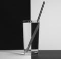
Black & white H2Oby ladpupmoeComment: Nice idea. I like it, though I think it could benefit from some contrast enhancement and some unsharp mask. Also, the table appears to be tilted to the left. This might be the result of barrel distortion, though. Still, nicely done. |
 Photographer found comment helpful. Photographer found comment helpful. |
| 04/24/2003 12:28:38 PM |
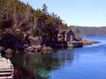
Lower Lance Cove LoRes.jpgby orussellComment: Let me say first off that you've got a good eye and this site definitely has possibilities.
The main issue I have with this photo is the time of day that it was shot. While it is possible to have a good landscape photo durning midday, here the harsh, direct light is preventing you from getting a good, dramatic range of tones. Most landscape shots are taken early in the morning or late in the afternoon when the light is a bit more dramatic and moody. As it stands the colours are a bit washed out, and not as rich as they would be in a more diffuse or lower light. The shed and the area behind it are in partial and full shadow, and I find this somewhat distracting.
Compositionally I think this might be improved slightly by either including a lot of the dock in the foreground, or none at at all. As it is, the dock is bright and it leads my eyes over to it, and yet it's cropped enough that I can't get a good look at it. Pulling back and including more, or moving the camera up and to the right and cropping it out would be better I think.
The partial reflection on the water is another slightly detracting aspect...A change of light and/or a the use of a polarizing filter would even this out somewhat.
Still, nice shot. Add some dramatic clouds in the background and you've got a winner. Do you live around here? If so, perhaps do a locational study and shoot it under a variety of times and weather conditions and see the differences that you can get in the shot. The spot is certainly worth it. |
| Photographer found comment helpful. |
| 04/15/2003 10:16:23 PM |
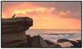
Sunrise Spectacular by andrewlrComment: Likewise Andrew, congrats. Great shot. Looking forward to seeing more of your stuff in the future. Cheers. |
| Photographer found comment helpful. |
| 04/14/2003 02:13:19 PM |
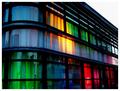
The Colors of Lightby kellymcgComment: Although I didn't get a chance to comment, this was one of my favourites this week. I thought it would do better. The composition is fantastic...I wanted to know what was going on inside! Well done. |
| 04/13/2003 12:58:07 PM |
Colours of love.by derekComment: Nice...good take on a contemporary cliché. The soft focus works very well. |
| 04/13/2003 12:55:23 PM |
Wash Colors Separatelyby scab-labComment: Nice primary shot. The texture in the towels brings out a nice range of tones. Great example, too, of how a good border can help. Nicely done. |
| Photographer found comment helpful. |
| 04/13/2003 12:52:42 PM |
Loves Me, Loves Me Not...by KazComment: Great hi-key shot. The slight overexposure is more than compensated for by the simplicity it brings. Very nice... |
| Photographer found comment helpful. |
| 04/13/2003 12:51:18 PM |
Green .... and a wee bit of brownby agwrightComment: Very sharp, clear shot. Great DOF. The composition might have benefitted from croppin gthe leaf on the far right, but a matter of preference more than anything. Great, and good luck. |
| Photographer found comment helpful. |
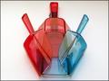
| 04/08/2003 12:11:36 AM |
Scoops of colorby justineComment: Hmmm...nice and sharp. I think, though, that a portrait layout might have seved the composition a bit better. Good shot nonetheless. |
| Photographer found comment helpful. |
Home -
Challenges -
Community -
League -
Photos -
Cameras -
Lenses -
Learn -
Help -
Terms of Use -
Privacy -
Top ^
DPChallenge, and website content and design, Copyright © 2001-2025 Challenging Technologies, LLC.
All digital photo copyrights belong to the photographers and may not be used without permission.
Current Server Time: 08/26/2025 11:08:28 PM EDT.