| Image |
Comment |
| 11/21/2006 05:58:28 PM |
Chicago - My Kinda Townby salmiakkiComment: The towers (especialy the tops) look like huge ears of corn from this angle :P I like the placement of the text, but it seems very small in relation to the whole composition. Perhaps just "Chicago" in a larger font would have worked? |
 Photographer found comment helpful. Photographer found comment helpful. |
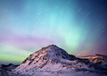
| 11/21/2006 05:56:03 PM |
Over the Topby indridistefansComment: Simply beautiful coloring, and a great shot with the star trails. I wish there were text here though to give it more of that postcard feel, and to share where this fantastic view can be seen. |
| Photographer found comment helpful. |
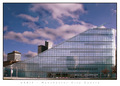
| 11/21/2006 05:54:34 PM |
URBISby ValdoComment: Something about the sky/clouds seems unnatural, or overprocessed. But, the shot definately has a great postcard feel to it. The font and placement of the text all feel very natural for a postcard. |
| Photographer found comment helpful. |
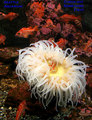
| 11/21/2006 05:52:36 PM |
Check Out Something Fishyby madcrabberComment: Great shot, but I feel like the font is too square and boldly colored, and doesn't seem to go with the flowing water and tentacles of the sea creature. |
| Photographer found comment helpful. |
| 11/21/2006 05:49:04 PM |
Treehuggers Welcome!by Army of nOneComment: Looks like the same thing I'd see all over the country. It's a cute shot, but I think with postcards, I'd prefer to see something that stands out as being unique to the area. Taken out of the postcard context though, it's still a great photo, and I love the bokeh in this one. |
| 11/21/2006 05:44:59 PM |
|
| Photographer found comment helpful. |
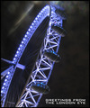
| 11/21/2006 05:43:54 PM |
Greetings Fromby redmoonComment: Great perspective with this shot, and I like the blue color of the lighting. The whole shot (including the font) seems to have this sci-fi, alien abduction feel to it, which seems odd. I'm still deciding how this shot makes me feel. |
| 11/21/2006 05:40:55 PM |
Classic Tackynessby bvoiComment: I like the mix of the added text with the sign to make the full phrase, but that pink.... eww! :P Very clever. |
| Photographer found comment helpful. |
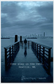
| 11/21/2006 05:39:24 PM |
Bring your Umbrellaby Sunshine86Comment: This is a nice shot, I like the way the pier leads out with the skyline in the background. The blue tones are nice too, and help give the feel of a dreary day. Unfortunately, I would have rather seen this in something like a "rain" challenge. It just seems so sad and depressing, and makes me want to stay away from Seattle. The text also seems just thrown on. I think I might have liked to see it lower to the bottom of the postcard, and a different font. |
| 11/20/2006 06:16:52 AM |
Stealthby scalvertComment: I'm glad the ocelot was asleep... this is a wonderful shot! And hard to believe he's the same little guy you shot before who's been sitting in my favorites for a long time. Great job! :) |
| Photographer found comment helpful. |
Home -
Challenges -
Community -
League -
Photos -
Cameras -
Lenses -
Learn -
Help -
Terms of Use -
Privacy -
Top ^
DPChallenge, and website content and design, Copyright © 2001-2025 Challenging Technologies, LLC.
All digital photo copyrights belong to the photographers and may not be used without permission.
Current Server Time: 08/26/2025 11:42:39 PM EDT.