| Image |
Comment |
| 04/26/2006 01:47:37 AM |
|
 Photographer found comment helpful. Photographer found comment helpful. |
| 04/13/2006 02:53:35 AM |
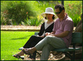
Quiet Moment Interruptedby QikiComment: The subjects are sitting in the shade but the grass behind them is in full sun. This makes the background brighter than the subject. |
| Photographer found comment helpful. |
| 04/13/2006 02:51:23 AM |
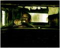
Master of Traditionby NoahGoldmanComment: Nice interesting subject. The strong lighting (which unfortunately looks too artificial) causes strong shadows on his body and some bright hot spots on the masks behind. |
| Photographer found comment helpful. |
| 04/13/2006 02:48:45 AM |
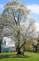
Relaxingby pagarneauComment: Lovely tree and sky and scene. The glass building in the background seems out of place in what would otherwise be a pretty restful picture. |
| 04/13/2006 02:47:28 AM |
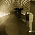
Sepia-toned joy, set in motionby biniComment: I suppose that this is deliberate, but the low contrast and blur in the pic just doesn't appeal to me. Also, the crop has cut off part of both of the girls hands, which distracts me. |
| 04/13/2006 02:30:28 AM |
A Stolen Momentby CaseWriter21Comment: The bright glowing parts of the guys shoe are quite distracting. The sepia was a good choice - making the scene warmer than a BW would have been. |
| Photographer found comment helpful. |
| 04/13/2006 02:28:40 AM |
Lost in Timeby rob_franklinComment: I like the desaturation, but I find the main subject quite uninteresting. No "wow" factor. |
| Photographer found comment helpful. |
| 04/13/2006 02:11:01 AM |
At Cliffs Edgeby woodseyComment: There's no "wow" in this pic for me. The only interest point in the pic is the photographer, but she is too small to make out any detail on. |
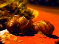
| 04/13/2006 02:09:15 AM |
Midnight Rendezvousby electinaComment: Blurry around the snails. The colours seem way too red/orange. I think that your lightsource was orangy and so if you had used white balance you would have got better colours. |
| Photographer found comment helpful. |
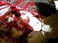
| 04/13/2006 02:08:12 AM |
My Bro Shahrukh's Weddingby doctabrezComment: Lovely rich colours. I think that the small size of this picture will mean that it will score lower than it should. The page makes a good central interest area - everybody in the pic is looking at it. |
| Photographer found comment helpful. |
Home -
Challenges -
Community -
League -
Photos -
Cameras -
Lenses -
Learn -
Help -
Terms of Use -
Privacy -
Top ^
DPChallenge, and website content and design, Copyright © 2001-2025 Challenging Technologies, LLC.
All digital photo copyrights belong to the photographers and may not be used without permission.
Current Server Time: 08/20/2025 11:22:20 AM EDT.