| Image |
Comment |
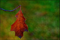
| 12/03/2011 10:48:45 AM |
Winter Leafby crikComment: The mottled background has a wonderful texture, but I would have preferred if the leaf was a bit sharper/crisper. It looks like you oversaturated the colors because the branch is cyan. |
 Photographer found comment helpful. Photographer found comment helpful. |
| 12/03/2011 12:47:11 AM |
|
| Photographer found comment helpful. |
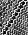
| 12/03/2011 12:45:58 AM |
Zipper IIby banmornComment: You get an extra point for having such an unexpected, yet fitting, title for a subject that is entered several times a week here. Thanks for spicing up this building abstract with an interesting title. |
| Photographer found comment helpful. |
| 12/03/2011 12:44:34 AM |
Large Heronby JarHeadComment: I would have preferred a tighter crop on the left side so that the bird wasn't pinned so close to the middle. |
| Photographer found comment helpful. |
| 12/03/2011 12:43:48 AM |
Chancelby mefnjComment: I assume you cropped this way because there was something on the ground that wouldn't have looked nice in your image. Still, I can't help but wish the crop had been moved down a bit to see what's going on down there at human level too. |
| Photographer found comment helpful. |
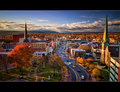
| 12/03/2011 12:21:13 AM |
Fall Frontierby NeilComment: Although this scene is beautiful, I think you tried to include too many things in it, which makes the image feel a bit cluttered to me. I would have cropped it just to the left of the road to keep the road and the right half of the image. That part of the image has light hitting it, which adds interest and makes that part of the image brighter and more attractive to the eye. The crop that I described would also make the road more of a leading line while putting the steeple on the third line to balance out the vertical of the road. |
| Photographer found comment helpful. |
| 12/03/2011 12:16:41 AM |
Autumn Morning Cloudby BarronessComment: I didn't notice the clouds until I read your title. I was distracted by the distortion, which makes me think the distortion wasn't a good choice for this image since it takes away from the part that you wanted the audience to focus on. |
| Photographer found comment helpful. |
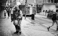
| 11/25/2011 08:32:52 PM |
Ballet dancerby keyzComment: I don't particularly understand the title, unless you're referencing the skinny legs of the person on the right, but I think this is a wonderful image. The black and white works perfectly, the composition is great, the depth of field is spot-on, and the moment is really intriguing. I love the small boy on the left. Great job! |
| Photographer found comment helpful. |
| 11/24/2011 10:03:55 PM |
Across the Water by jimnessComment: The tones on this are just perfect. I love the texture of the reflection in the water. The HDR is definitely not overdone in this one. The blue hue is a nice touch too. My top pick in the challenge. |
| Photographer found comment helpful. |
| 11/24/2011 10:00:41 PM |
|
| Photographer found comment helpful. |
Home -
Challenges -
Community -
League -
Photos -
Cameras -
Lenses -
Learn -
Help -
Terms of Use -
Privacy -
Top ^
DPChallenge, and website content and design, Copyright © 2001-2025 Challenging Technologies, LLC.
All digital photo copyrights belong to the photographers and may not be used without permission.
Current Server Time: 07/30/2025 06:18:39 PM EDT.