| Image |
Comment |
| 09/03/2011 10:28:36 AM |
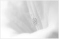
Delicate Balanceby karmatComment: Nice control of light for the high-key feel, but I think I would have preferred the tiniest bit more contrast to help the stamen stand out from the petals. |
 Photographer found comment helpful. Photographer found comment helpful. |
| 09/03/2011 10:26:08 AM |
Feeding the youngby marobertsComment: This looks like it was taken on a cloudy day because the lighting is really flat. I think adding a touch more contrast would have given this a huge boost. |
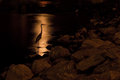
| 09/03/2011 10:21:18 AM |
Breakfast Timeby mgsmith53Comment: I love the pose of the bird and how it is highlighted with the reflection on the water. You could have cropped closer on that part to emphasize how beautiful that part is. I would have preferred a shallower depth of field to blur out the background. |
| Photographer found comment helpful. |
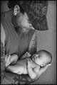
| 09/02/2011 09:49:39 PM |
Portrait of a Daddyby LydiaComment: I like that the dad didn't feel the need to dress himself up into something he's not just because he was getting his picture taken with a baby. The light on the child is very beautiful. |
| Photographer found comment helpful. |
| 09/02/2011 09:48:22 PM |
On a loss of a daughterby HighNoonerComment: He does have a very interesting face (love the curled mustache), but I think it's cropped too close for my taste. I also don't think the title and the image quite match because we very very rarely get such a close, intimate view of someone's grief. Grief is usually hidden or at least held at a distance. |
| Photographer found comment helpful. |
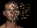
| 09/02/2011 09:46:10 PM |
Digital Photographyby MikeComment: Interesting idea. I get the title, but I wonder if you could have come up with something stronger. Not docking you for that though. I think the title you have could have worked better if you had more items to support it (the first idea I had was maybe making the background look like PhotoShop or something).
As for the other parts of the image, I think flatter light (almost as if coming from a computer screen, perhaps?) would have worked better with this concept than an on-camera flash. I don't think his expression quite fits either. He looks angry or maybe just put-off, but that's probably not the expression that would be on my face if I was being picked apart pixel by pixel! |
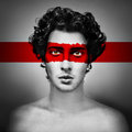
| 09/02/2011 09:40:05 PM |
RED by elsapoComment: The tones in this are pretty perfect. I love the texture of his hair. I also like that the band on his face isn't smooth like the one on the background. Simple, yet incredibly effective. My favorite in the challenge. |
| Photographer found comment helpful. |
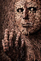
| 09/02/2011 02:33:45 AM |
The Artisan by gyabanComment: Wow, this must have taken you FOREVER. Probably took a lot of pre-planning too. Very cool. I just think that the title isn't as strong as the image. With a picture as cool as this, I think you could have come up with a more striking title. Not docking you for that though. |
| Photographer found comment helpful. |
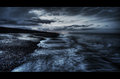
| 08/23/2011 10:33:23 PM |
Sunsetby NiallOTuamaComment: I also think this might work better for the free study. For shez, people are going to look for colorful flowers and other macros that fill the frame, I think.
I might crop a bit off the top to make this more of a letterbox ratio. |
| Photographer found comment helpful. |
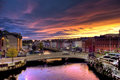
| 08/22/2011 08:53:45 AM |
Coastby SimmsComment: EASILY the best one in the challenge. The processing on this is absolutely perfect and creates the most wonderful emotive scene. The texture and the tones are gorgeous. I'd love to know your processing steps on this. |
| Photographer found comment helpful. |
Home -
Challenges -
Community -
League -
Photos -
Cameras -
Lenses -
Learn -
Help -
Terms of Use -
Privacy -
Top ^
DPChallenge, and website content and design, Copyright © 2001-2025 Challenging Technologies, LLC.
All digital photo copyrights belong to the photographers and may not be used without permission.
Current Server Time: 08/04/2025 06:34:57 AM EDT.