| Image |
Comment |
| 02/02/2003 01:04:11 PM |
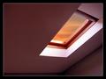
My left footby av8orboyComment: clever interpretation of the challenge. good colors on the tat and in the photo |
| 02/02/2003 01:03:37 PM |
|
 Photographer found comment helpful. Photographer found comment helpful. |
| 02/02/2003 01:03:21 PM |
|
| 02/02/2003 01:02:27 PM |
|
| Photographer found comment helpful. |
| 02/02/2003 12:49:26 PM |
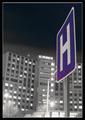
"Rising Healthcare"by KickDrum5150Comment: CRITIQUE CLUB REVIEW
If this shot was really sharp, it would be stronger. I wonder if you used a tripod? Even if you did, that's a looong exposure :).
Another way to improve might be to use more contrast. As it is it's sort of gray, with the one color present adding to the low temperature feel. Use your curves or levels tool to play with this.
The title, while clever, doesn't imho fit the shot :). So I'm choosing to just look at the image as if it was untitled.
The tilt has been remarked upon, yet your H sign is level, so that's good. That's prolly all a function of e-20 lens distortion at wide angle. I might have had the H sign leaning in.
Good luck in the challenges! |
| 02/02/2003 12:29:09 PM |
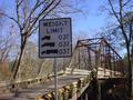
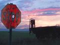
Everything has it's limit!by RaindropComment: CRITIQUE CLUB REVIEW
I'm amazed that they let trucks that big on the bridge. It looks old and rickety. It must be well reinforced.
This picture is an interesting location. What could we do to make it better?
Point the camera a little more to the right, or even actually move physically to teh right (if there's a place to ) to get the sign in the upper left third corner of the frame (do a search on Google for "Rule of Thirds" for more information). As it is, it's almost centered but not enough for it to look like you made a strong compositional choice. Also the right edge of the bridge is to close to the edge of the frame.
Try having used your fill flash to bring the lighting on the sign up to match the rest of the scene. Roadsigns are made to flouresce when lights hit them, and a fill flash can be just the thing to have made this sign pop. Also, even tho it's an interesting sign with an interesting backdrop, since there's not a ton of color in the background it might have been a nice contrast to have a more colorful or more brightly lit sign.
Time of day could also have played a major role in the improvement of this picture. A sunset, sunrise or lower more angular lighting would be nice. Usually when the sun is high in the sky is the most boring time to shoot. Interesting clouds in the sky are also good to watch for. |
| 02/01/2003 11:16:11 AM |
|
| Photographer found comment helpful. |
| 01/31/2003 09:54:24 PM |
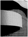
Grillby ArtifactsComment: i cant believe this did so low. i liked it quite a lot. very graphic design and a right-on exposure. good work! |
| Photographer found comment helpful. |
| 01/30/2003 12:47:00 PM |
|
| 01/30/2003 09:00:04 AM |
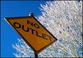
"Snow" Outletby DougPazComment: Critique Club Review
Composition: Excellent. One of the strongest features of the picture. The strong shape and placement of the sign is balanced by the unique sunlit, snow covered tree branches. Good angle of view on the sign.
Technical: Focus is good and the deep DOF works well here. I don't think you can control aperture on that camera but if you can, I'd be curious what a shallow DOF would look like? I think that the pic would actually be a tad stronger if you had used some fill flash on the sign. It still looks good even backlit and obviously the snow is providing a lot of fill reflection but these signs are designed to flouresce in a strong light and it tends to make them really pop. As it is, the tree branches are almost primary and the sign is almost secondary. Also, when I look closely at the sign, it seems as if the focus on the letters is actually a tiny bit soft, yet the tree is really sharp, as if your AF hit the tree and missed the sign.
Post-Processing: Looks good. The only thing that stands out is the branches look like they might be a tad oversharpened.
All in all a great picture that might benefit from a few small tweaks! Good job! :) |
| Photographer found comment helpful. |
Home -
Challenges -
Community -
League -
Photos -
Cameras -
Lenses -
Learn -
Help -
Terms of Use -
Privacy -
Top ^
DPChallenge, and website content and design, Copyright © 2001-2025 Challenging Technologies, LLC.
All digital photo copyrights belong to the photographers and may not be used without permission.
Current Server Time: 08/07/2025 08:41:45 PM EDT.