| Image |
Comment |
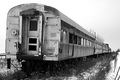
| 11/19/2006 02:20:05 PM |
Abandonedby CaitlynComment: Nice perspective, I would have liked to see a little more contrast though. |
 Photographer found comment helpful. Photographer found comment helpful. |
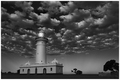
| 11/16/2006 11:48:17 AM |
Light house by FirstyComment: Back for a second look and definatly bumping up. Love the sky the beautiful highlights and shadows make it outstanding. Love the lighting on the tower. My only complaint is the flat black foregound. Maybe if you had cropped a little higher this wouldn't have been a distraction to the rest of the beautiful image. |
| Photographer found comment helpful. |
| 11/16/2006 11:45:59 AM |
00OOby boysetsfireComment: Nice shadows on the ground and contrast within the stones and the black bike. I am not sure I like the crop I think it stops just a little short. Also the background seems a little burnt out. |
| Photographer found comment helpful. |
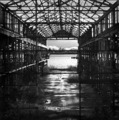
| 11/16/2006 11:43:53 AM |
Forgottenby dbuhlerComment: Really love the shine on the old pavement through the centre of the building, very interesting and a great focal point. Also love the way it frames the city in the background. The left side of the building has some nice highlights where the right seems a little flatter and less defined, I think it would have been better if you did a little dodging and burning on that side to really take the viewers eye through the picture smoothly. Also the water seems a little flat and it would have had more impact if the city in the background also had some darker shadows and lighter highlights to really make it stand out. Over all though I really like it, great composition, hope you don't mind the opinions here. |
| Photographer found comment helpful. |
| 11/16/2006 11:37:48 AM |
Outtedby inspir8tionComment: Love the face whiskers and eyes here. The blown out white of what ever it is he is sitting on distracts from that however, in my opinion. |
| Photographer found comment helpful. |
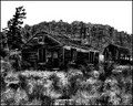
| 11/16/2006 11:36:14 AM |
Old American Homesteadby heathenComment: Love the composition and the subject. The rocks behind could have shown more definition and I am not sure about the post processing looks a little burn't out in areas. |
| Photographer found comment helpful. |
| 11/16/2006 11:34:58 AM |
Church Houseby brimacComment: Nice angle and perspective, interesting old building. Looks a little grainy through the sky to me though and would have been nice if the buildig was just a little sharper to highlight some of the textures that are apparent there. |
| Photographer found comment helpful. |
| 11/16/2006 11:33:41 AM |
Afternoon Thunderstormsby JuliBocComment: Beautiful sky and nice contrast with the trees. I wish there was more definition with the water and the bridge though. Maybe more shadows and highlights to realy define the ripples inthe water and the lights and darks of the bridge. It also looks like some of the area in front could have been highlighted a bit to give it more life and depth. |
| Photographer found comment helpful. |
| 11/16/2006 11:31:36 AM |
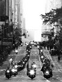
Motorcycle Vetsby levyj413Comment: Interesting shot, the sky seems a little blown out though and is rather distracting from the main point in picture. |
| Photographer found comment helpful. |
| 11/16/2006 11:30:24 AM |
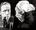
Smokinby jfwolpertComment: Overall I like it, wish the shadow on the bottem of Marilyns face wasn't so strong and feel it would be better if you could see both his feet but I do like the picture in general. |
| Photographer found comment helpful. |
Home -
Challenges -
Community -
League -
Photos -
Cameras -
Lenses -
Learn -
Help -
Terms of Use -
Privacy -
Top ^
DPChallenge, and website content and design, Copyright © 2001-2025 Challenging Technologies, LLC.
All digital photo copyrights belong to the photographers and may not be used without permission.
Current Server Time: 08/23/2025 11:17:58 PM EDT.