|
|
| Image |
Comment |
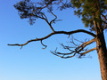
| 02/08/2006 03:16:54 AM | Branchby MazkaComment: I came by to check, but there weren't many comments, so I thought I'd say something at least. I don't know if it helps at all. If I could have voted for that I'd linger between a 4 and a 5. I'd most likely give a 5 because of the focus, it's there. The blue is great, but the composition is too bland that doesn't make most viewers go "WOW! look at that!". I thought it was great that you combined the branch to give the blue an extra punch though. I guess you might have put in too much tree and very little focusing on the blue. Although the natural lighting I must say is a well done. Lovely in fact, showing of the hues of blue. But really, I'd say you'd probably score a lot higher if you managed to get something interesting in the sky. |  Photographer found comment helpful. Photographer found comment helpful. |
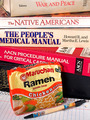
| 01/18/2006 12:32:21 AM | Recipe for Success or College Cuisineby fotomann_foreverComment: I should have known it was you. All I remember thinking when I saw this was "who the hell made up this shot!? Freaking crazy, but a good laugh. Oh! My friend is reading that book (War and Peace)!" So just to tell you, I gave a 6. I'd say the composition is pretty good though. Somehow, I thought you could have added more to it, maybe it's just me being silly. The lighting is alright, but it gets a bit too dark towards the top. Maybe that was your intention to highlight the instant noodles. It's not as appealing so it's probably why I gave it that score. | | Photographer found comment helpful. |
| 01/16/2006 11:18:56 AM | vanilla sky puddingby gocComment: If you didn't have the title, I would have been lost. I'd say it's an interesting picture on its own though. I just think it would have done better if you didn't over saturate and sharpen it. If you didn't, I apologise because it really does look like you have. The black bowl worked fabulously well to show off the vanilla cream colour. Your focus does seem a bit off though. Towards the back of the other pudding, I think it's too orange, I would have thought it was more pale yellow colour. It's a bit too noisy towards the top of the picture.
I'd say the lighting doesn't work very well in the picture, but I guess for that angle, it's alright. Diffused light might have worked better. So for all of that, I gave a 6. | | Photographer found comment helpful. |
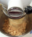
| 01/16/2006 11:14:10 AM | MmMmMmMm cookiesby nlghttrainComment: It's certainly a different view than the rest of the pictures. My honest opinion for this shot is that you probably focused too much on the machine. I think you've over sharpened as well. If you could have changed your focus to the dough and used 1/600 sec. shutter speed (I think), it would have been fabulous to me. The composition itself is alright, but what really lost points was the appeallingness of the shot. Personally, I think shot with a contrast in colouration looks fantastic and gives an extra "wow" factor that normally leaves a pretty good first impression. I might be no expert, but lighting-wise, you could have worked more on it. So the way you've presented this, makes it feel more like a challenge for machinery rather than food because of the focus. Oh and that bit of clue stick at the bottom of the bowl is also a bit distracting to the whole concept of the picture. So all in all, a 6. | | Photographer found comment helpful. |
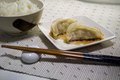
| 01/16/2006 11:08:22 AM | Dim Sums ... "potstickers"by Pug-HComment: Let me start off, I love dim sums, never knew how to make them, but there are lots of Chinese in Thailand. So for all its worth, I gave a 6. I'm avoiding to judge on my taste of food and just it like every other challenge photos. So to me, your focus is too centred for me. At least you've focused on the rice as well. I honestly think it would have been better off if you managed to just focus on the dimsum if that's the kind of focus you wanted to do. The composition of the entire photo isn't too bad, but it's too bland. The colours need to stand out more. Maybe it's also because of my personal preference. The a change on table mat to show off the food would have added so much more to this shot. Cropping the end of the chopsticks isn't working for me either, it gives a very constricted feeling to the food. Your dishes chosen for decoration is good though. I like the natural lighting going on in this picture, but maybe adding a bit more light so that the closer objects don't look too dark in comparison may have worked very well for the shot.
I'm terribly sorry this is long, but I really thought this shot has a lot of potential. | | Photographer found comment helpful. |
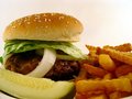
| 01/15/2006 02:36:31 AM | Gone in 60 secondsby CamComment: The fries are a bit too burnt for me, but I think it's a great set up, quite appealing even if I'm not a big fan of burgers. It gives a very home-made feeling to it, but maybe a bit too sloppy? The arrangement inside the burger could have been a be better (neater). The cucumber I can't figure out if it works for the picture or not. In one way it does, and then looking at it again it doesn't. I must say your lighting is very well done though. Doesn't have those hot spots that ruin the picture. I gave this a 7, since I thought the setup could have been immproved by a bit. Perhaps even a bit more colour to help on the contrast would have worked well as well. | | Photographer found comment helpful. |
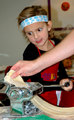
| 01/11/2006 11:30:09 PM | Homemade Pastaby shadeeuaComment: I sincerely love the girl's facial expression. Fabuluous. I gave this a 6. The composition could have been a bit better. Maybe if you had this done in black and white it could have turned out spectacular. What destroyed the integrity of the capture was the flash. It was too strong for me. I don't know if the picture is supposed to have a fierce/firey atmosphere or not, but it's too strong in my opinion. Oh perhaps if there wasn't an extra hand to help out, it would have been better. I can't get over her facial expression, I love it! |
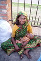
| 01/11/2006 11:25:51 PM | heavenly foodby voboghurayComment: A beautiful shot indeed. I honestly love it, but I had to give it a 6. The baby of the baby's face is also very impressive. I think you could have scored higher if you didn't stand up. If you could have knelt and be at her level, make sure she was looking elsewhere, boy I would have given it a 10 I think. I personally think to pull this kind of picture off in colour isn't easy. They're normally better off in black and white. If you also could have played a bit more with the lighting and made her sari stand out more it would have worked great as well. At least for me it would have. There's just a small distraction at the bottom right corner. It looks like a big of hand and someone's dress. So really, I think this came down to lighting and camera angle. | | Photographer found comment helpful. |
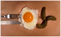
| 01/11/2006 11:20:54 PM | She's HOT, I'm cookin'by GiorgioComment: Creative. I was thinking if anyone would do this kind of shot, and you were the only that did it. Good for you! For me this shot is slightly out of focus. There's something lacking in the composition and I'm not exactly sure what it is. It could be the dilled pickle arrangement and the utensils. The lighting isn't working too well either, but for such a great capture, I gave this a 7. | | Photographer found comment helpful. |
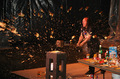
| 01/11/2006 11:17:36 PM | Gallagher's Apple Sauceby SunnieeComment: This looks like a lot of fun. Very fun in fact. I thought the shutter speed was out into great use, and a very creative shot. There is some sort of atmosphere lacking in the picture though or it could be because of the music I'm listening to. Besides that point, placing the focus in the middle was a great idea, but some how I'm convinced it might have been better if you were able to show more of the table. I could be terribly wrong though. I think the focus us just a bit off and it might have hurt you there. There's also too much black going on in the picture, but that must have been vital since the splash contrast would have counted on it very much. I gave this shot a 7. | | Photographer found comment helpful. |
Home -
Challenges -
Community -
League -
Photos -
Cameras -
Lenses -
Learn -
Help -
Terms of Use -
Privacy -
Top ^
DPChallenge, and website content and design, Copyright © 2001-2026 Challenging Technologies, LLC.
All digital photo copyrights belong to the photographers and may not be used without permission.
Current Server Time: 06/27/2026 08:19:10 AM EDT.
|