DPChallenge: A Digital Photography Contest You are not logged in. (log in or register
 
Browse Settings
Currently viewing:
Registered UserDrJOnes

Show comments:

Per page:

Order:

Comments:


Comments Made by DrJOnes
Pages:   ... ... [66]
Showing 51 - 60 of ~659
Image Comment
OUTBACK
05/02/2005 02:11:56 AM
OUTBACK
by DrJOnes

Comment:
Thanks for all the kind comments about this shot.

It's been a while since I submited anything to DPC. I've been extremely busy with my career and had less time to work my way in DPC challenges. The jewelry challenge inspired me to do this shot, and I thought it would be nice to submit something other than what DPCers are used to see me submit. It's kind of my way to say "hey, I can do other stuff too you know! ;-)".
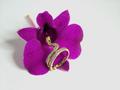
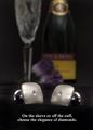
I suspected that the majority of entries would be closeups of jewels, so I wanted to depart from that idea and try to use suggestive advertising. The idea was to create a feeling that the viewer would associate with the product. The downside to this technique is, in this occasion, a much smaller product shot and (especially on DPC at 640 pixels resolution) a high loss of jewel detail.

This is actually an autoportrait. So thanks girls for all the nice comments about the model! ;-)

It was extremely frustrating to shoot on a timer. I hated it because I didn't have control on the composition; I shot large and cropped after. I did about 75 shots, many of them facing the camera, some of them on the side like this. I went for the shot that suggested movement in it.

I'm happy with the lighting. This is pretty much what I had in mind when I visuallized the shot. This was simple to light:
- Main light source 1 meter to the right, half a meter forward. 4 foot soft box with grid on it (so the light does not affect the bgr.)
- second lightsource facing down on the lower left part of the bgr. A 30o grid ensures that the light does not affect too much of the bgr.

Post editing:
- Cropping.
- unsharp mask.
- slight level correction.
- slight color adjustment to give more yellowish tint to skin tone.
- some burning in the right bgr and around the watch.
- minor healing in on the skin in the face.
- doged a littlebit to whiten the eyes.
- added text.

Thank you to everyone who voted on this challenge, and to everyone who took the time to write comments. I appreciate it.

Take care!

Martin

Message edited by author 2005-05-02 02:14:28.
"Wild Thing"
04/27/2005 11:58:12 AM
"Wild Thing"
by Heavy

Comment:
Well presented. Simple, efficient. Jewel works well with the flower. Composition is well executed. A bit uninspiring to me, but still a very good job.
Photographer found comment helpful.
Speak Her Language!
04/27/2005 11:57:12 AM
Speak Her Language!
by Sunniee

Comment:
Jewel is very sharp and crisp. nice details and reflections. I think the DOF could have been more narrow to make the jewel stand out more. Nice use of the flowers to complement the color of the jewel. I am not sure about the centered composition which seems a bit off to me. Good job!
Photographer found comment helpful.
Silver Greek Key Design Bracelet...$129.95
04/27/2005 11:55:16 AM
Silver Greek Key Design Bracelet...$129.95
by Cutter

Comment:
Very nice composition. Excellent colors and textures. i wish the DOF was not so narrow, but that's just my personal taste. nice selection of jewel. font seems to work here, which cannot be said about most of the entries inthis challenge. On of my top 10. Cheers!
Photographer found comment helpful.
Silver Heart Earrings
04/27/2005 11:53:36 AM
Silver Heart Earrings
by postoakinversion

Comment:
Very nice use of white on white. Head may be a bit too tilted (gives a weird angle to the earring). Overall well executed. Nice shot.
Photographer found comment helpful.
Be the light...
04/27/2005 11:52:40 AM
Be the light...
by Shaman

Comment:
I know it' snot easy to shoot a candel and I think you did it very well! Personaly, I wish the fire was more elongated vertically. I think it would make the candle more powerful. Nice use of the black and the reflection. The text is big and annoying to me, but I'm difficult when it comes to the use of fonts. I wish we were not limited to 640 pixels because I'd love to see the detail on the jewel. ;-) Nice shot. Well done.
Photographer found comment helpful.
Untitled
04/25/2005 05:51:11 PM
Untitled
by troylox

Comment:
Very soft and great composition! Well done!
Photographer found comment helpful.
Diamond Cuff Links
04/25/2005 05:50:21 PM
Diamond Cuff Links
by cajay

Comment:
nice use of DOF. Good try with the lighting to set a mood. I think lighting could have use more modeling on the background to give a more dramatic effect, but maybe it's just me. The center composition is throwing me off a bit... Fonts could be a darker shade of grey to give back some forcus to the jewels. Good job overal! Cheers!
Photographer found comment helpful.
a diamond is forever
04/25/2005 05:48:04 PM
a diamond is forever1st Place
by hopper

Comment:
Funny idea. Nice details. Uninspiring lighting. Font could use a better selection to complement the design of this image. Good luck!
Photographer found comment helpful.
We take trade-ins....
04/25/2005 05:46:06 PM
We take trade-ins....
by ralph

Comment:
Funny or sad? Yuo certainly have a good sense of humour. ;-) I don't know about a jewel ad though. LOL. Amusing for a second, but looses its charm rapidly. Good luck!. :-)
Pages:   ... ... [66]
Showing 51 - 60 of ~659


Home - Challenges - Community - League - Photos - Cameras - Lenses - Learn - Help - Terms of Use - Privacy - Top ^
DPChallenge, and website content and design, Copyright © 2001-2025 Challenging Technologies, LLC.
All digital photo copyrights belong to the photographers and may not be used without permission.
Current Server Time: 08/23/2025 12:33:34 PM EDT.