| Image |
Comment |
| 01/25/2006 02:18:51 PM |
|
 Photographer found comment helpful. Photographer found comment helpful. |
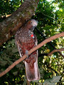
| 01/21/2006 11:17:04 PM |
Little Natby ShelleyComment: Greetings from the Critique club. After reviewing your photo I have some thoughts I'd like to share. Beautiful focus, and wonderfully composed shot. Only thing I might change as an after thought would have been the angle of his head. Maybe turn a bit toward the camera. I like the background and I think centering works well. Selective desaturation makes this a nice portrait. But I dont think it makes it a burst as it needs for the challenge. I think it scored really well, and the models parents would surely love this as a print. As a dad I know I would. The shirt does have a few spots that are a bit too bright for my taste, but its not too bad. Overall a pretty good job. |
| 01/18/2006 11:24:08 PM |
Summer Treatby mpetersComment: Greetings from the Critique club. After spending some time looking at the challenge entry. I am brought to a few thoughts I am going to put forward for you. I love the colors of this entry. The purple and green go really well together. It has wonderful composition and the border works really well. Nicely done.
I do have concerns that in reference to the challenge, they appear to be drinks, although by reading the description I'm sure they can be either/or, or both. The photo seems overexposed/blown out in areas. Making the glass stems disappear at some points and all together in others. The shallow DOF with the focus on the front straw takes away a bit. Perhaps the same shot done at f9 or so, would have made more focus then added gaussian blur to make the effect that you want. I think you actually scored real well for the challenge and a pretty nice finish. Well done. |
| Photographer found comment helpful. |
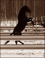
| 01/15/2006 10:07:22 PM |
In Perfect Shapeby messerschmittComment: Greetings from the Critique club. After spending some time reviewing your photo I have some thoughts to share. With meeting the challenge shapes, I think you have met it. The horse is a shape in its purest form.
Some things to improve the image. The fence is distracting and seems to grab some of the focus. The Shape (horse) isnt sharp like the DPC voters seem to need for higher scoring images. The background is a bit distracting and takes focus off the horse. The image is also a little dark and that likely cost you some higher votes. If possible the same shot out in a more open field, without the fence so noticeable would have scored higher. Good luck in future challenges. |
| Photographer found comment helpful. |
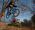
| 01/14/2006 10:41:12 PM |
Streetby MadMan2kComment: Hello and greetings from the Critique club. After spending some time viewing your photo I have some thoughts and suggestions. This is a nice stop action photo, with good colors and pretty good composition. Deciding if it met the challenge is a problem for some viewers. I think that city life for a lot of folks indicates large downtown metropolitan areas. However for myself living in a town of 6k thats not the case. I think you represent city life where you are rather well. Its well exposed and focus while not spot on, is pretty good.
On to things that could have improved the score. The composition is good but has some flaws. The 2 kids in the background distract from the main subject. The main subjects face is blocked by the right hand and handlebar. As I mentioned before focus is a little soft, but with a shot like that dead on focus is hard to achieve. Overall pretty well done. Good luck with future challenges. |
| Photographer found comment helpful. |
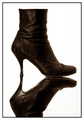
| 01/13/2006 01:39:57 PM |
REFLECTIONby ellulsComment: Greetings from the Critique Club. I think you have done well with this entry. I love the focus and the whit background. I generally dont like centering, but it really seems to work well here. The border also adds to the photo. I think the score represents real well your efforts here.
Things that might have improved on. I think having the whole reflection in the foreground would have increased the score on this shot quite a bit. I also think that a little more light on the front of the boot would have accented it a little more. I also wonder what a leg in the boot might have done for it. Overall well done in a pretty high scoring challenge. Respectable finish. |
| Photographer found comment helpful. |
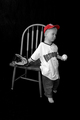
| 01/12/2006 07:01:50 AM |
Dear Momby shankswareComment: Greetings from the Critique Club. After reviewing the photo I have some suggestions and some comments.
Challenge met, good representation of Mother this is a nice emotive photo. Good use of DOF to add to your presentation.
The color seems a bit flat, perhaps bump the saturation, and the contrast a little to help make things stand out. The photo seems a little busy, I might have taken the books and the cup out of the photo and left some empty space to help draw the attention to the photo and the letter. I think the letter being printed and then having a pencil in the photo takes away, I would have liked to have seen a Pen and handwritten, or if you used the pencil the writing to be in pencil. Overall a good entry. Good luck with future challenges. |
| Photographer found comment helpful. |
| 01/11/2006 03:08:18 PM |
A bee. See?by burtctComment: This is a great entry into the challenge, nicely composed, but the focus is just off, it seems too fuzzy. Had the focus been spot on it would have been a 9. |
| Photographer found comment helpful. |
| 01/11/2006 03:05:00 PM |
Crystal Hallby GivemeashotComment: This is a good approach and good idea for the challenge, however the photo is way too busy and I just cant find a focal point that draws my attention and keeps it. |
| Photographer found comment helpful. |
| 01/10/2006 10:49:37 PM |
Pretty In Pink Poka Dotsby deepfrog17Comment: Greetings from the Critique club. I hope to give you some insight on your photo. I really dont have lot to go on with no photographers comments, so I will try to help with my opinion. You have met the challenge, you have a pattern in the photo and that meets the challenge. Pretty good DOF. The lighting seems flat on this photo, perhaps it was taken on a cloudy day or indoors with minimal lighting. The colors dont seem to pop out on the screen like they could. Maybe you could have bumped up the saturation or the contrast. More initial lighting on the subject would have helped. But I dont think that the pattern is the main focus of the shot. That likely effected the score as well. Good luck with future challenges.
|
| Photographer found comment helpful. |
Home -
Challenges -
Community -
League -
Photos -
Cameras -
Lenses -
Learn -
Help -
Terms of Use -
Privacy -
Top ^
DPChallenge, and website content and design, Copyright © 2001-2025 Challenging Technologies, LLC.
All digital photo copyrights belong to the photographers and may not be used without permission.
Current Server Time: 08/01/2025 10:24:02 AM EDT.