| Image |
Comment |
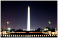
| 05/11/2006 01:20:26 PM |
Monument and Memorialby phreakonComment: This is a wonderful shot, however the exposure is off a touch, too long of a shutter or too big of an apeture or something. I'd like to see some detail in the lights across the bottom and not have the Tower so blown out. Otherwise its a beautiful shot. 6 |
 Photographer found comment helpful. Photographer found comment helpful. |
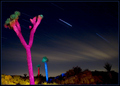
| 05/11/2006 01:15:01 PM |
The Painted Desertby cutlassdude70Comment: I really like this shot alot. The colors the streaks in the sky. But I feel like I have to lean to the left to get it straight. I realize the horizon in the back is correct, but it just seems odd to me to have to do that. I still give you a 7. Nice fit for the challenge. |
| Photographer found comment helpful. |
| 05/09/2006 01:28:32 PM |
everything comes to him who waitsby cordobesComment: This photo is small and very blurry. I'd suggest better lighting to speed up the shutter speed, or the use of a tripod. Keeping the image as large as allowed is a huge help here on DPC. I'll bump it a bit now. |
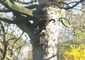
| 05/09/2006 01:27:35 PM |
Killing two birds with one stoneby xxsofaxxComment: This photo is small and very soft on focus. I'd suggest either getting closer or use more zoom if possible. Using the 640 max size here is important as well as having colorful and sharp images. I like the idea of the cat with the birdhouse, but at its size and the lighting its very hard to pick that out without staring. Most voters wont spend the time. I'm bumping you up a bit now. |
| 05/08/2006 11:38:42 PM |
On the Lambby lawreeComment: This photo is very soft on focus and is slightly blown out in areas. I do like the idea though. Also the photo seems to have a good deal of noise in it. |
| Photographer found comment helpful. |
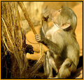
| 05/08/2006 11:32:34 PM |
Monkey Businessby BigKComment: I like the colors of this, and the sharpness as well. I usually dont like the border use on this, but in this instance the border seems to compliment it well. Nicely done. |
| Photographer found comment helpful. |
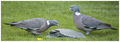
| 05/08/2006 11:30:25 PM |
Two birds with one stoneby PixelstateComment: NIce use of DOF, not sure I really like the pano look. But it fits the challenge well and is a nicely done shot. Maybe bump the saturation a touch and maybe the contrast. I'd also like to see a little more sharpness with it. Overall well done. Its a 6 from me. |
| Photographer found comment helpful. |
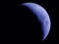
| 05/08/2006 11:24:57 PM |
Once In A Blue Moon.by marboComment: I love moon shots. I'm envious that you have such a well done shot. I like the color cast of the blue. I wish the crop was a bit different though. Maybe put the moon up a touch and to the right. Overall a good entry that meets the challenge well. 6 or 7 from me cant decide right now. |
| Photographer found comment helpful. |
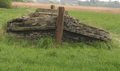
| 05/08/2006 11:21:28 PM |
Sea of Grassby HXP101Comment: I like this idea, the angle seems a bit too low, I'd like to get a better view of what your subject it, I think its a boat, but I'd like to know for sure. I'd also bump the saturation and contrast just a touch to give it some pop. Meets the challenge well. |
| 05/08/2006 11:19:33 PM |
Face the musicby yannComment: This is a nice idea and well setup, I like the idea very much, however for me I wish you had used a larger DOF so that the person would be in focus as well. The focus on the speaker is awesome, just wish it extended out a bit. |
| Photographer found comment helpful. |
Home -
Challenges -
Community -
League -
Photos -
Cameras -
Lenses -
Learn -
Help -
Terms of Use -
Privacy -
Top ^
DPChallenge, and website content and design, Copyright © 2001-2025 Challenging Technologies, LLC.
All digital photo copyrights belong to the photographers and may not be used without permission.
Current Server Time: 08/02/2025 07:01:20 AM EDT.