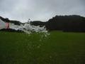
DPChallenge: A Digital Photography Contest You are not logged in. (log in or register
 
Browse Settings
Currently viewing:
Registered UserTurbotech

Show comments:

Per page:

Order:

Comments:


Comments Made by Turbotech
Pages:   ... [51] [52] [53] [54] [55] ... [121]
Showing 511 - 520 of ~1202
Image Comment
A Stranger, A Piece of Me, Walks Away
12/11/2002 02:27:56 PM
A Stranger, A Piece of Me, Walks Away
by coeurdusucre

Comment:
1)Does the Photo fit the theme? (2)
2)Color:(4)
3)composition(2)
4)Focus(3)
5)Background(3)
6)Lighting(6)
7)Relavancy of the Title(4)

Overall Score: 3.42 rounded to 3.

Commentary: Sorry I was harsh on the scoring but had I not used my new method
It would have been evan worse. There seems to be nothing special
about this picture. You tried to be intresting by leaving the photo on
its side, and by doing this you made it worse. Sorry. That was just
my oppinion. I gave a 6 on lighting because you used Shaded light
on what appears to be a cloudy day. That is the only thing that you
did right here.

Starlight Express
12/11/2002 02:16:53 PM
Starlight Express
by Natasha

Comment:
1)Does the photo fit the theme? (9)
2)Color:(6)
3)Composition:(7)
4)Focus: (6)
5)Bacground:(7)
6)Lighting:(6)
7)Relavance to the Title:(5)

Overall Score: 6.57 rounded to 7

Commentary: This is an intresting shot to say the least. Curious if the Wheel in
the background is the same as the wheel in the fore and midground
If it is I really need to know how you did this shot. I like this. Very
well thought out.
Photographer found comment helpful.
Gridlock'd
12/11/2002 02:01:37 PM
Gridlock'd
by arnit

Comment:
Ok. Lets see.
1)Does the photo fit the theme? (6)
2)Color(6)
3)Composition(6)
4)Focus(7)
5)Background(5)
6)Lighting(6)
7)Relavance to the Title(5)

Overall Score 5.85 rounded to 6

Comment: I think this shot is a good shot. I am still trying to figure out what the
the woman has to do with the title.
Ferris Wheel
12/11/2002 04:16:42 AM
Ferris Wheel
by Froober

Comment:
This is decent. Believe it or not this is one of the ideas I had. Glad I did not do that.
Ok here we go.
1)Does the photo the theme? Yes (8)
2)Color. I think the color here is good for a night shot. I think the lack of color on
the wheel itself adds to your shot. The White, Red, and yellow play nicely. (6)
3)Compositon: This photo is not centered and that is a good thing. I would have
liked to see the Center of the wheel a little closer to one of the four sweet spots.
(6)
4)Focus: I am thinking you were holding the Camera in your hand. I would have
personally liked to see the Center of the wheel in focus, but if you were holding
Camera in your hand that is not going to happen. Would have needed a tripod
and youwould have had to set your timer. (4)
5)Background: I can not think of a better background the dark sky provides for
perfect contrast.(9)
6)Lighting: I think the lighting speaks for itself here. (7)

Overall Score is. 6.83 rounded to 7 :-) Good job.
Photographer found comment helpful.
shopping cart rally
12/11/2002 04:06:06 AM
shopping cart rally
by Arachnophilia

Comment:
Hmmm
1)Does the photo fit the theme of the challenge? I can not tell. (3)
2)Color: I have nothing here to focus on so I have to grade low. (2)
3)Composition: What is the Focal point here. Your title suggest shopping carts.
Am I missing something? (2)
4)Focus: Since there is no real focal point, (if you consider the thing in the middle
a focal point then so be it.) I can not give a good score. (3)
5)Background: I assume it is a retail store of some sorts. Can not grade this very
Well. (2)
6)Lighting: This light is just way too harsh here. But since the focal point barely
exists, does it matter. (2)

I hate to be overly critical but you did not give me much to work with. I am sorry about this, but if I did not use my critique guidline I would have given this a 1.

Score overall is 2
John (TurboTech)
Photographer found comment helpful.
Water In Motion
12/11/2002 03:57:11 AM
Water In Motion
by Swami G

Comment:
Not Flattering but, but I will elaborate.
1)Does the Photo fit the Theme? In an Iffy Way. (4)
2)Color: There is not that much here to deal with. (4)
3)Composition: It appears that none of the Guidlines (rules) apply to this photo
as far as composition is concerned. The grass/tree line basically midlines this
photo providing for a bit of "static". (4)
4)Focus: OK here lies a problem I am sure you are aware of. I do not know what
to say to help correct this problem. For a picture like this what can you focus
on prior to squezzing the water out of this bottle to assure you have the
subject in focus? (3)
5)Background: Technically The trees are a good background, but I think they are
too far away. The grass does not appear to be a good background and I base
that on the waterdroplets that have fallen to the lower part of the photo. They
in my oppinion take away form this shot. (3)
6)Lighting:For a portrait I would say this lighting would be great. It is an overcast
day the lighting is not harsh but yet it can still be directional. For this shot I think
the sun needs to shine to give a possible surprise effect on the water exploding
out of the bottle.
(ie. a light diffraction causing a possible prism) In my personal
oppinion that would give a cool effect. (4)

Overall Score. 3.6 rounded to 4
Sorry about this score. It was not ment to discourage you. I do feel however
that there could have been more time taken to set this shot up.

John (TurboTech)
SEESAW.
12/11/2002 03:30:58 AM
SEESAW.
by tattoo

Comment:
This is intresting.
Does your photo fit the Theme? Yes Theme score (8)
Color: Color is good since there is not that much to this photo. (6)
Composition: Well I will say that your shot fills the screen nicely. I think the
subject is a tad bit busy. (6)
Focus: Well since this is a blur shot, there really is no focus except for the
pedastal. Which is in focus. (7)
Background: OK down to the nitty gritty. I feel the blue was not a great choice.
I also used blue for my background and I am paying for it. I should have gone
darker. I think you chould have gone lighter. maybe white. That would add
contrast and a nice shadow. That I think is needed here for this. (6)
Lighting: I am big on diffusing light. Notice the harsh reflection off the base. The
eye most always goes to the lighest part of the photo and this can cause for a
distraction and it does here. (4)
Score overall. (6)
Tanya
12/11/2002 12:25:30 AM
Tanya
by bamaster

Comment:
This is intresting and kinda cool.
You will be the first person I use my New Critique Criteria on.
1. Does the photo fit the theme? (5)
2. Composition; I think the composition here is good. You may not know it but you
used a L shape composition here that works very well. With most portraits
of females you want to have the body turned. It is not a straight on torso
so you did well with that. You also Turned her head toward the shoulder
closest to the Cam. Bravo. Works very well for Female portraits. Though not
a closeup, you had her eyes closed enough to were you sould not see the
Sclara of the Eye above or Below the Iris. (9)
3. Focus; Everything that needs to be in focus is in focus. (7)
4. Background: Since the background is dark and the the subject is lighter, you
have a nice contrast here. (7)
5.Lighting: The lighting here is a bit flat. Not much contrast on either side of the
face. In Portraits, you would like to have just one light visible in the eye. I see
two I think. Since the lighting is a bit Flat I bid a (5) for the lighting.
Overall Score is a 6.5 but I round to 7.

Photographer found comment helpful.
Motion From The Ocean
12/10/2002 11:24:28 AM
Motion From The Ocean
by Walena

Comment:
YOru composition is not bad here. You managed to pit the horizon on the top line. I assume the focal point is the Rock on the bottom left third intersection. There is a decent blur to the motion of the water. It is pleasent and not distracting. The only thing I would assume to have a problem with is the amount of light. Overall the shot is a decent shot.
ROCKING CHAIR
12/10/2002 11:21:37 AM
ROCKING CHAIR
by howza

Comment:
This is a cool shot. But I think it would have been better to remove the light out of view. I think it proves for a distraction since the eye naturally moves to the brightest part of the picture first. The intresting thing here is that the rocking chair is not in the refection of the Mirror. This is a nice eshot. This is a nice shot Keep up the good work.
Photographer found comment helpful.
Pages:   ... [51] [52] [53] [54] [55] ... [121]
Showing 511 - 520 of ~1202


Home - Challenges - Community - League - Photos - Cameras - Lenses - Learn - Help - Terms of Use - Privacy - Top ^
DPChallenge, and website content and design, Copyright © 2001-2025 Challenging Technologies, LLC.
All digital photo copyrights belong to the photographers and may not be used without permission.
Current Server Time: 08/22/2025 03:35:14 PM EDT.