| Image |
Comment |
| 08/31/2006 09:32:52 PM |
Nightfallby WadeComment: I like the composition, but I don't like what you appear to have done in post-processing. Parts of it look very grainy, others look over-smoothed or blurred. |
 Photographer found comment helpful. Photographer found comment helpful. |
| 08/31/2006 09:30:36 PM |
The Place of the Skullby philupComment: I really like the concept your going for here. The red really sets the scene well. I think you could improve this by getting closer to and under the crosses. With the threatening red sky I feel like the crosses should be towering over the picture, rather than occupying the corner. |
| Photographer found comment helpful. |
| 08/31/2006 09:22:51 PM |
Heading Homeby drj0037Comment: Nice colors and composition. The focus seems a touch off as nothing looks sharp. |
| Photographer found comment helpful. |
| 08/31/2006 09:21:35 PM |
Eye Glassesby jdotakuComment: Not really a sihouette, as the light is coming from behind the camera. On its own its a very striking photo. |
| 08/30/2006 09:31:47 PM |
|
| 08/30/2006 09:30:18 PM |
Watching the Stormby irishblueComment: I like idea here. I think a slightly lower angle on your model to eliminate some of the tracks in the sand and draw the eye out to the waves would help this. |
| Photographer found comment helpful. |
| 08/30/2006 09:29:15 PM |
Purpleby Shea927Comment: Your biggest flaw is the background -- the wrinkles of the sheet are REALLY distracting. The same goes for being able to see where the sheet ends, as well as the uneven lighting on it. You need to get a larger sheet with a more distributed light source and but some distance between you and it so the sheet is not in focus. And iron it, if possible.
The pose is dramatic, but I'm not sure I'd have the left hand at the head like that. |
| Photographer found comment helpful. |
| 08/30/2006 09:25:14 PM |
Smile for the fishesby walblandComment: A nice take on this challenge. I wish the photographer wasn't leaning out of the frame as much as she is. I also wonder if shooting over her shoulder would have made for a stronger composition. Still, a nice capture of an activity most of us have probably tried. |
| Photographer found comment helpful. |
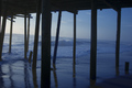
| 08/30/2006 09:23:14 PM |
Under The Board Walk Down By The Sea...by ElliottjmsComment: I like the colors. There's something off about the composition, though. I think its that the subject appears to be the waves, and the silhouette is distracting from the waves. I keep trying to look through them, rather than at them. Maybe backing up a bit to get more of the boardwalk itself in the frame and reduce the impact of the seascape would help this. |
| Photographer found comment helpful. |
| 08/30/2006 09:19:59 PM |
Evening Stormby TheBryGuyComment: Your colors look a bit pixellated -- a result of over-processing the image, perhaps? Beyond that the composition is good, except for the silhouette in the upper left corner. Not sure what the red lights are in the lower right, but I think they also detract from the image. A slightly sharper focus on the horizon (the trees in particular) would also help. |
Home -
Challenges -
Community -
League -
Photos -
Cameras -
Lenses -
Learn -
Help -
Terms of Use -
Privacy -
Top ^
DPChallenge, and website content and design, Copyright © 2001-2025 Challenging Technologies, LLC.
All digital photo copyrights belong to the photographers and may not be used without permission.
Current Server Time: 08/19/2025 07:03:02 AM EDT.