| Image |
Comment |
| 10/01/2005 10:55:22 AM |
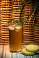
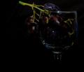
Tea, Anyone?by sanyComment: Overall nice. The tea tends to blend into the background a bit, though. |
 Photographer found comment helpful. Photographer found comment helpful. |
| 10/01/2005 10:54:14 AM |
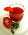
Healthy choiceby InnaNComment: I like the choic of colors. Its needs a bit more saturation, though. The colors are the star of this shot and should jump out at you more. Maybe move the parsley into the light to bring out the green a bit. |
| Photographer found comment helpful. |
| 10/01/2005 10:52:54 AM |
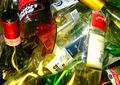
Afterpartyby sailorboyComment: The subject doesn't do anything for me. The colors could make it an interesting shot, but they don't grab my attention enough. |
| 10/01/2005 10:48:40 AM |
Dear John...by WadeComment: An interesting concept. Vertical blinds make a distracting backdrop, though. I think it would be better composed with a closer crop and better angle on the letter (maybe so the viewer could read "Dear John"). |
| Photographer found comment helpful. |
| 10/01/2005 10:45:47 AM |
|
| Photographer found comment helpful. |
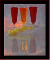
| 10/01/2005 10:41:57 AM |
Just Relaxingby KitaComment: This seems to be a underexposed -- I'd like to see a whiter background. The whole color cast of the photo seems a bit off -- kind of muddy. The colors are the real subject here, so they should really pop. The backdrop needs to be ironed -- the wrinkles are really distracting. Same for the drops on the left-most glass. |
| Photographer found comment helpful. |
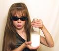
| 10/01/2005 10:38:41 AM |
Be Cool Drink Milkby cheegirlComment: A cute idea, but I would have cropped much more closely to the face. There is a lot of white space that doesn't contribute anything to the picture and neither does the left arm. |
| Photographer found comment helpful. |
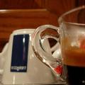
| 10/01/2005 10:36:20 AM |
Espressoby LedZeppelin588Comment: I think you need a little more depth of focus. The handle is in sharp focus, but I think the rest of the coffee cup should be as well. |
| Photographer found comment helpful. |
| 10/01/2005 10:34:29 AM |
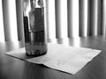
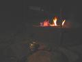
Sippin' in Septemberby BeckyKellermanComment: This just doesn't work for me. Its dark, the beverage isn't really the focus of the picture (the fire is, IMO), and it seems a bit out of focus. |
| 10/01/2005 10:29:17 AM |
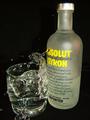
Absolut Richterby esdarbyComment: I like the lack of color here. The black and white with just a punch of the yellow label really works. |
| Photographer found comment helpful. |
Home -
Challenges -
Community -
League -
Photos -
Cameras -
Lenses -
Learn -
Help -
Terms of Use -
Privacy -
Top ^
DPChallenge, and website content and design, Copyright © 2001-2025 Challenging Technologies, LLC.
All digital photo copyrights belong to the photographers and may not be used without permission.
Current Server Time: 08/19/2025 01:50:42 PM EDT.