| Image |
Comment |
| 05/18/2003 11:09:19 AM |
Water Colorsby crabappl3Comment: Excellent shot. I like the way you've lined the 'necks' of the vases up to balance the shot. Colours are great, especially the red in the yellow vase. 10 |
 Photographer found comment helpful. Photographer found comment helpful. |
| 05/17/2003 02:42:16 PM |
Primary Glass by JackoComment: Great shot. Perfectly set up, technically spot on, and very appealing to the eye.
The colours are nice & strong and I love seeing the effect of light refracted through glass.
Well done. |
| Photographer found comment helpful. |
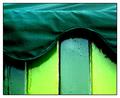
| 05/17/2003 12:49:37 PM |
ice cream hutby deceptiveComment: Excellent. The contrast between the gloss paint and the material is especially striking. |
| Photographer found comment helpful. |
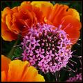
| 05/17/2003 09:39:33 AM |
In a corner of the gardenby jjbeguinComment: A super shot of the 'ball' of flowers, focus & DoF here are spot on, but the overall composition lets it down. The petal at the front is probably the most distracting, and the stamen from the ball are starting to creep out of frame. Good effort, and lovely flowers. |
| Photographer found comment helpful. |
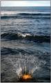
| 05/17/2003 09:34:38 AM |
Dash of Orangeby finnurComment: Now that's taking the splash photo to a whole new level!
Great idea, and the splash is well captured, but the composition lets it down. The top half of the photo, after the first wave, is wasted in this shot because the focal point is right down at the bottom. |
| Photographer found comment helpful. |
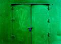
| 05/17/2003 09:31:27 AM |
Green Steel Blue Lockby CosmosFotosComment: An interesting subject, but a somewhat plain shot. Shooting this from several different angles, from low down, from the side, closer in, etc would likely have provided a more eye grabbing shot than the straight-on, centered composition. Personally I would have made a bee-line for the lock and switched to macro mode.
Technically well done, but doesn't really grab the attention of the viewer. |
| Photographer found comment helpful. |
| 05/17/2003 09:25:24 AM |
Fiery Nightby MarjoComment: Great idea, and the 'fiery' colour is superb, but this lacks enough sharpness to bring out the detail. The dark areas could probably do to be a bit darker too, as it is it seems a bit noisy in the shadows.
Good composition, and I would like to know how you achieved the effect with the colour. |
| Photographer found comment helpful. |
| 05/16/2003 06:24:01 PM |
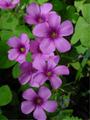
Faerie footprintsby pt2meComment: Beautiful.
Would like it zoomed out a touch to get the whole of the bottom, and top corner flowers fully in frame if possible.
Colours are great. Well done. |
| 05/16/2003 06:08:31 PM |
Mother's Day Flowersby gpflmanComment: There's too much going on in this image and nothing is leaping out saying look at me. I think keeping it simple, maybe just the orange flowers, would have worked better here. |
| Photographer found comment helpful. |
| 05/16/2003 06:05:23 PM |
Time for the Ballby aimee_skittlesComment: The composition is great, jumps right out at you straight away.
After looking for a bit longer though the image appears *too* soft, like is been run through neatimage.
Colours are lovely and the image is pleasing, well done. |
| Photographer found comment helpful. |
Home -
Challenges -
Community -
League -
Photos -
Cameras -
Lenses -
Learn -
Help -
Terms of Use -
Privacy -
Top ^
DPChallenge, and website content and design, Copyright © 2001-2025 Challenging Technologies, LLC.
All digital photo copyrights belong to the photographers and may not be used without permission.
Current Server Time: 08/08/2025 07:56:43 AM EDT.