| Image |
Comment |
| 10/05/2005 02:21:24 PM |
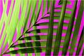
Natural Symmetryby JeanComment: The llines and shadows/light and dark in this image are amazing and hold interest really well. I think the background is more purple than red, so it loses impact as far as the challenge theme. |
 Photographer found comment helpful. Photographer found comment helpful. |
| 10/05/2005 02:17:52 PM |
|
| Photographer found comment helpful. |
| 10/05/2005 02:16:41 PM |
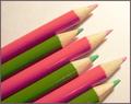
Pink 'N' Greenby trobergeComment: With this image, you take me out of the limitation of red and green in the strictest sense. The pastels are refreshing, and I lile the angle of the pencils. |
| Photographer found comment helpful. |
| 10/05/2005 02:13:05 PM |
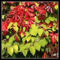
Natural complementsby AntanasComment: Red and Green. Great representation of comp. col. in nature. I like how the colors are split diagonally. |
| Photographer found comment helpful. |
| 10/05/2005 01:44:25 PM |
Red Vs Greenby jmleliiComment: The red and green don't really have a high impact here. Nice comp. A little dark with the shadow in the middlo eof the frame. |
| Photographer found comment helpful. |
| 10/05/2005 01:42:15 PM |
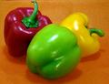
An Exercise in. . .by drydocComment: The orange and yellow sort of dminish the impact of your complementary red and green. I like the composition though. It might have had more imapct if you had kept with just the red and green and shot on a black or white background. |
| Photographer found comment helpful. |
| 10/05/2005 12:40:22 PM |
berrysby polkopComment: The berries are a bit too centered. If they are centered, it would be best to zoom in on them more. I can see the complementary colors, but not in the berries. More in the leaves. If the focus is the purple berries, it would have more impact is the leaves were yellow. The leaves in the forground are a little distracting. If they framed the subject more, they woul be fine, but here they just look like they are in the way. |
| Photographer found comment helpful. |
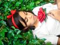
| 10/05/2005 12:33:38 PM |
Snow White Asleepby kenaComment: I see the red and green. The image looks oversharpened to me, and the white shirt really throws the image off balance. Still, your subject is in a nice position in the frame, and the idea is cretive. Not to mention the clear use of red and green complimetary colors. |
| Photographer found comment helpful. |
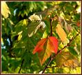
| 10/05/2005 12:31:40 PM |
Fall's Complementrary Colorsby Buckeye_FanComment: The focal point is too centered. I can clearly see your complimentary colors, and I applaud you for finding the arrangement naturally. It is sometimes difficult to spot complimentary colors in nature. |
| Photographer found comment helpful. |
| 10/05/2005 12:26:24 PM |
ROPEby CONRADComment: This looks more salmon pink and periwinkle blue to me. I do like the idea - very abstract. Your subject is sharp. There is a little too much reflection though - light is too harsh for my eyes. |
Home -
Challenges -
Community -
League -
Photos -
Cameras -
Lenses -
Learn -
Help -
Terms of Use -
Privacy -
Top ^
DPChallenge, and website content and design, Copyright © 2001-2025 Challenging Technologies, LLC.
All digital photo copyrights belong to the photographers and may not be used without permission.
Current Server Time: 08/19/2025 11:20:28 PM EDT.