| Image |
Comment |
| 03/06/2006 10:01:39 AM |
Vastby cheekymunkyComment: Excellent composition. I like the lines going across the frame formed by the tide. There is layer upon layer of texture and pattern. The detail of the two figures really adds a great element. It makes the entire frame look large - somethin g I feel is hard to do with a square crop. |
 Photographer found comment helpful. Photographer found comment helpful. |
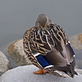
| 03/06/2006 09:59:50 AM |
littleby bucketComment: Sweet capture! I love the lighting and the textures. There is a lot of detail here! |
| Photographer found comment helpful. |
| 03/06/2006 09:58:57 AM |
Reachingby tooterComment: Beuatiful child. I feel the composition could be a little stronger if the lighting was better. Just a tad too dark. |
| Photographer found comment helpful. |
| 03/06/2006 09:58:09 AM |
Whats up ??by CamComment: Awesome! I love the sharp detail in the fur and whiskers. Nice bright eyes. Your background is perfectly split with the background trees on one side, and the tree on the other. Lots of great textures and nice color tones. Excellent composition. |
| Photographer found comment helpful. |
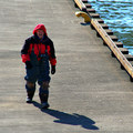
| 03/06/2006 09:56:23 AM |
Photographer's Wharfby StrikeslipComment: I like the subject ans his shadow, The colors are nice with the splash of red. I also thing the horizontal lines in the concrete work well. Nice capture. |
| Photographer found comment helpful. |
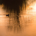
| 03/06/2006 09:54:20 AM |
On Golden Pondby JamesterComment: Very golden and dreamy. I love the ripples around the duck. Excellent catpture. |
| Photographer found comment helpful. |
| 03/06/2006 09:53:40 AM |
Fair Complectionby NoahGoldmanComment: I think the color here is very soft a pretty. The composition would be stronger if there was a tighter crop around the face. I think as it, it looks too much like her chin is cut off. |
| Photographer found comment helpful. |
| 03/06/2006 09:52:21 AM |
|
| Photographer found comment helpful. |
| 03/06/2006 09:51:35 AM |
Sticky Squares - Squaredby TomH1000Comment: Excellent composition. The blue is very rich, and the yellow is very creamy looking. I think the lighting on the sticky notes really brings out some interesting shadows and highlights. |
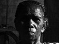
| 03/05/2006 03:53:03 PM |
The Faceby balmikiComment: Hello, from the Critique Club!!
I wanted to take a moment to go over your image. The first thing that hits me about the image is the strength in the face. Though the darktones are nice, the side of the face obscured by the shadow takes away from that strength. There is so much detail, why not really build your composition around that.
I think another thing that might help the image along is the composition or crop. Ther is too much room on either side of the face, and not really enough at the top and bottome of the frame. I think that opening up the frame at the top and bottom might allow more light around the face. You could also trry cropping out the dark side of the frame to focus more on the side of the face that is lit.
All in all, your subject is very interesting. Lots of contrast and strength, just needed a better composition and slightly better lighting on the darker side of the face. Thank you for making the effort, and your submitting the photo already shows that you have a certain amount of pride in your shot. Keep it up!!
Amy Jordan |
Home -
Challenges -
Community -
League -
Photos -
Cameras -
Lenses -
Learn -
Help -
Terms of Use -
Privacy -
Top ^
DPChallenge, and website content and design, Copyright © 2001-2025 Challenging Technologies, LLC.
All digital photo copyrights belong to the photographers and may not be used without permission.
Current Server Time: 08/20/2025 11:48:02 AM EDT.