| Image |
Comment |
| 09/27/2013 01:26:38 PM |
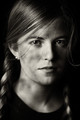
Little Farm Girl by njsabsby markwileyComment: Voted earlier coming back to comment.
Little farm girl all grown up. Excellent lighting that really shows off the details in the face & hair. Love the catch-lights in the eyes. Light and dark tones/contrasts are spot on! Well done portrait work should place high. |
 Photographer found comment helpful. Photographer found comment helpful. |
| 09/27/2013 12:02:08 PM |
Our Planet's Basics by pambComment: Voted earlier coming back to comment and bump up.
I love how you took the original and added extra touches that improve the visual impact! I also like how each partitioned section is not remote from each other, they do overlap and interact with each other. Water pours into earth to get the plantlife growing while the flames and heat from fire provide light and warmth for plantlife to grow as well. The colors and and the details of each element just pops visually off the page. Love the flow of water and the smoke and dancing flames in the shot. Well done! |
| Photographer found comment helpful. |
| 09/27/2013 11:53:08 AM |
Back to the 60's - curtpetguy image 939454by grahamgatorComment: Voted earlier coming back to comment and bumping up.
Excellent portrait work! Lighting if fabulous. I like how the pose feels more casual than the original. In your redux, it feels like we just made eye contact with this soldier and he is raising his cup up in a hello nod. I also like how you captured the additional detail of steam rising from the tin coffee cup - it is a nice little touch. Visually this one just pops more than the original and one reason is that you have a nice dark backdrop which your subject contrasts off of. Nice work! |
| Photographer found comment helpful. |
| 09/27/2013 11:42:58 AM |
"Paul" a portrait inspired by MAK's "Weatherproof"by CoryComment: Voted earlier coming back to comment.
Image grain and/or texture overlay can either work for a photo or work against it. Here it works in spades. It gives texture, dimension and a sense of age/time. This takes on the characteristics of an old and time worn photograph. One that we spot while turning the pages in a family album. Lighting is great and love the details I see in this portrait. Well done. I only have one tiny critique/observation. There is image grain and 'texture' overlay all throughout the background, except there is what looks to be a smooth/bald patch just to this man's right. It just looks bare and out of place with the rest. |
| Photographer found comment helpful. |
| 09/27/2013 11:35:43 AM |
'Long forgotten' tributeby snafflesComment: Voted earlier coming back to comment and bump up.
Great dynamic B&W tones! Well done tribute to the original. One thing I note that could have been done in the redux that was used effectively in the original is a even lower angle. The original has a lower angle that makes the image look like it is stretching out and appear longer - what that does is make it feel like it is stretching off to the horizon which plays into the mood that this is stretching out over years. I am also wondering if both the original and the redux might be even better if the shoes looked like they are 'long forgotten'. |
| Photographer found comment helpful. |
| 09/27/2013 11:27:03 AM |
"it's all about the color" by curtpetguy - remakeby sfaliceComment: Voted earlier coming back to comment.
I like the pop of colors of the red and the yellow. There is some details in the flower petals but overall the image is soft in focus where it could have been sharper and crisp. The other critique I have is that the lighting is rather flat. The contrast between light and shadows is not dynamic where it would pop off the page. One might be able to use PP with Levels and Curves to increase that dynamic range but it might be better to have better, balanced lighting on the subject first. |
| Photographer found comment helpful. |
| 09/27/2013 11:19:59 AM |
Strange Profile: Tribute to fpalumboby IAmEliKatzComment: Voted earlier coming back to comment.
You have great detail on the man's face, nice catch-light in the visible eye, and good, dynamic B&W tones on the portrait. It is a good emulation of the original but I feel there are a few things that could have been done to make the shot better. The original had the backdrop dark and the shoulder almost non-existent. This redux could have used those two elements to help make the subject pop more visually. The white shirt and the backdrop do not allow the face(s) to shine as the main focus - they call focus away from what you want your audience to stay focused on. The face cut out while good could have been even better had the features been more pronounced and detailed like the original. Not sure that either the original or the redux benefit from the flat grey of the cut out face as maybe white or black would have more contrast pop. |
| Photographer found comment helpful. |
| 09/27/2013 09:15:24 AM |
|
| Photographer found comment helpful. |
| 09/08/2013 11:46:36 AM |
Troglodyteby CoryComment: Just astounded that this is so far back when it was such a well lighted and executed shot. 14 fours and 4 fours??? Really thought I would find this to be anywhere from 5.8 (at minimum) or higher slot. Well, nonetheless, this is something different and very well done. |
| Photographer found comment helpful. |
| 09/08/2013 11:29:27 AM |
Goddess of Rain by HaakonComment: Congrads on your well planned out and executed shot!!!! Lighting, idea, and details all come together for a very unique Umbrella and Rain shot. Love the umbrella skirt - I figure that must have taken a lot of work too given that one would have to put supports in for it to keep its shape after cutting a hole in it. |
| Photographer found comment helpful. |
Home -
Challenges -
Community -
League -
Photos -
Cameras -
Lenses -
Learn -
Help -
Terms of Use -
Privacy -
Top ^
DPChallenge, and website content and design, Copyright © 2001-2025 Challenging Technologies, LLC.
All digital photo copyrights belong to the photographers and may not be used without permission.
Current Server Time: 08/24/2025 04:59:50 AM EDT.