| Image |
Comment |
| 09/28/2013 10:22:12 PM |
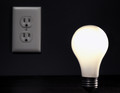
Powerless Withoutby giantmikeComment: Voted earlier coming back to vote.
The light is lit!!! Different bulb than the original but I think in this redux it is better because it fills out the frame more. Overall the photo is a bit dark which does help make the lightbulb pop more off the background, but the drawback is that the outlet is too much in the shadows that it gets lost. I think that this would be better if the exposure was a bit brighter either through slower shutter speed paired with lower aperture to let more light in or perhaps in PP with Levels and Curves. |
 Photographer found comment helpful. Photographer found comment helpful. |
| 09/28/2013 09:22:38 PM |
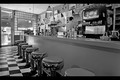
vawendy's Diners, Drive-Ins, and Dives (image ID 960847) recreatedby namComment: Voted earlier coming back to comment.
Nicely captured B&W of the classic diner. And see what you did with the title!- Now I have the theme music from Guy Fieri's show in my head :grumbles: need to find some other music to drive it out of my head. O.K. back to the photo:-) I like the angle and the B&W treatment that gives plays into the feel of 'classic oldie'. I do have two suggestions on how to improve the visual impact more. First the contrast could be a little bit more dynamic. Playing with Levels to adjust highlights/midtones/shadows can increase the contrast and give it more pop. Second, is composition. You got the right angle you just needed to move the bar stools a little more to the right so that the line come out from the bottom right corner. That way it acts as a great leading line and draws the eye to explore the rest of the diner. |
| Photographer found comment helpful. |
| 09/28/2013 05:09:52 PM |
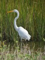
Majestic Snow by eyeartby LN13Comment: Voted earlier coming back to comment.
A good shot of the egret, but there are things that can be done to make it a stellar shot. Getting closer by zoom, by different camera lens, or physically closer (if possible; safety first, then try to get the shot imho) will have your main subject fill the frame more. Thus making the subject dominate the spotlight rather than swim in too much negative space. A lot of detail in the feathers and body is lost - you have great detail and balance of light in the reeds behind it but it is to the sacrifice of the egret. White tends to blow out if you are not careful to balance it with adjusting shutter speed and/or aperture. Expose the photo for the white bird even if that means your backdrop is going to turn out a bit dark. Actually it would help make the egret pop more off a slightly darker or dark backdrop. If your camera has it, something that would greatly help is using the camera's histogram to determine if it's too light or too dark by seeing if the graph falls to far to the left or right. |
| Photographer found comment helpful. |
| 09/27/2013 11:10:13 PM |
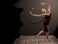
Magritte's Muse (929261)by Alex_PetriniComment: Voted earlier coming back to comment.
A very good redux of the original. Lighting is great. But there is something about the pose that seems forced. Hmmm, I think it is the hand position under the apple. It just seems too stiff. The hand pose on the top is great and more naturally posed -looks like she is casting a hold spell on the apple. My only other critique is that those dropoff areas on the back wall where the spotlight fades to black are a little to hard edge. It only really comes to my attention when looking at Magritte's silhouette in the fact that the top of the head area becomes less defined. Other then that it is a good tribute piece. |
| Photographer found comment helpful. |
| 09/27/2013 08:48:41 PM |
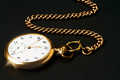
Remake of "Timeless" Classic (170276)by hajekaComment: Voted earlier coming back to comment.
I like that the redux has some 'texture' to the ground that gives this pocketwatch a foundation to lay on whereas the original seems to be floating in negative space. There is more detail in the pocketwatch all the way up to the chain. Love the sparkles coming off the watch - a nice touch to keep because it adds zing to the composition. I think that both the original and the redux would have had a bit more visual impact had the chain come out of the right top corner. That way you would have the subject lined up on the diagonal letting the eye easy and naturally travel up and down the subject - from the beginning of the chain in the top right corner following the chains path down to the pocketwatch that is in the bottom left corner. Lastly, I think that this rendition would have even more visual impact if the watch face was oriented more towards the viewer instead of turned away- I would give the impression it is coming in our direction and also be easier to appreciate and read the details on the clock face. |
| Photographer found comment helpful. |
| 09/27/2013 08:32:49 PM |
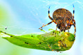
Breakfast of championsby redpandaComment: Voted earlier coming back to comment and bump up.
Hmmm, well I think I found the matching photo that this is emulating. That is a twist. The 'green' subject (the grasshopper) is being eaten rather than doing the eating in the original (lizard eating a bug). Interesting twist but still the same concept that plays into the food chain in action. You have some creepy good details on the spider, but the grasshopper is not in as sharp focus...but maybe that is a good thing because your audience already has enough of the visual to know that this bug is dead and getting eaten by the spider. I am wondering if it would provided another subtle nod to the original had the green grasshopper was oriented on the diagonal like the lizard is in the original photo. |
| Photographer found comment helpful. |
| 09/27/2013 08:19:23 PM |
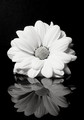
After Daisy Reflectionsby paynekjComment: Voted earlier coming back to comment and bump up.
Some really nice details captured in the center portion of flower. I like that the petals show more depth and details in the redo than the original. B&W tones are nice and dynamic. Just one small critique, watch the lighting that it doesn't blow out the highlights on a light colored object. The bottom half of the daisy's petal's loose some of the wonderful detail due to blown highlights. Using a higher aperture to let less light in and maybe have the histogram function on your camera on so that you can readily see by the graph if it is too light or too dark. |
| Photographer found comment helpful. |
| 09/27/2013 05:58:57 PM |
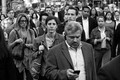
DSC_0327 (original title: file name)by tvsometimeComment: Voted earlier coming back to comment and bump up.
A-ha! Got it! I like how this shows more of the people and personalities in the crowd rather than the original where I feel like I'm lost in the shuffle of people. The redux gives me a subject to focus on. My eye then travels along a 'pyramid' structure of people that fan out off into the horizon. This photo is social commentary - we are so focused on moving forward, never looking back and never making eye contact that there is a social disconnect. There is the man out front checking his iphone, the woman with the large handbag intent on just getting to her destination, and there is the woman and a man behind her that are in their own worlds listening to whatever is transmitting from the earbuds. Everyone is this crowd is a 'single' entity - I don't see anyone that seems to be a pair interacting with each other. |
| Photographer found comment helpful. |
| 09/27/2013 05:32:59 PM |
A cup of Teaby JudiComment: Voted earlier coming back to comment.
Such a stern look on such a young face, but then, it is channeling some of that 'what may care' expression from the original. Lighting is good and showcases a lot of details, but need to watch that it is not too overpowering. On both the PC and laptop monitors, the left side of his face is a bit blown out and the right side of the white coffee cup has blown highlights. I do have another suggestion that the original makes good use of that could be utilized to great effect in this redux. Zoom or crop closer to the main subject. Bring your audience closer to the subject - give and up close and personal 'conversation' with this gent. I feel this has more a stand-offish feel where the original had more closeness of familiarity to it. Unless....stand-offish is what you were going for but not quite sure. |
| Photographer found comment helpful. |
| 09/27/2013 05:20:58 PM |
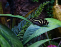
Spring Butterflyby KelliComment: Voted earlier coming back to comment.
This butterfly shot has some really nice richer tones than the original. It looks to have some nice detail but why so far away? Bring your audience closer to the main subject either through camera zoom or after the shot is taken: crop closer. It teases me with lovely details from the antenae to the wings - bring me closer to this Zebra Wing. My other suggestion is to take the shot at an angle where nothing is obstructing full view of the main subject. I know, sometimes that is difficult with such a subject as a butterfly but it is what makes a difference between a good shot and a stellar one. |
| Photographer found comment helpful. |
Home -
Challenges -
Community -
League -
Photos -
Cameras -
Lenses -
Learn -
Help -
Terms of Use -
Privacy -
Top ^
DPChallenge, and website content and design, Copyright © 2001-2025 Challenging Technologies, LLC.
All digital photo copyrights belong to the photographers and may not be used without permission.
Current Server Time: 08/24/2025 04:59:56 AM EDT.