| Image |
Comment |
| 10/02/2013 10:46:20 PM |
The Fabulous Tris Imboden by cynthiannComment: A little late but better late than never -Congrats on your first ribbon and PB! This is a fantastic image where composition, lighting, angle, focus, and expression are spot on perfect! |
 Photographer found comment helpful. Photographer found comment helpful. |
| 10/02/2013 09:41:04 AM |
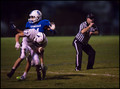
Friday Night Lightsby bobnospumComment: Voted earlier coming back to comment.
Many sports actions shots are tough to capture unless you are really lucky with the timing or have the camera on burst mode (and even then the 'moment' you want may not get captured). The first thing that I see that can be improved in the shot as it stands now is that it is rather dark - I recommend some levels and curves adjustments to make the shadows/midtones/highlights pop more get it a bit brighter. I feel that this is an average shot but I feel it has potential to be stellar if all the faces were more visible. The action is one thing (I see that number 17 is dropping the ball) but the faces/expressions can really draw the viewer in by 'telling the story'. For the most part I can't see much of the faces or expression of the three subjects in the shot. Showing expressions along with the action can turn a average shot into a spectacular one. |
| Photographer found comment helpful. |
| 10/02/2013 07:41:26 AM |
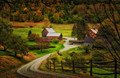
Sleepy Hollow Farmby Ja-9Comment: Janine! Look who hit the ball outta the park!!!! Congrats on such a capturing such a beautiful picture and the ribbon! Love the leading lines and the fall colors in this photo. Congrats as well on the super duper PB! |
| Photographer found comment helpful. |
| 10/01/2013 04:26:34 PM |
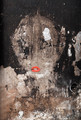
skin deepby daisydavidComment: Voted earlier coming back to comment.
What a cool find of this pattern of a woman on eroding wall! The addition of the lips further helps bring the imagery of this woman to the forefront - the pose takes on the look of a pouting model on a fashion magazine. One critique I have is that the lips don't look properly registered to the 'ground' and the tones don't quite match the tones of the rest of the photo composition. There is a shadow edge on the bottom right that makes it look pasted on - which it might have been in either PP or physically on the wall:-) As for the tones on the lips they look washed out either because it was a seperate shot where the lighting was different than the one for the wall or it was actually on the wall but the lighting was reflected stronger on the glossy surface. A quick pass with levels and curves could correct the tones for this surreal lady to shine. |
| Photographer found comment helpful. |
| 10/01/2013 04:09:34 PM |
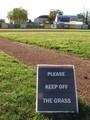
Play Ball, NOT!by GeneralEComment: Voted earlier coming back to comment.
Hmmm, the General's hidden DQ from the Games Challenge;-).
It remains true to the original with the "Keep off the Grass" sign. This redux has a leading line in it that the original did not feature prominently. The only thing is, is that dirt path/line doesn't really lead the eye to any element that would help the composition or play into/support the main subject. Maybe if the composition showed the corner where that path ends and a person (someone dressed in baseball outfit would be best given the location) walking towards it. Then that leading line would have something the eye could focus on and it would be another supporting element that would be a nod back to the 'keep off the grass' sign. |
| Photographer found comment helpful. |
| 09/30/2013 08:13:41 PM |
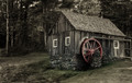
A Grandfather's Mill ~ wetlandby Ja-9Comment: Voted earlier coming back to comment.
Old grist mills just have this nostalgic charm to them. Love that this redux has stonework and wood for lots of interesting textures. The biggest thing that is missing here is the flow of water - which unfortunately is something out of your control. But I do have one suggestion that could have taken attention away from that fact. Taking the shot at a lower angle framing it were the bottom of the composition is just under the base of the stonework. It would give the mill a look of being taller & grand and also showcase the background scenery of the trees and some lovely lightplay in the leaves that I see going on there. By having the tall trees step into the spotlight as a supporting element it could call attention away from the element of no flowing water. One last small observation that would make this picture of the Old Mill even more appealing is that you can remove the modern power lines from the picture as that it ruins a bit of the rustic charm. |
| Photographer found comment helpful. |
| 09/30/2013 03:39:23 PM |
DQd for In-Camera Panoby pixelpigComment: Voted earlier coming back to comment.
I am having trouble finding a point to call the main subject or a leading line that draws and holds my eye in this redux. In the original the wood railing came out from the bottom right corner and flowed out to the center so that the eye could travel along the composition and take in the shapes and lines gradually. In the redux it is all there front and center with no clear path for my eye to settle on. It is just too much a lovely jumble for the eye to take in all at once. It does look like a nice place to sit, relax and read a book but it needs a main character to stand out for me to take notice of the sense of place of this story;-) |
| Photographer found comment helpful. |
| 09/30/2013 03:28:00 PM |
Silhouette at Sunsetby mrbig65Comment: Voted earlier coming back to comment.
The colors and mood are vastly different in the original and redux. The redux comes off more cold and moody with the cool blue tones and moody clouds in the sky. The clouds really don't allow the tree silhouette to pop off a minimal background. The reason why that is problematic is because the clouds are taking focus away from your main subject which is the silhouette of the tree. The original is minimal in presentation showing clear distinct lines and shape of it's main subject. The tree in the redux gets lost amoung the water, clouds, and mountain. I suggest that had you taken this from a lower angle where the tree limb comes out from the bottom left corner it would eliminate the distracting elements of the water and perhaps mountains to give a cleaner and clearer silhouette that could have greater visual impact. |
| Photographer found comment helpful. |
| 09/30/2013 12:54:55 PM |
Sentinel's boyfriend (Cutout)by 2mccsComment: Voted earlier coming back to comment.
The redux is in B&W accenting the shapes and textures whereas the original is in color and has those haunting, hypnotic eyes. The framing of both is the same with the long rectangular shape that helps keeps the focus centered on the eyes without any distractions. The original has just something piercing about the eyes that this redux just doesn't quite capture. The eyes are looking away instead of staring straight at the audience. I think it would improve the visual impact if both eyes had sharp details - the one on the right loses alot of details due to the haze/overlay when it could have the same possible 'look into the soul' clarity as the eye on the left. |
| Photographer found comment helpful. |
| 09/30/2013 12:40:41 PM |
amazed by charlie bakerby posthumousComment: Voted earlier coming back to comment.
I guess I'm really with the old crowd that I remember Charlie Baker without having to even look this up at all:-) Never truly did understood his shift in doing really avant-garde compositions. I do remember voting in two back to back challenges where I ran smack into Charlie's new work and spent the next few minutes struggling with laughter and feeling the sting because I my coffee went down the wrong way;-) As a tribute piece, it does emulate some of the lines and shapes of the original, but it lacks that same piercing, hypnotic, eye-straining quality due to it missing those bold yellows & blacks (Oh, my eyes!!!) :-) I think if you had limited the composition to two strong, contrasting colors to strongly accent the shapes the photo would have been better and a stronger connection to Charlie Baker's piece...although, I do thank you for this one is easier on the eyes to look upon than the original;-P |
| Photographer found comment helpful. |
Home -
Challenges -
Community -
League -
Photos -
Cameras -
Lenses -
Learn -
Help -
Terms of Use -
Privacy -
Top ^
DPChallenge, and website content and design, Copyright © 2001-2025 Challenging Technologies, LLC.
All digital photo copyrights belong to the photographers and may not be used without permission.
Current Server Time: 08/23/2025 11:38:50 PM EDT.