| Image |
Comment |
| 10/05/2005 11:48:28 AM |
Oriental Mystic by librodoComment: Subject, lighting, and color tones are all in balance to create a lovely picture that captures and holds the viewers attention. |
 Photographer found comment helpful. Photographer found comment helpful. |
| 10/05/2005 11:34:27 AM |
Sky Ablaze In Yellow & Orangeby DrakeComment: Nature can be stunningly beautiful. This is a very beautiful capture. The oranges and yellows of the bottom sky are deep and rich in hue. I would have liked to have seen a tad more blue sky to compliment the orange (say 50/50 balance) but I do like the inclusion of the plane wing for it adds a bit more added interest to viewing the image. The Plane Wing gives/puts the viewer in the position of actually "being there" and that helps to make this image even more appealing. |
| Photographer found comment helpful. |
| 10/05/2005 10:26:46 AM |
Sew Complimentaryby ElaineComment: Love the title on this piece. Very creative arrangement of complementary colors. The deep purple spool of thread is in the center and that object/color is the first thing to capture the eyes attention. We then radiate out from the center to notice the yellows and pale violet hues surrounding the center subject. I like the addition of the measuring tape for it just helps to strenthens the imagery of sewing not to mention it is also the color compliment to purple. Hmmm, I wonder if the addition of a sewing needle would have added to the invoked imagery of sewing - given the arrangement of objects it is not necessary but it might have been a nice compliment. My only other critique is that you might have cropped out a little more of the right hand portion to eliminate that unappealing beige background that appears in the top right hand corner. |
| Photographer found comment helpful. |
| 10/05/2005 10:16:06 AM |
Lonesome by danderson107Comment: Wow! Lighting on the subject is soft and perfect. Love shadows that compliment the orange vase and the tulip. The hues are beautiful and vibrant. The eye is immediately captivated with the imagery and the colors hold our attention. Very nicely done! |
| Photographer found comment helpful. |
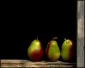
| 10/05/2005 10:13:23 AM |
pearsby dragonladyComment: Colors, composition, and objects are lovely and interesting to look at. I like that you have the three pairs resting on a old window wood frame - the texture of the wood adds additional interest to this "Still Life" capture. Lighting is very good on the main subjects. My only critique is that there is to much 'blank space' floating around the main subject of focus. Cutting down that 'empty' black space by say half to get a closer crop or zoom in on the three pears would have improved the overall image. |
| Photographer found comment helpful. |
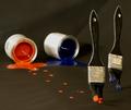
| 10/05/2005 10:07:15 AM |
Run!!! Run!!!by TransitComment: Love the fun and playful creativity seen in this composition!!!!! The orange and blue hues of the paint from the tipped cans is vibrant and bold and that sheen on the paint just really helps to draw the eye to the colors. Love the personification of the paint brushes that are "running" away from their paint containers. Their little "feet" (love how you split the brushes to show that they have legs) leave a paint trail behind them. My only critique is that I wish the black paper background and "floor" where a deeper black to really make the color hues of orange and blue pop off the page. |
| Photographer found comment helpful. |
| 10/05/2005 09:59:55 AM |
Petal Complementsby banmornComment: Strong focus on the petals of two different flowers. Complementary colors of blue paired with the orange/yellow is vibrant and rich in tones. Love the textures seen on the petals of both flowers for it gives the eye an added interest to look at. I was going to say that I would have prefered the two flowers to have been of the same kind so that the imagery of them being paired complementary colors would be stronger, but I do think this choice works. The reason? Different colors found in differnt flowers with different textures in the petals adds interest |
| Photographer found comment helpful. |
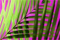
| 10/05/2005 09:53:57 AM |
Natural Symmetryby JeanComment: Whoa! The colors really pop off the page and grab the viewer by the lapels:-) Nice composition of objects and the hues of the magenta almost appear as a neon hue to compliment the greens of the fauna. Only real critique on the image itself is that the leaves on the far left are a tad too overexposed due to the light source being really strong on that side. |
| Photographer found comment helpful. |
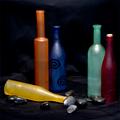
| 10/05/2005 09:49:22 AM |
Missing One ...by tonyvComment: At first I was going to say that there are too many colors here when the title of this piece and the pairing of some of the bottles struck me. Very clever! Yellow is missing is paired complementary partner purple. Lovely idea on the composition, however the execution calls for some improvement to really make this image "pop" off the page. The colors on the blue and orange bottles are perfect they are both vibrant and the hue shades compliment each other well. However the red bottle and green bottle pairing doesn't work quite as well. The green bottle is a shade too pale standing next to the vibrant deep red bottle. A richer green hue would have been a better pairing for that red bottle. Next I don't know why you include thos black rocks for they do nothing for the composition - in fact they detract the eyes attention from the main focus which are the bottles. Lastly the black background needed to be a deeper, flat and darker hue (there are variations in the black hues such that some 'highlights" appear in the cloth) so that it would make the color hues of these bottles literally "pop" off the page. |
| Photographer found comment helpful. |
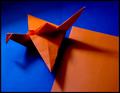
| 10/05/2005 09:40:47 AM |
Orange on Blueby persimonComment: I like the hues of the blue and oranges as well as the arrangement of objects. The only thing that is really detracting from an overall appealling image is those deep shadows on the oragami crane and upper left hand corner. Perhaps a light source directed from below the crane as well as camera flash would significantly eliminate those deep shadows. |
| Photographer found comment helpful. |
Home -
Challenges -
Community -
League -
Photos -
Cameras -
Lenses -
Learn -
Help -
Terms of Use -
Privacy -
Top ^
DPChallenge, and website content and design, Copyright © 2001-2025 Challenging Technologies, LLC.
All digital photo copyrights belong to the photographers and may not be used without permission.
Current Server Time: 08/07/2025 07:10:50 PM EDT.