| Image |
Comment |
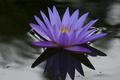
| 10/05/2005 08:05:02 PM |
Moonlight Lotusby kbrownvcComment: Beautiful composition. The subject, focus, lighting and colors are pretty much spot on and attract and hold the eye's attention. The only critique I have is that the crop could have been more on the flower leaving less space to the left and right. |
 Photographer found comment helpful. Photographer found comment helpful. |
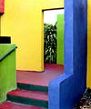
| 10/05/2005 07:46:03 PM |
Stepsby TampaDanComment: Too many shapes and colors here in the composition that the true pairing of complentary colors gets lost in this bold and vibrant composition. Yes, the colors are bold and beautiful and attract the eye, but I think it could have been stronger if you focused on a central area that also plays up the shapes one sees here. I.E. centering on green wall and red/violent stairs would not only have been an abstract showing bold colors but also bold and clearly defined shapes with interesting angles. |
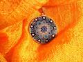
| 10/05/2005 07:40:06 PM |
my favourite colorsby anotherdayComment: Too much sheen on the yellow/orange hue here causes the eye to squint. The pendent with its floral blues is mostly lost in the folds of the cloth - the crop could have been closer such that the composition is 50/50. Given that the orange/yellow hues are bold and brilliant they tend to overpower the few blue hues seen in the pendant which are not as vibrant. |
| Photographer found comment helpful. |
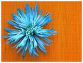
| 10/05/2005 07:34:53 PM |
Blue on Orangeby MsMiaComment: A nice aqua blue 'mum' flower on a bright orange bamboo mat attracts the eye. I like that this composition has some shapes represented in the lines of the bamboo. It adds some interest to this still life composition. |
| Photographer found comment helpful. |
| 10/05/2005 07:32:32 PM |
Beneath the Leafby jonnieComment: Natural colors of greens and reds to be found in nature if one just looks:-) Good find. Love how you composed the shot to make the underside of this leaf appear as if it is a fan. |
| Photographer found comment helpful. |
| 10/05/2005 07:30:23 PM |
feeling blue & orangeby liahComment: Bold and vibrant oranges and blues on the clothing that really grabs the attention of the viewer. I like the play on the word "blue" when applied also to the feeling that the model is expressing with the downcast facial expression. There are three things that could improve this image. First the blue border detracts from the main focus which should be on the objects and colors within the composition. Second, a stark white or deep black background would have better suited the subject and made the colors contrast better. The dull white background with some unattractive "dents" in the wall surface do nothing to compliment the photo. Lastly a closer crop on the model from the waist up would have been better as that I think that their is a tad too much "empty space". |
| Photographer found comment helpful. |
| 10/05/2005 07:23:51 PM |
stand by meby Bus352Comment: Nice bold and vibrant greens and reds on the pipes. Two things that detract from the image is that their is too much empty space - focus should have been more on those two pipes and perhaps the signs above them; a closer cropping would have improved the image. Second the ground plane of the dull and dirty gray is unappealing to the eye and the composition. Had you cropped the composition to eliminate the ground plane the black walls would have been the main background that makes those greens and reds "pop" off the page. |
| Photographer found comment helpful. |
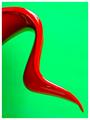
| 10/05/2005 12:07:35 PM |
stre`am·lineby RikkiComment: Bold, vibrant, with an abstract shape whose curves and well as vibrant color captures the eye's attention. |
| Photographer found comment helpful. |
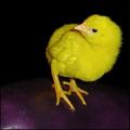
| 10/05/2005 12:00:13 PM |
What's Behind?by noryComment: The eye gets immediately drawn to the vibrant and bold yellows of this cute little chickie. The little chick is in sharp focus such that one can see every hair on it soft furry body. Again I am struck by the bold yellow colors but the complimentary color of purple is almost lost. The purple needs to be brought more into the light so that it does not get 'lost in the shuffle" If it had been light a little better the viewer would have noticed that color more readily along side with the yellow of the main subject. |
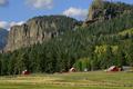
| 10/05/2005 11:55:10 AM |
Conspicuous Barnsby RistyzComment: This is a beautiful scenic shot, but the main point of the challenge gets lost in all this beautiful scenery. I see that you were going for the red/green complimentary colors but that focus gets totally lost as our eye wanders around this beautiful expanse. I think it would have made a stronger impact and better met the challenge requirements if you had just focused our attention on one red barn surrounded by beautiful greenery. As it stands now those red barns are dwarfed by their scenic environment. |
| Photographer found comment helpful. |
Home -
Challenges -
Community -
League -
Photos -
Cameras -
Lenses -
Learn -
Help -
Terms of Use -
Privacy -
Top ^
DPChallenge, and website content and design, Copyright © 2001-2025 Challenging Technologies, LLC.
All digital photo copyrights belong to the photographers and may not be used without permission.
Current Server Time: 08/07/2025 07:11:17 PM EDT.