| Image |
Comment |
| 12/02/2005 10:13:32 AM |
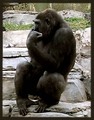
The Thinkerby groggyfroggyComment: A good capture of the moment. I think the visual would better suit the title if the zoom/crop was closer - a chest to head shot fully filling the frame. There is too much space surrounding the gorilla that it takes focus away from what you want to call attention too. A stronger visual equation to The Thinker and this gorilla which is striking the same pose would have been to tightly crop or frame your image as a medium shot (waist to head). Not only would you call direct attention to the action and pose of the gorilla but an added boon would be that we would see more of those facial features including what looks to be an intense stare. |
 Photographer found comment helpful. Photographer found comment helpful. |
| 12/02/2005 10:07:54 AM |
Into The Westby TerramarComment: Visually and techincally this is a very good capture. The hues of golds and oranges project warmth. The two subjects stand hand in hand observing the warm glow of the sunset. An added boon to the visual interest is the addition of the capture of a seagull flying above the surf. |
| Photographer found comment helpful. |
| 12/02/2005 10:03:39 AM |
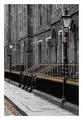
Lines of Goldby ScotlandPicturedComment: Interesting overall composition of B&W with a smattering of color. The gold hue is what really stands out - actually it pops off the page and really captures the eye's attention. What I find interesting about this photo is the gold of the fence trails down as a horizon line off into the distance much like the orange/gold leaves near the cobblestone pathway do as well. My critique on this piece is that for added interest you could have included more of that trail of leaves to follow and mimic that horizon line of the fence. A juxtaposition of a man-made one to a nature made one. |
| Photographer found comment helpful. |
| 12/02/2005 09:57:46 AM |
Upby NordlysComment: A clean uncluttered image with just the sea below and the parasailer high above. Cropping is good for it calls attention directly and instantly to the main focus - the parasailer sailing high above the ocean waters. It also gives the viewer a sense of height and distance. My only critiques on improving the image would be that the color on the parasail be more richer in hue such that it really pops of the page - here it looks a little washed out. Also if the parasailer could be in sharper focus such that more details are visible would be good. |
| Photographer found comment helpful. |
| 12/02/2005 09:52:32 AM |
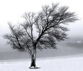
Standing Guard In Snow and Fogby alfrescoComment: I like those strong visual shots with stong clean shapes/lines that are color but could easily pass for B&W because only those two colors dominate the scene. The stark, white groundplane and background compliment this barren tree by making it pop off the page. My only critique is that I would have changed the angle slightly so that the eye doesn't have the distracting element of the some buildings which are visible on the far right hand side. Just a solid, clean, fully uncluttered white static background really complements the main subject - the tree. |
| Photographer found comment helpful. |
| 12/02/2005 09:42:46 AM |
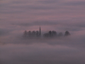
Sanctuaryby mexicoComment: A very interesting capture that invokes imagery of a magical and mysterious place that is ensrouded in fog. I love how you see just a smattering of trees through this heavy pinkish/blueish tinged fog. Colors tend to make me think of watercolors. In fact this photograph could almost pass for a painting. Very nice capture. |
| Photographer found comment helpful. |
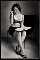
| 12/02/2005 09:39:11 AM |
Did someone say study?by jadkpicsComment: Classic B&W adds a portrait feel to this in addition to making the image clean and simple without distractions of color. Lighting is spot on with it calling our eye's attention directly to the model. Pose, dress, and expression of the model also plays into the concept of 'playful' study. Very well done. One suggestion I have that could possibly add to the composition is to have had the model hold the book at a 45-60 degree angle such that the title of the book would be visible - and it would be titled "The Study of the Human Body" of course (or some title similiar to that - a textbook that I believe some art students studying how to draw the human body would use). |
| Photographer found comment helpful. |
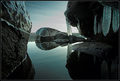
| 12/02/2005 09:33:03 AM |
frozen moment by arngrimurComment: A low angle shot showing us the perspective of getting close to cold, flat, clear waters. The ice on the rocks and the close proximety to the water makes my teeth chatter as I gaze upon this image. As added interest to the composition we see a rock straight ahead of us such that I get the impression of steering through these large rocks as we navigate through a extremely cold river. |
| Photographer found comment helpful. |
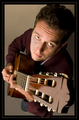
| 12/02/2005 09:29:32 AM |
Strumming...by srdanzComment: I like the angle of this shot which adds interest to the overall photo. Lighting and focus is very good where everything in the composition is very clearly and sharply visible. My only critique is that the model should have been captured lost in the music he is strumming. Instead he is looking up directly at us. And because he is making that eye contact with the viewer I don't 'feel' any vibes of music coming forth from this photo - especially since the title plays to the fact that he is strumming. Compositionaly I think it would be more interesting if we could see the player (with his face in profile at this same angle) getting lost in his music. |
| Photographer found comment helpful. |
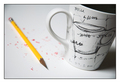
| 12/02/2005 09:24:31 AM |
Impromptu Brainstormby jpetersComment: Points to you on originality! I could very well see this hanging on the wall in an architect's office:-) Instead of drawing design plans on a clean sheet of white paper it is the coffee cup the bears the "blueprint" of the design. Also when I gaze upon this photo I think of someone working either in the early morning hours or late night hours on a blueprint taking a few moments every so often to take a sip of hot coffee to keep themselves alert. Lighting is good, compostion is good, and concept is good. My only critique is that the choice of pencil could have been better and more sharper. By that I mean the shaved wood part leading up to the lead point should have been lighter because it blends in to much with the lead point. I see the person who is not in the shot being very meticulious, clean and sharp such that the lines drawn are very defined - so it should also be on the pencil (yeah, I know I am one for stickler details). Also, I would have liked the number of the Number 2 pencil to have been more visible and clearer to see. Aside from that this is a very good conceptual shot. |
| Photographer found comment helpful. |
Home -
Challenges -
Community -
League -
Photos -
Cameras -
Lenses -
Learn -
Help -
Terms of Use -
Privacy -
Top ^
DPChallenge, and website content and design, Copyright © 2001-2025 Challenging Technologies, LLC.
All digital photo copyrights belong to the photographers and may not be used without permission.
Current Server Time: 08/08/2025 01:04:50 PM EDT.